17 Above Sofa Gallery Wall Ideas for a Balanced Living Room
The hardest part of decorating behind a sofa is not choosing pictures. It is making separate frames behave like one object that belongs to the furniture below. When the scale, lower edge, or visual center is wrong, even beautiful pieces can seem disconnected.
Measure the sofa section that actually touches the wall, then test the complete arrangement with paper templates. Center the group on the sofa unless another permanent architectural feature creates a stronger reason not to. Keep the lowest frame close enough to the sofa that the two read together, while leaving room for heads and cushions.
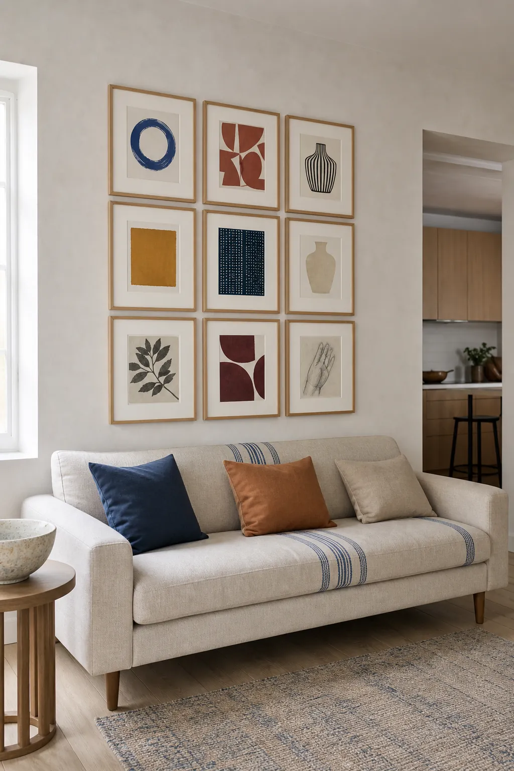
A Balanced Nine Frame Grid
Nine identical frames create a clean rectangle that can carry varied subjects without looking chaotic. Use equal mats and precise gaps, then size the whole grid in relation to the sofa rather than the empty wall. This approach works especially well when the room already contains patterned upholstery or several strong colors.
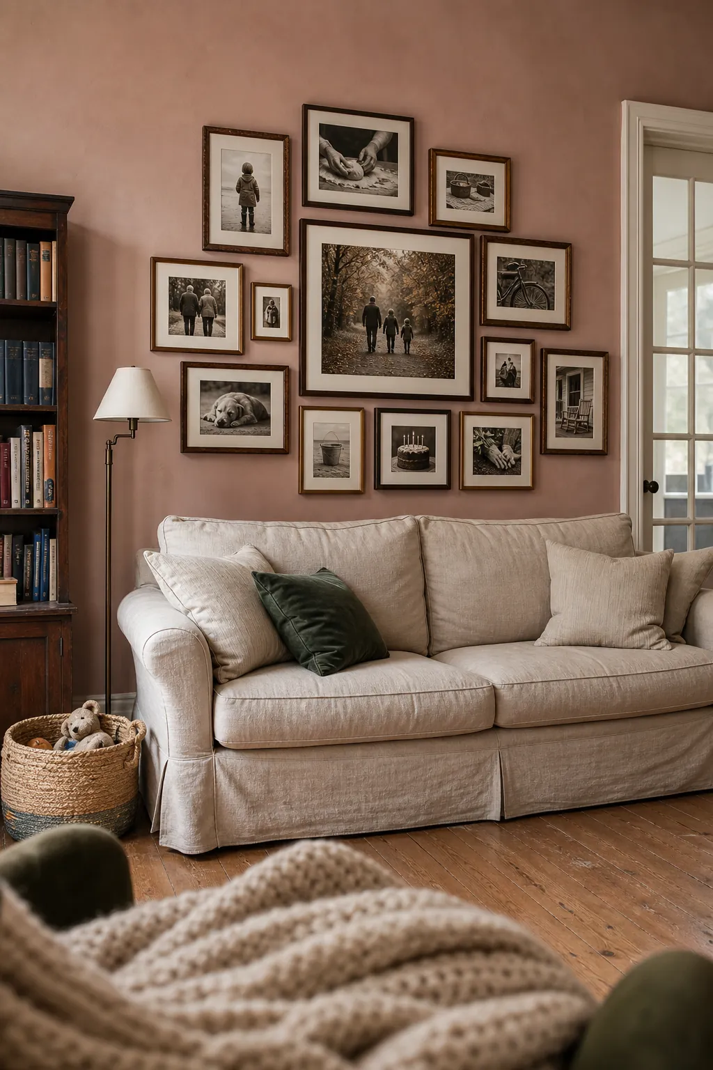
An Organic Family Photo Collection
Family photographs feel more relaxed when frame sizes vary but the image treatment remains consistent. Convert the photos to a shared warm monochrome palette, then build outward from one larger anchor. Keep faces away from frame edges and mix close portraits with wider everyday scenes for a natural visual rhythm.
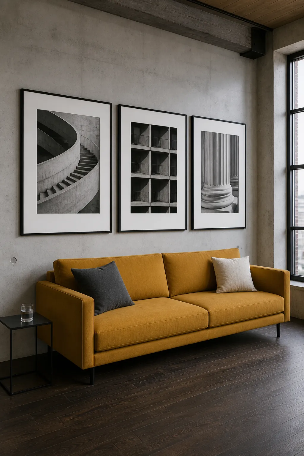
Three Oversized Black and White Prints
Three large photographs can deliver gallery wall presence with very little visual noise. Choose related architectural subjects, use generous white mats, and let the frames span much of the sofa width. The repetition suits a modern room and makes spacing errors easier to spot before hanging.
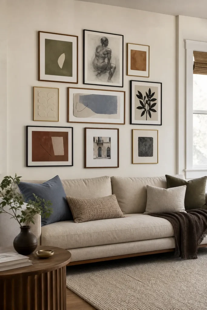
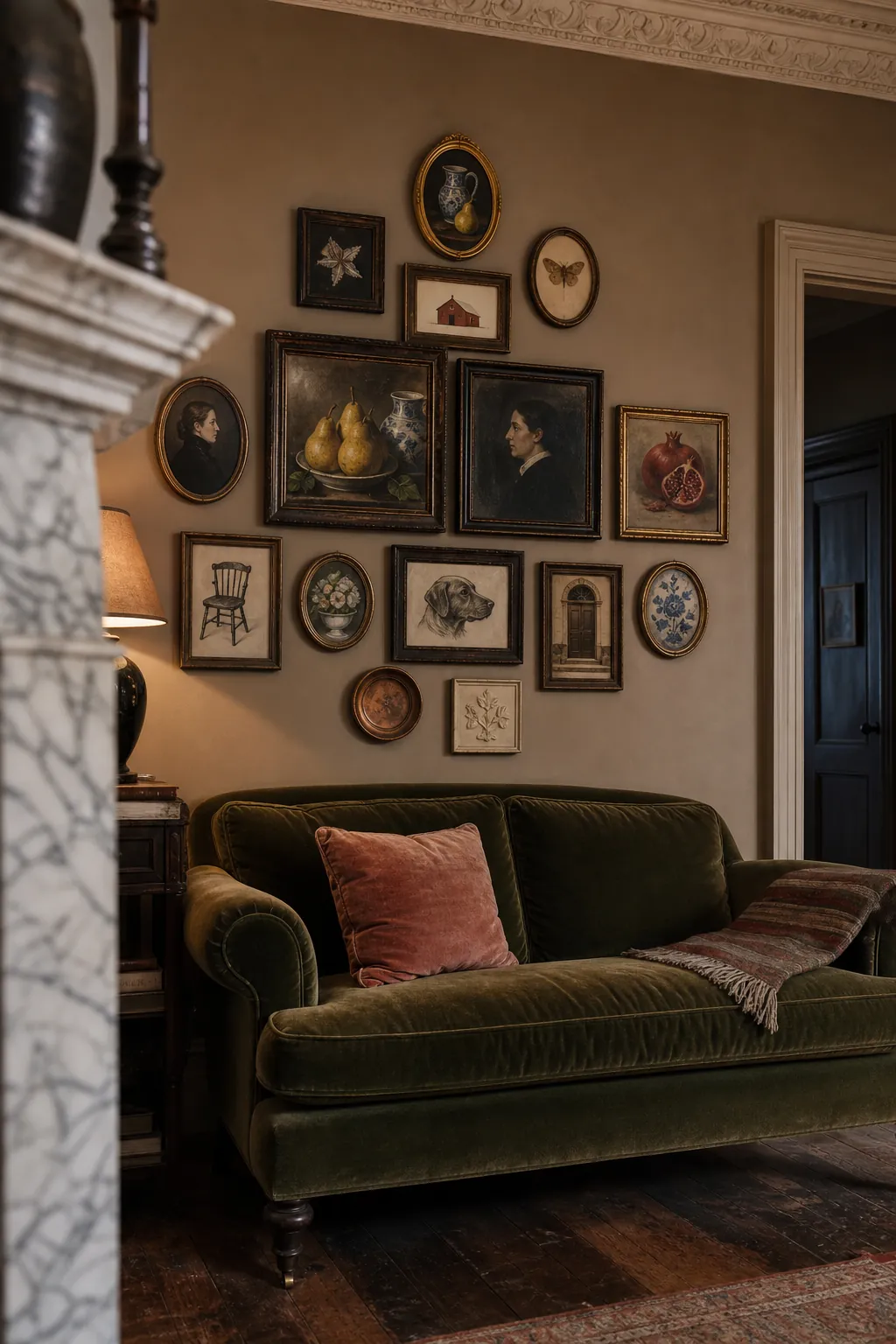
A Collected Vintage Salon Wall
A salon arrangement succeeds when every frame feels collected but the outer silhouette stays controlled. Combine small portraits, still life paintings, and miniature studies in aged wood and brass, then repeat one warm tone across the set. Start close to the sofa with the larger pieces and allow smaller works to rise toward the ceiling.
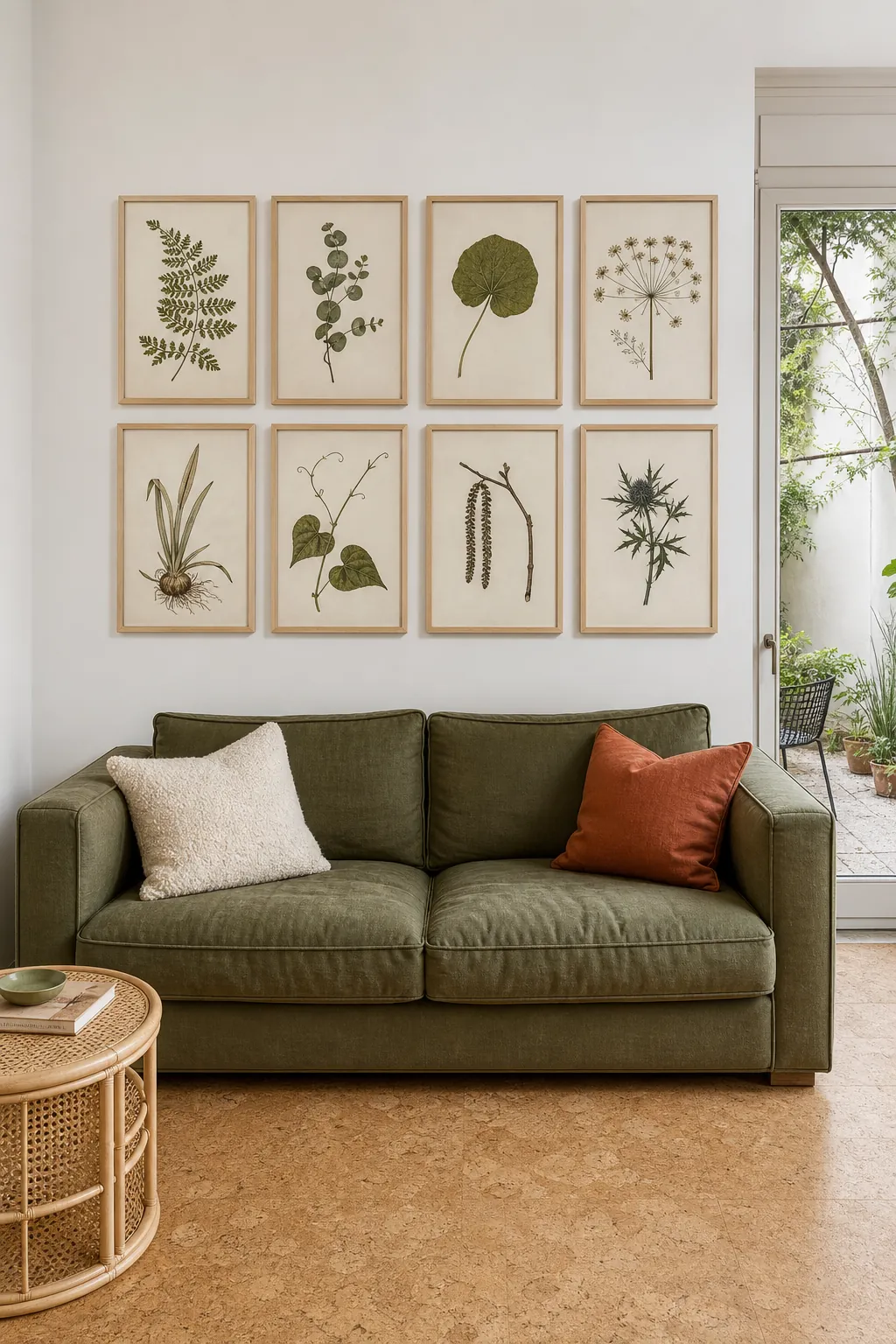
A Calm Botanical Study Wall
Botanical studies bring detail to a living room without demanding strong color. Select different specimens on similar paper and use slender frames that let leaf shapes remain the focus. A symmetrical arrangement can feel fresh when the individual plants vary in scale and structure.
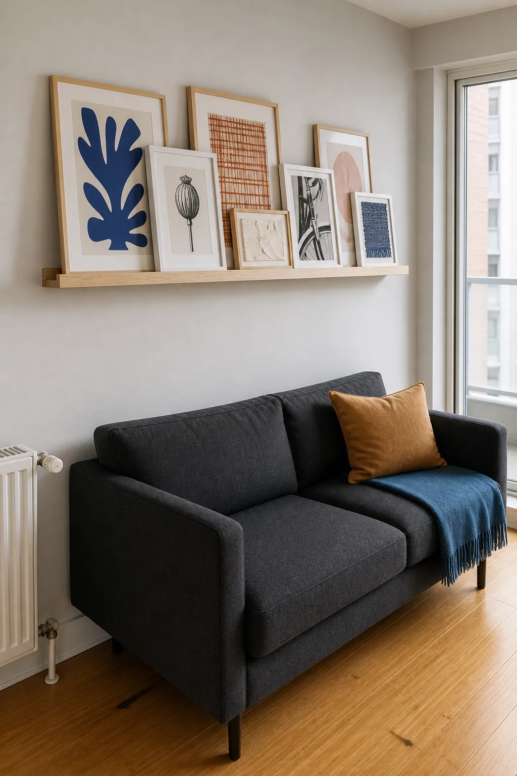
A Picture Ledge With Layered Frames
A long picture ledge makes it easier to adjust art as a collection changes. Overlap frame edges slightly while keeping important image details visible, and limit the depth so objects remain secure above seating. Mount the ledge firmly and high enough that a seated person cannot strike it.
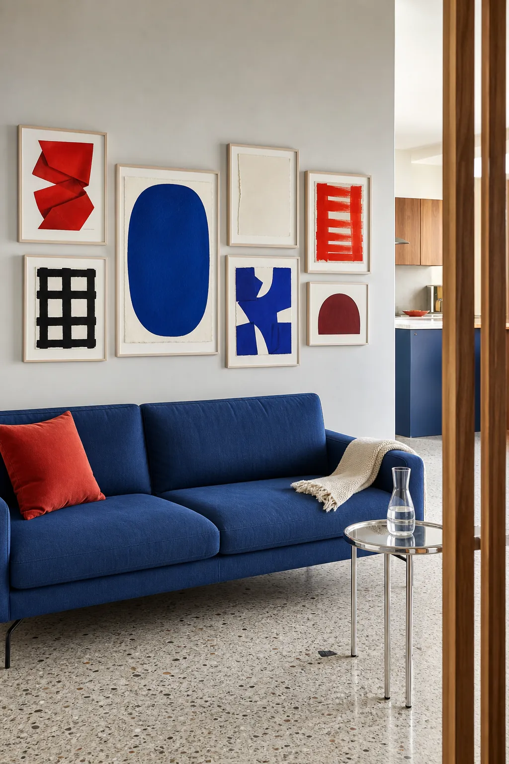
A Colorful Modern Art Mix
Bold color works above a sofa when the palette has a clear limit. Choose abstract prints that share two dominant hues, then repeat one of them in a cushion or throw below. Keep the frames simple so color relationships carry the composition instead of competing profiles.
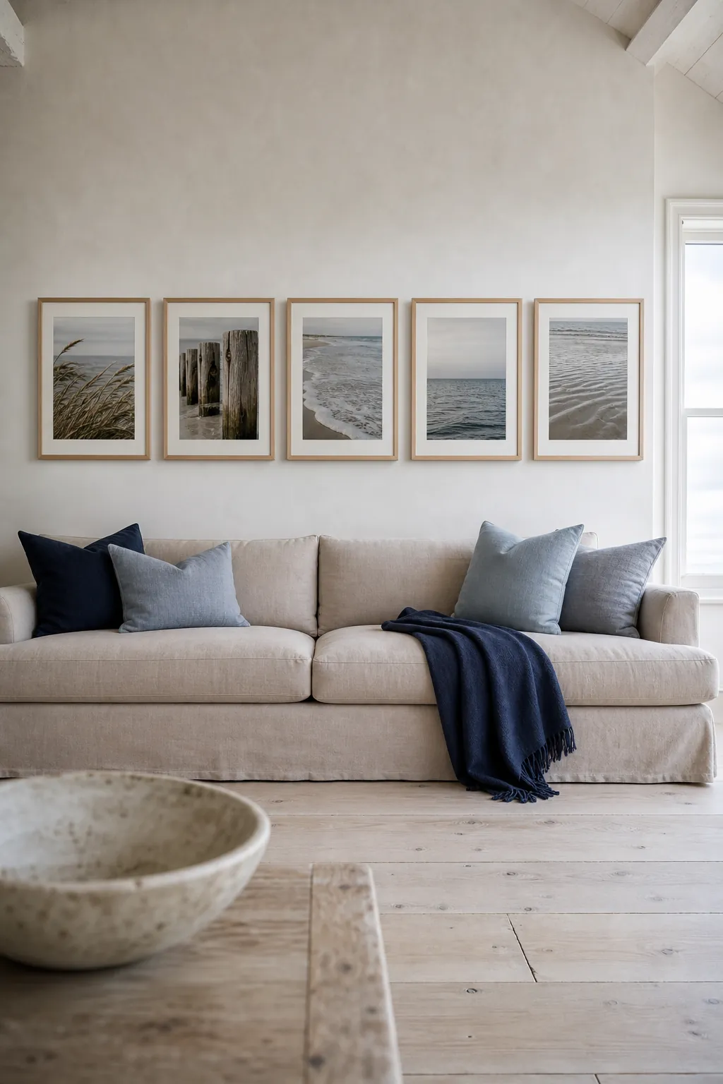
A Coastal Photography Sequence
A sequence of shoreline photographs can make a long sofa wall feel wider and calmer. Use different views from the same coast, such as dune grass, weathered posts, and open water, while matching horizon levels. Pale oak frames and broad mats keep the scenery airy rather than themed.
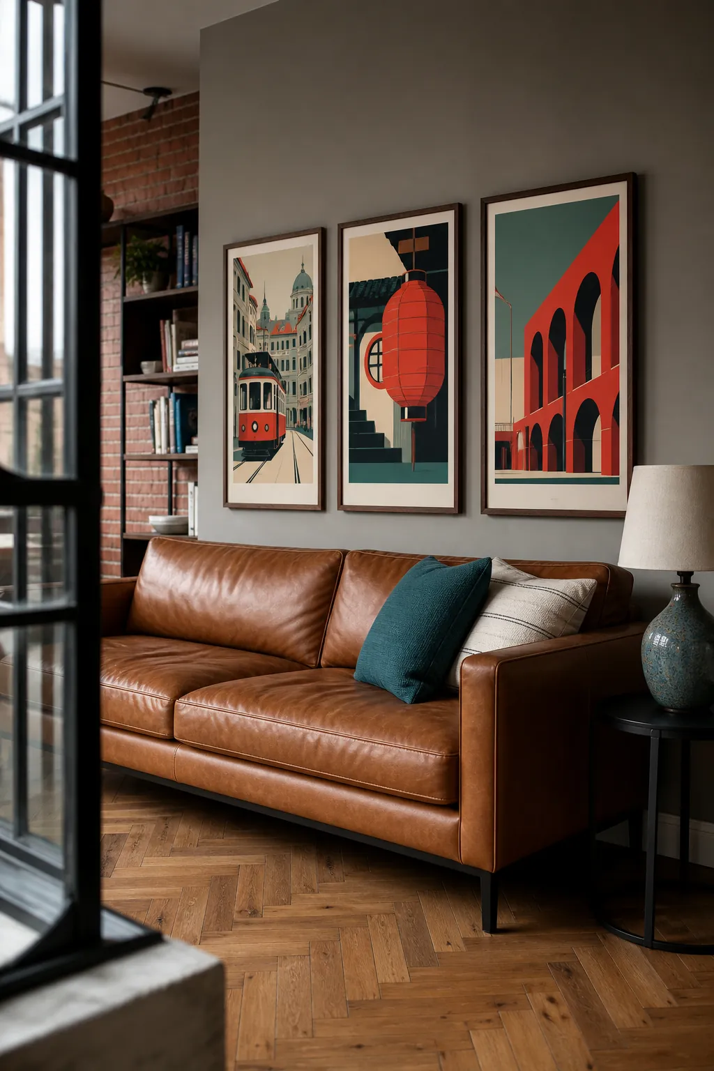
A Graphic Travel Poster Row
Travel posters add energy when their typography and illustration styles feel related. Choose three destinations with a shared limited palette and align the bottom edges to create stability above the sofa. Give each poster enough size to be read as an image from across the room without relying on tiny lettering.
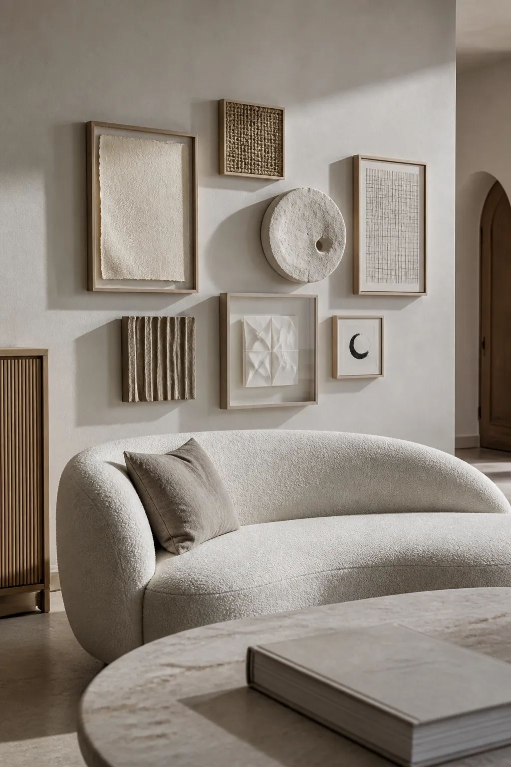
A Soft Neutral Texture Collection
A neutral room needs material contrast more than additional beige color. Mix framed handmade paper, a small woven panel, and a shallow plaster relief within one tidy outline. Keep every texture subtle enough to support the sofa, then use side lighting to reveal depth.
An Eclectic Mix With One Round Accent
One circular piece can release the stiffness of an arrangement dominated by rectangles. Place a small convex mirror or ceramic disc near the visual center, then balance its weight with two stronger frames on the opposite side. Repeat a frame finish elsewhere so the unusual shape feels integrated.
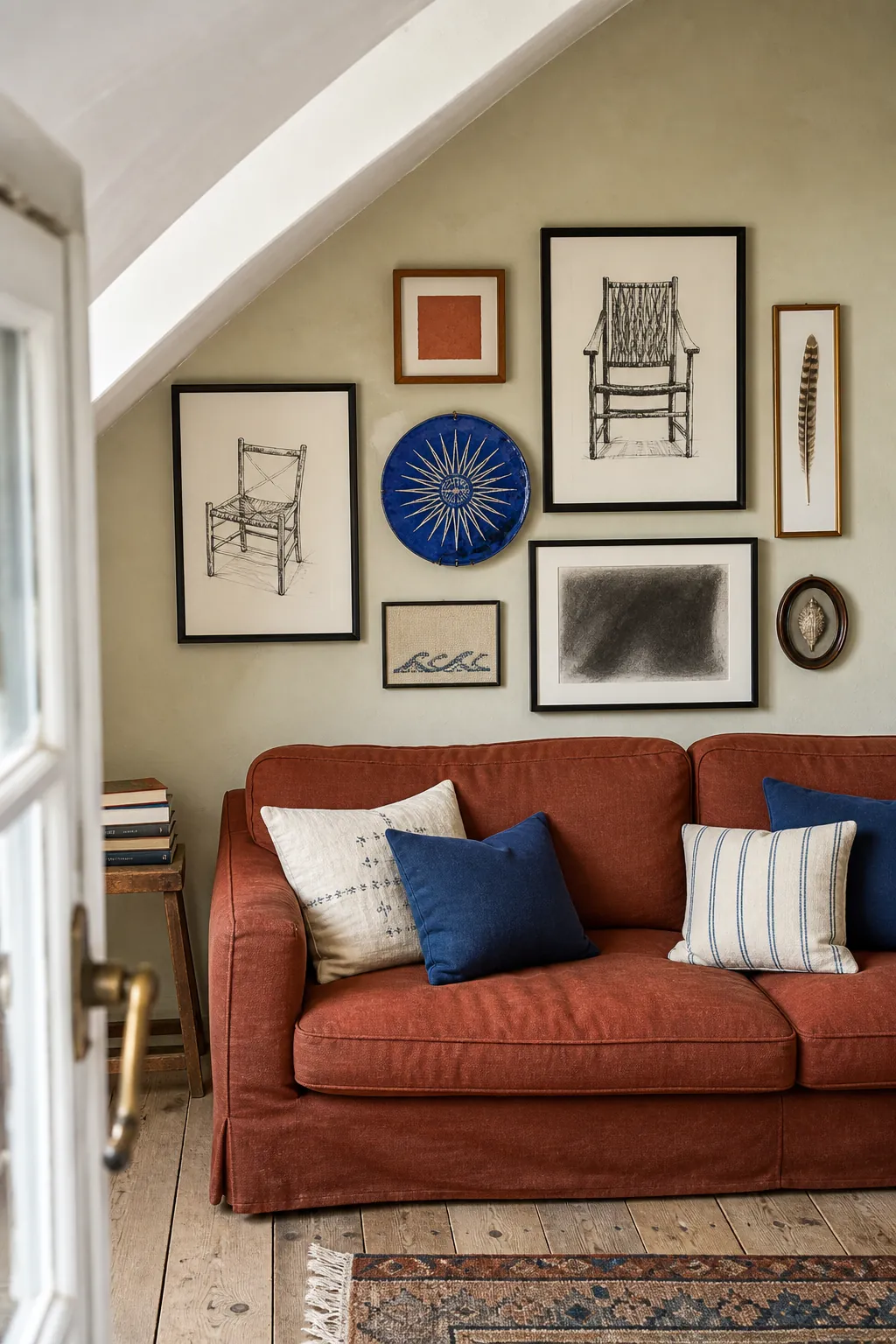
A Minimal Two Row Layout
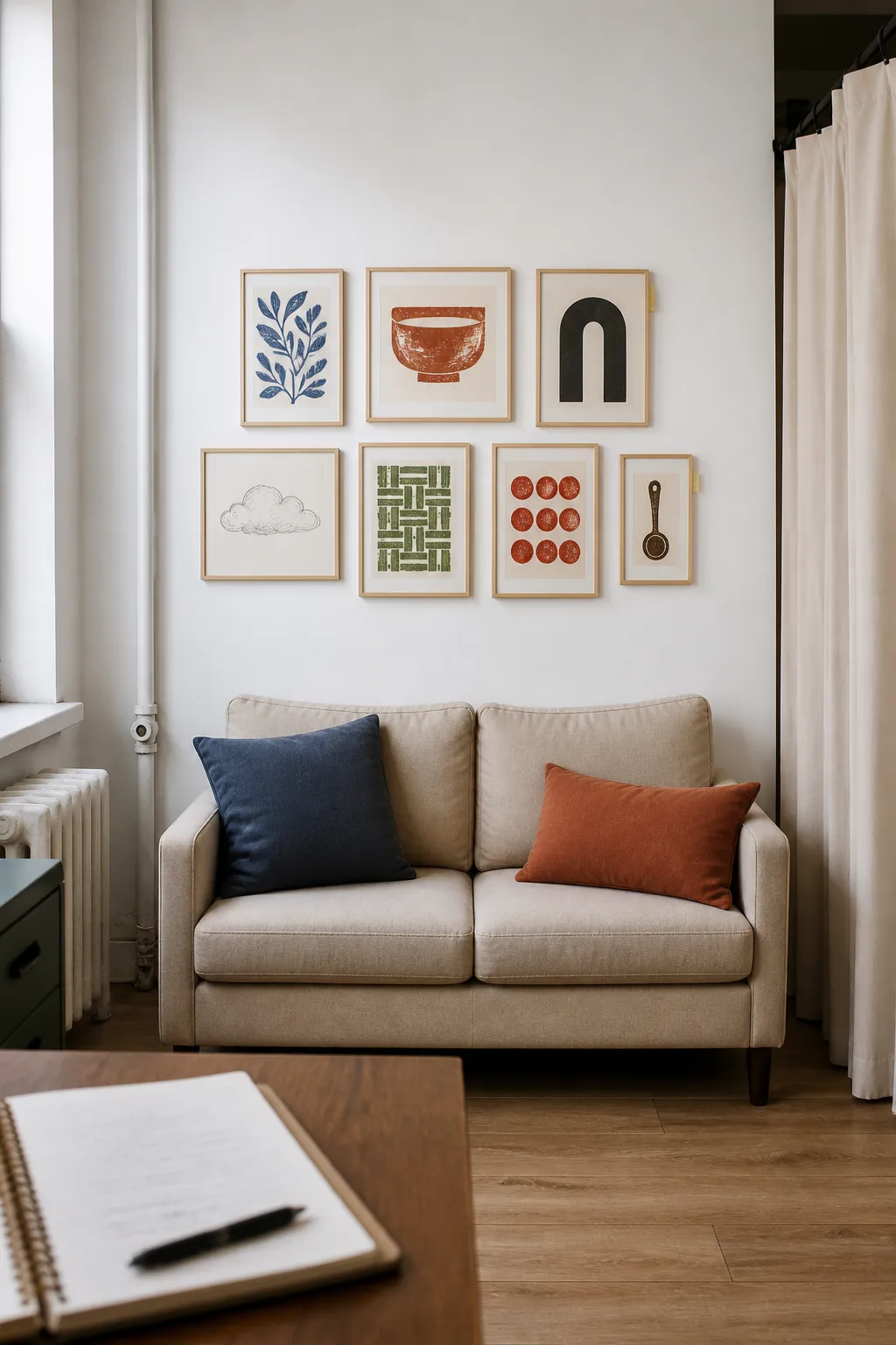
Two rows of four frames offer order without the formality of a larger grid. Alternate quiet line drawings with small fields of color while maintaining identical frame sizes. This layout gives a standard sofa enough visual width and still leaves calm wall around the group.
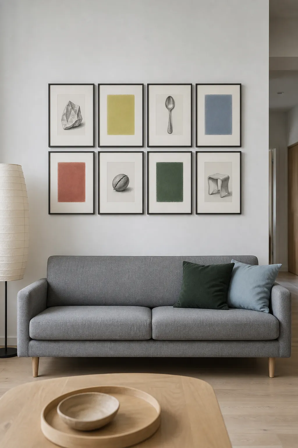
A Kids Art Gallery With Matching Mats
Children’s art can look cohesive without losing its spontaneity. Use matching white mats and simple natural frames, then rotate the drawings within a fixed arrangement. Choose pieces with different mark types and colors so the display feels lively rather than repetitive.
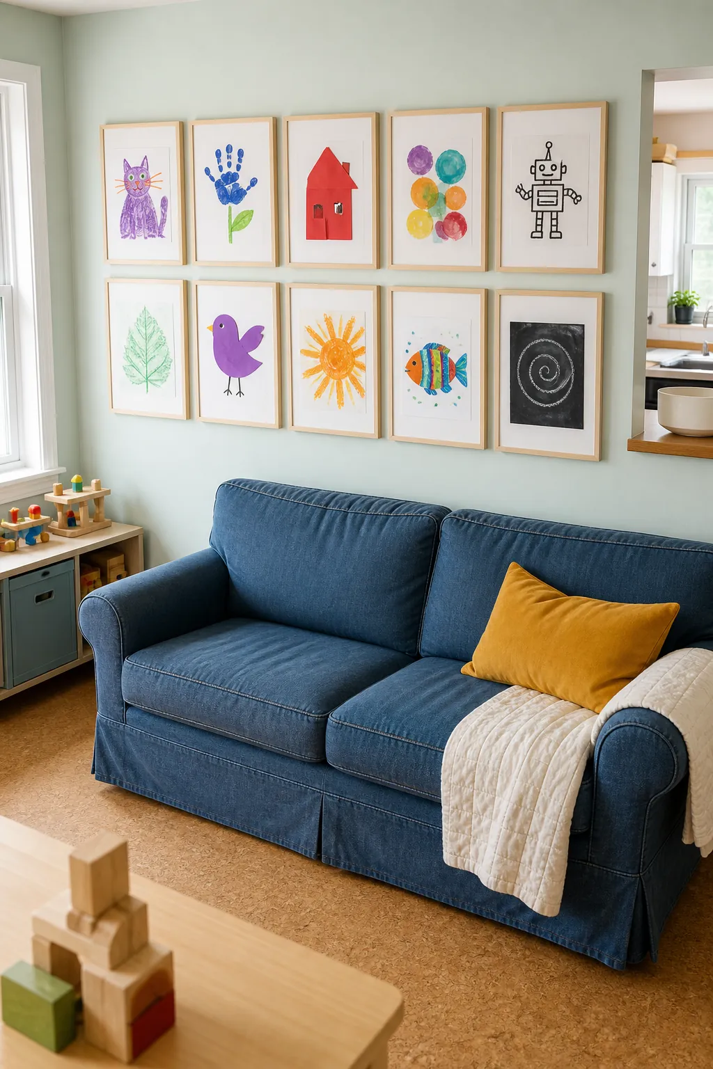
A Dramatic Dark Wall Collection
A deep wall color can unite frames that would look unrelated on white paint. Use brass, black, and dark wood frames with artwork that includes pale highlights, allowing each image to remain visible. A low light source beside the sofa can give the arrangement depth without creating glare on glass.
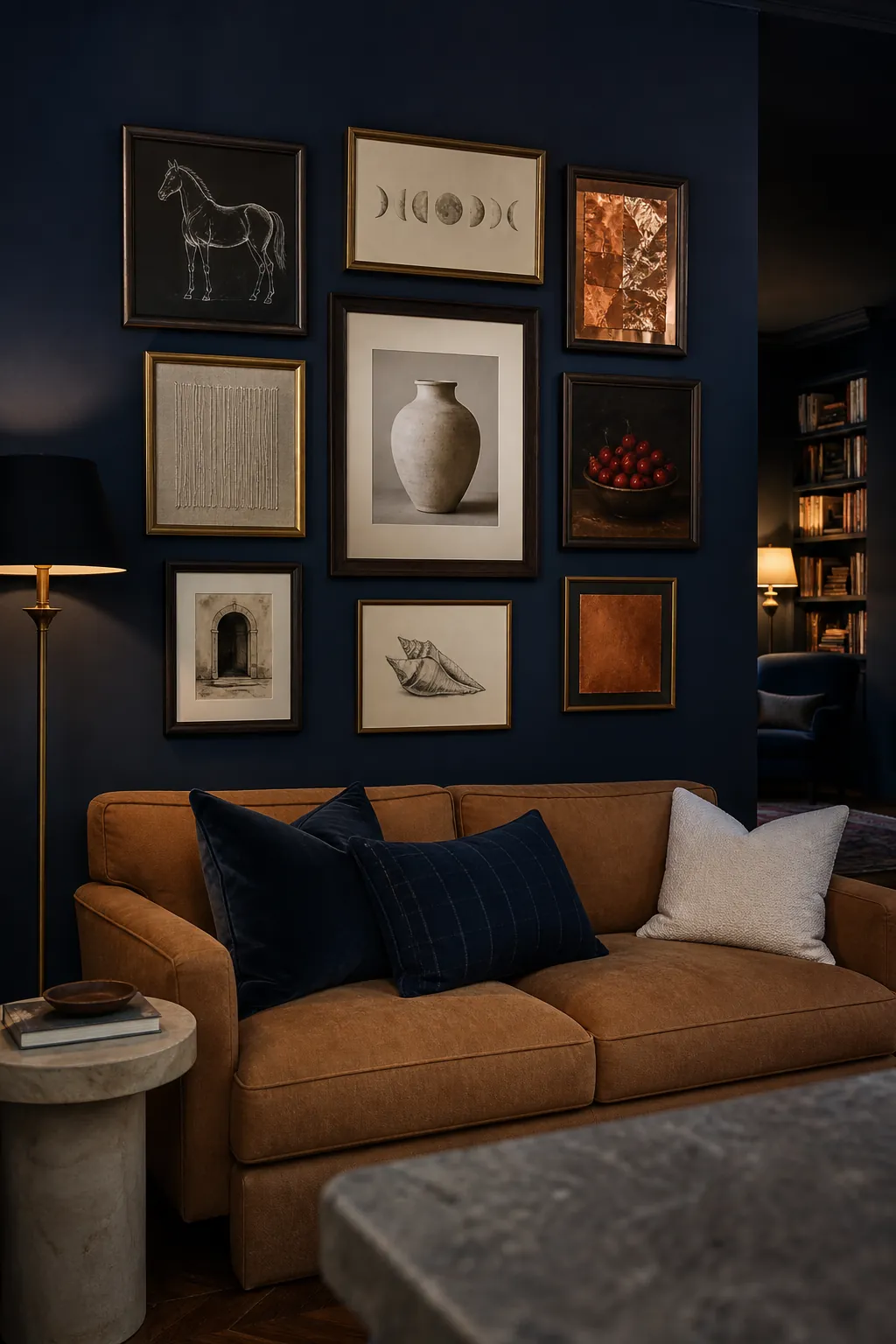
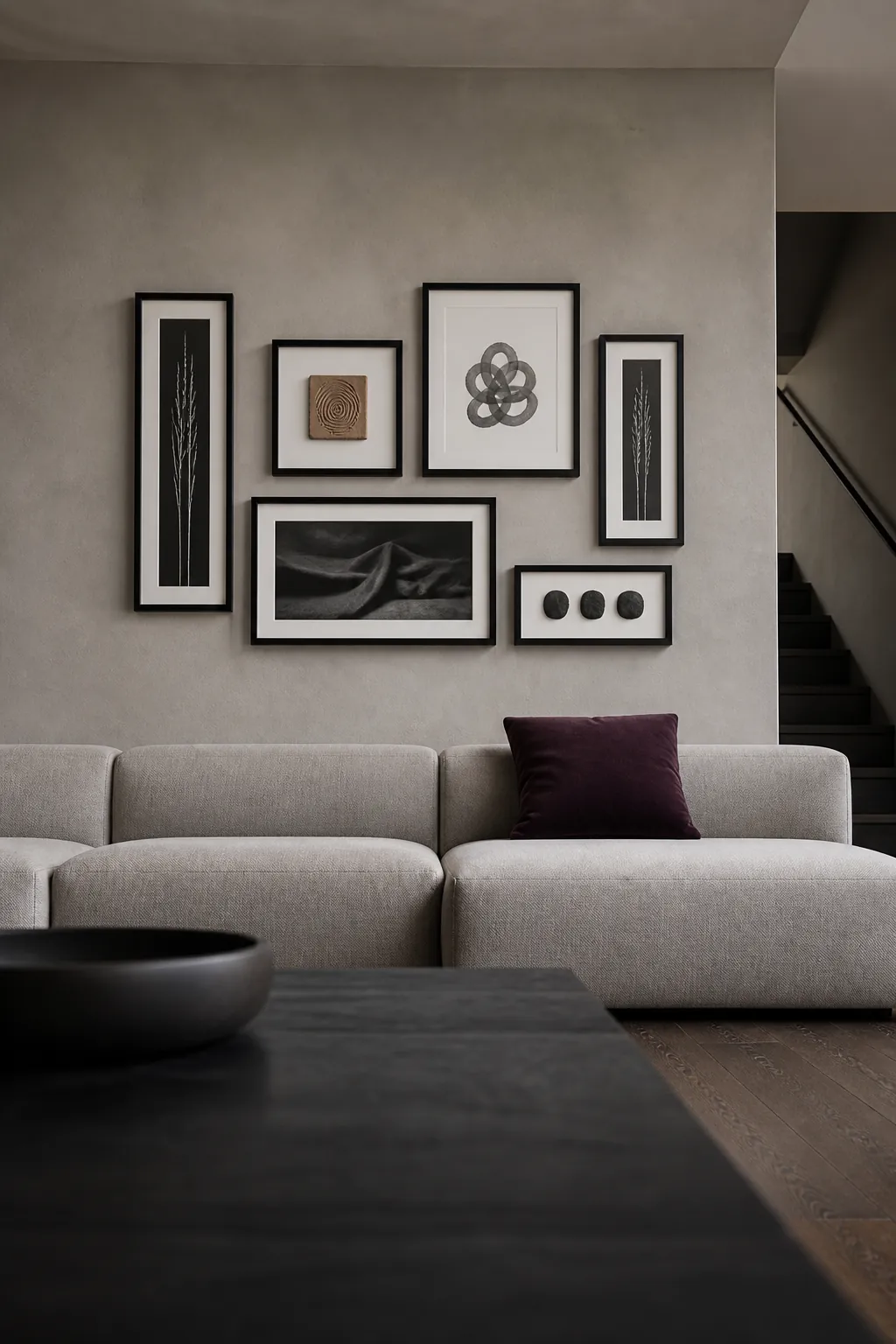
A Sculptural Black Frame Arrangement
Black frames can feel sculptural when their proportions vary and the artwork remains restrained. Combine narrow verticals, one broad horizontal, and a small square while keeping the gaps consistent. The outer shape should still relate to the sofa, even when the inner geometry is intentionally irregular.
A Rental Friendly Lightweight Gallery
Lightweight frames reduce wall damage and make paper planning easier in a rental. Choose acrylic glazing, slim timber profiles, and removable hanging hardware rated for the actual weight. Keep the arrangement compact enough that minor alignment changes do not expose a field of unused holes.
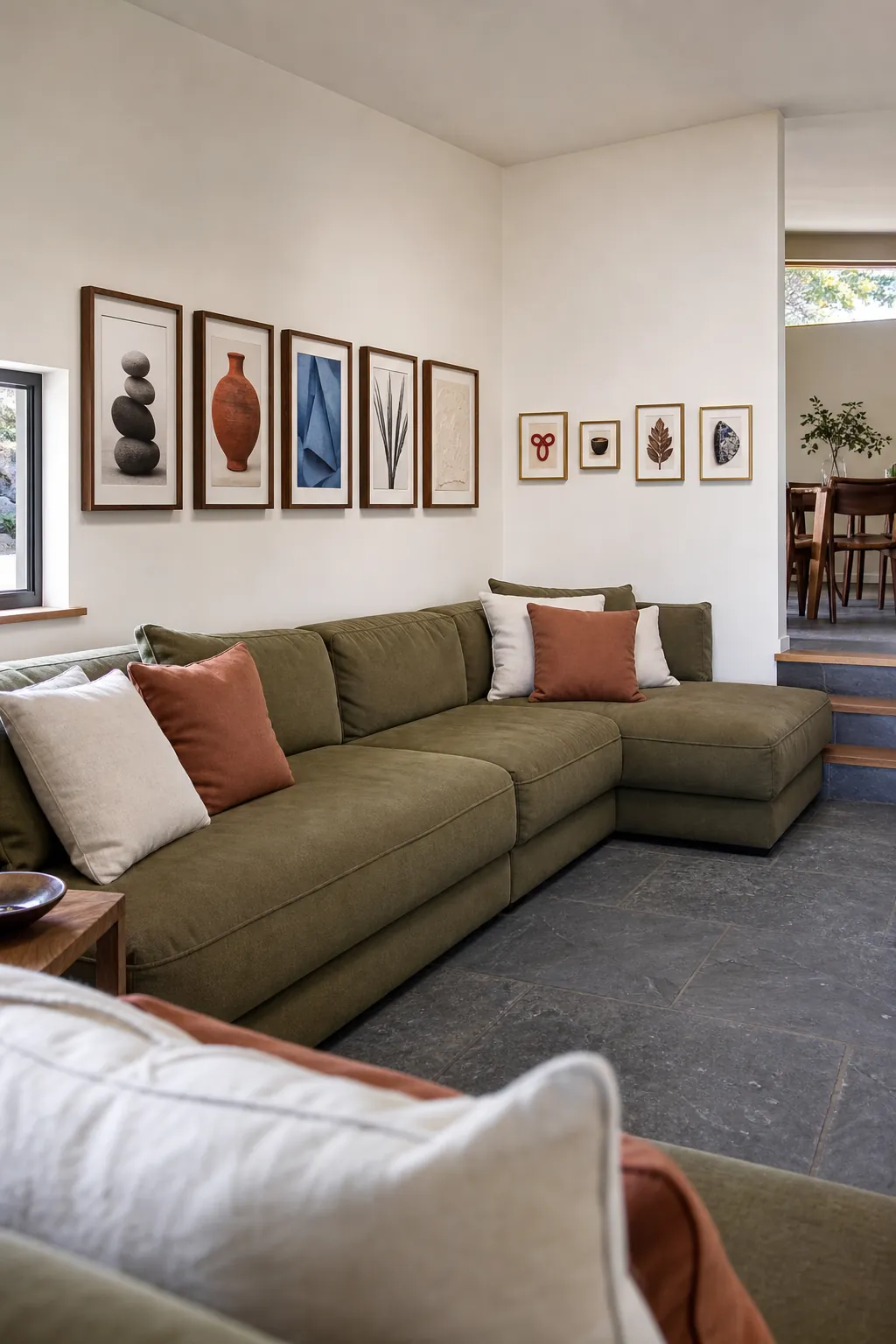
A Corner Wrapping Gallery
A sofa placed near a corner can support art that turns gently onto the adjoining wall. Keep the strongest pieces above the sofa and use smaller works to carry the rhythm around the corner. Match the vertical center lines so the two wall planes feel connected rather than separately decorated.