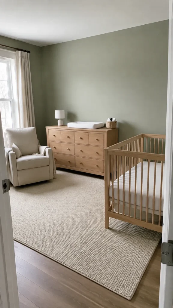
17 Sage Green and Cream Nursery Color Palette Ideas
The green sample looked gentle in the shop, but beside your furniture it suddenly seems gray. Cream can change the comparison just as much as the light does. Choose the two colors together, using the room’s fixed surfaces as your starting point, before you commit to paint or large textiles.
Keep cream walls and add sage through fabric
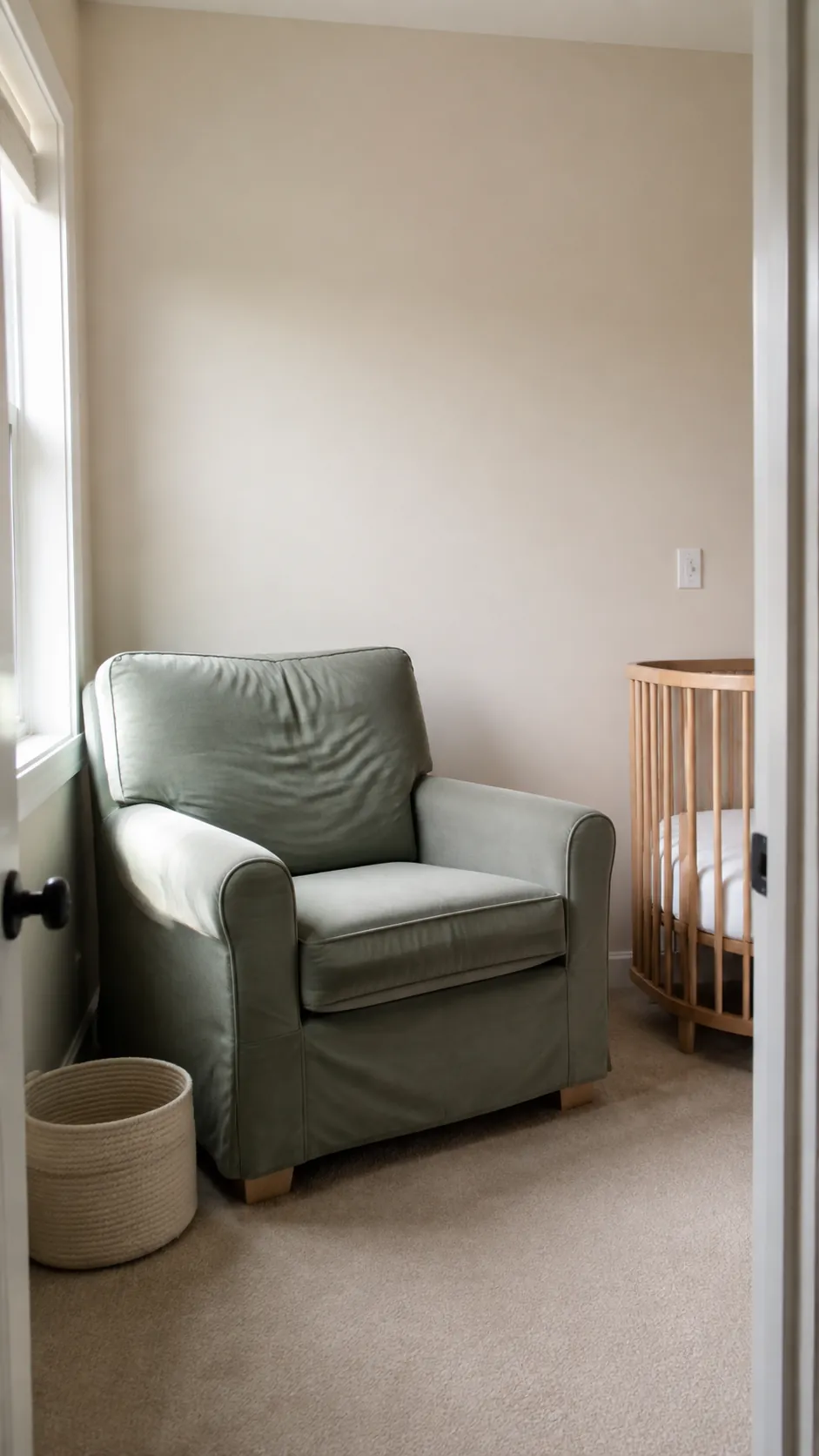
If you like green but hesitate to repaint, start with a cream room and one substantial sage textile. A washable chair cover or simple window treatment gives the color enough area to register without scattering tiny accessories everywhere. Compare the fabric beside the wall in daylight before buying matching pieces. Window coverings and their cords must stay out of the baby’s reach and away from the crib.
Balance pale sage walls with soft cream trim
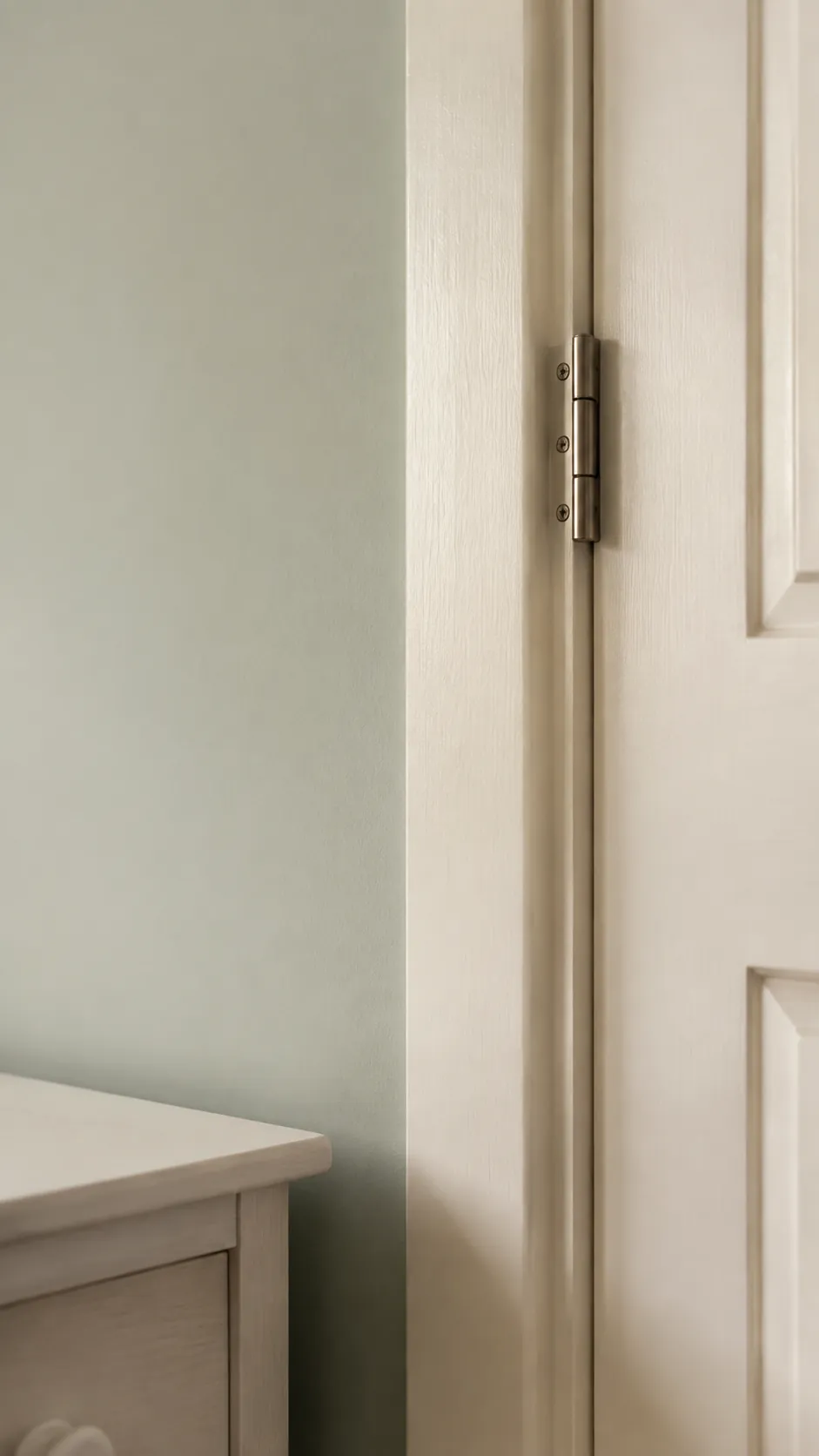
Pale sage can look quietly green against a cream trim that has only a little warmth. A strongly yellow cream may make the wall look grayer by comparison, so evaluate the pair together. Paint large samples on separate boards and move them between the brightest and darkest corners.
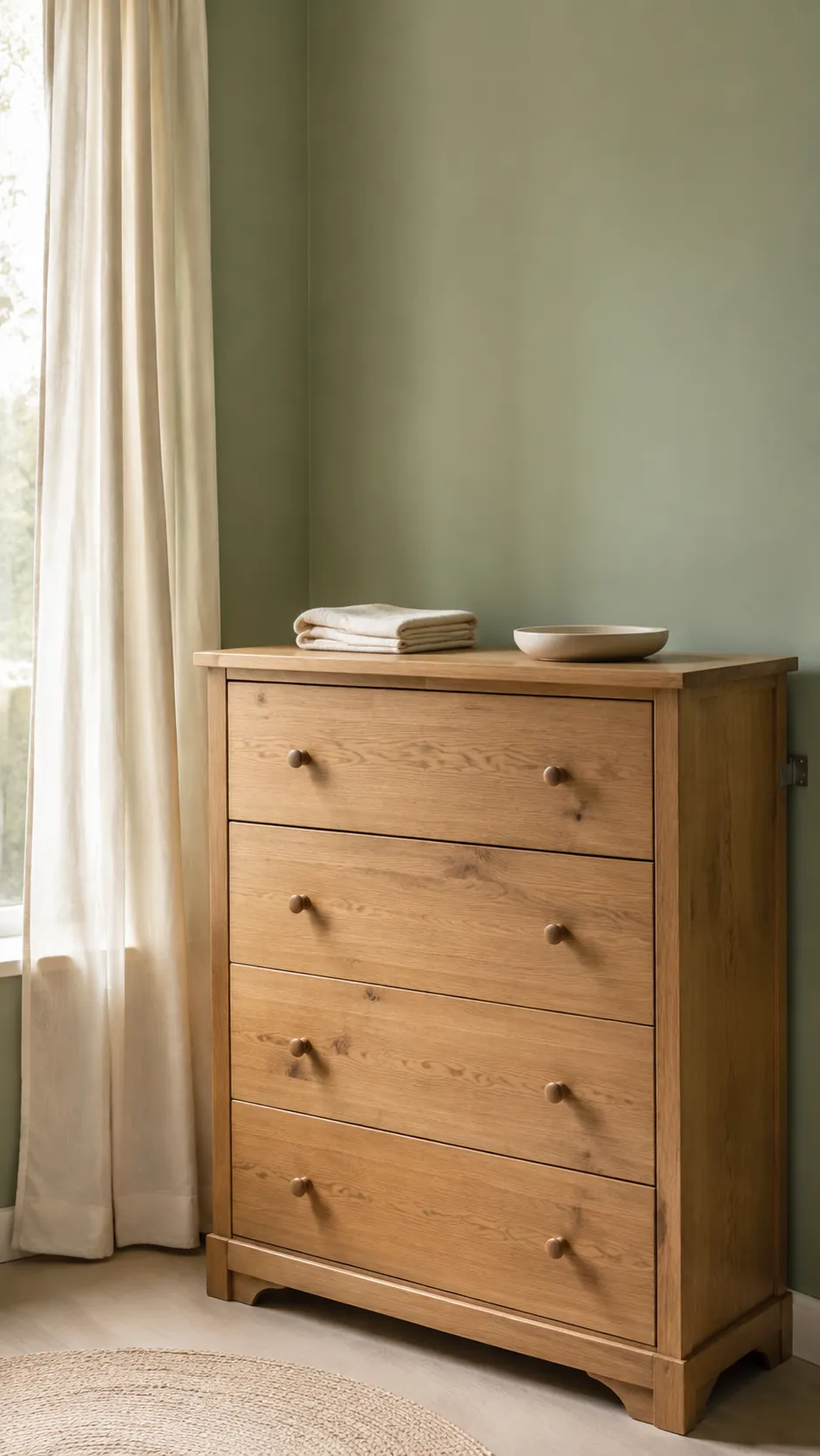
Ground the palette with natural oak
Natural oak gives sage green nursery decor a warmer material base without requiring another painted color. Choose a wood tone you already own, then compare the green against its actual grain and finish. Orange stained wood can shift the effect much more than a small fabric accent. Repeat the oak in one useful piece rather than trying to match every object exactly.
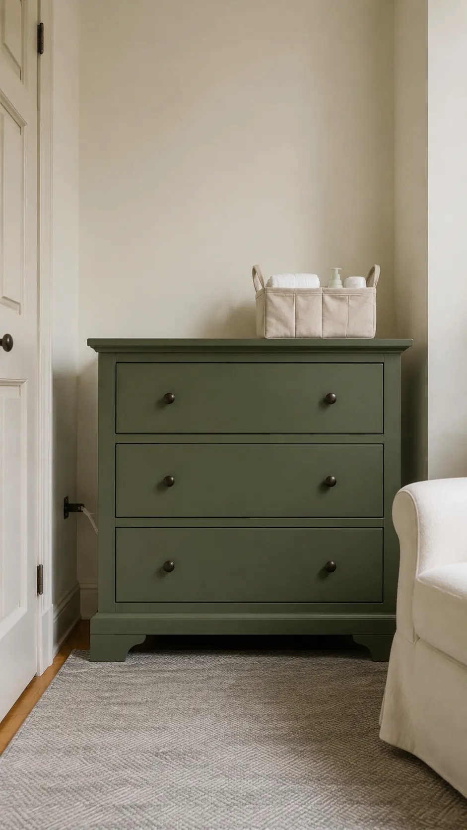
Use a deeper sage on one storage piece
A muted sage dresser can supply the strongest color while cream walls keep the room open. This is especially useful when the wall color belongs to the rental or must coordinate with an adjoining bedroom. Choose a finish suitable for the furniture and follow preparation, curing, and ventilation directions. Anchor the dresser according to its instructions. Keep the rest of the furniture quieter so the room has one clear color anchor.
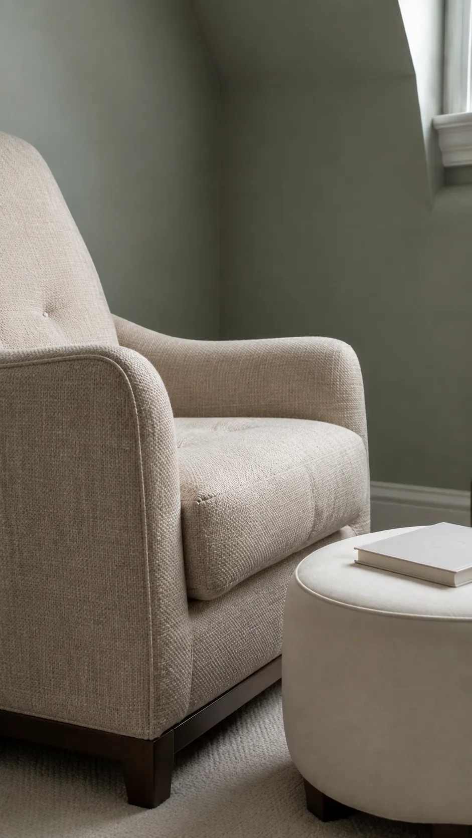
Pair gray sage with oatmeal upholstery
A gray leaning sage and an oatmeal chair create a gentle palette with more depth than green and bright white. Look for oatmeal fabric that reads beige rather than pink when placed against the paint. The woven texture gives cream nursery decor interest without a busier pattern. Test the chair fabric under the lamp you plan to use for evening feeds.
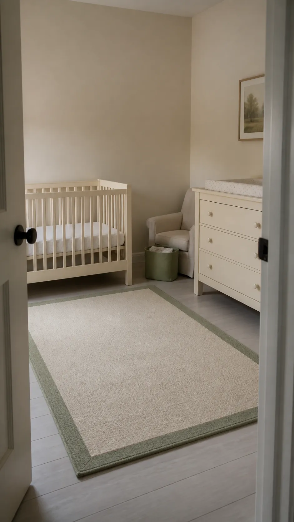
Let cream dominate a small shaded room
A shaded nursery may need a lighter overall balance even when you love green. Keep the broadest surfaces cream and use sage on a rug border, storage basket, or chair cushion kept outside the crib. Several small touches should repeat the same muted family instead of introducing unrelated greens. The room will still feel coordinated without covering every wall in color.
Give a sunny room a cooler sage
Strong daylight can make a warm green look more yellow than expected. Try a slightly cooler sage sample beside a restrained cream and observe both through the afternoon. A color photograph on a phone cannot confirm the final undertone because the camera and screen alter it. Let the actual room decide how cool the green needs to be.
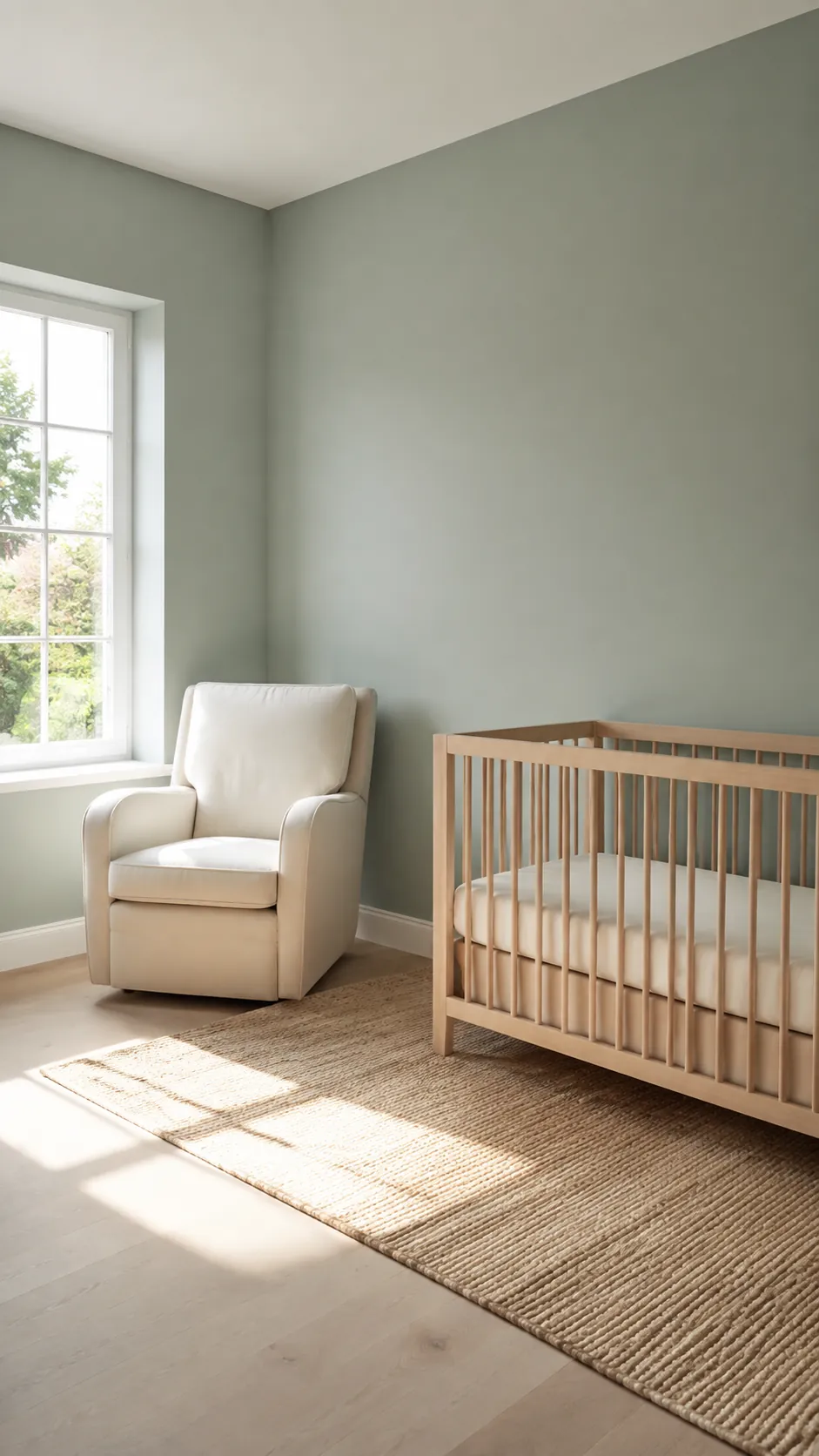
Introduce muted clay as a small third color
A little clay pink can keep sage and cream from feeling too uniform. Use it in a washable adult chair cushion, a storage container, or a printed detail rather than another large wall. Choose a dusty version with similar softness to the green; a vivid terracotta can quickly take over.
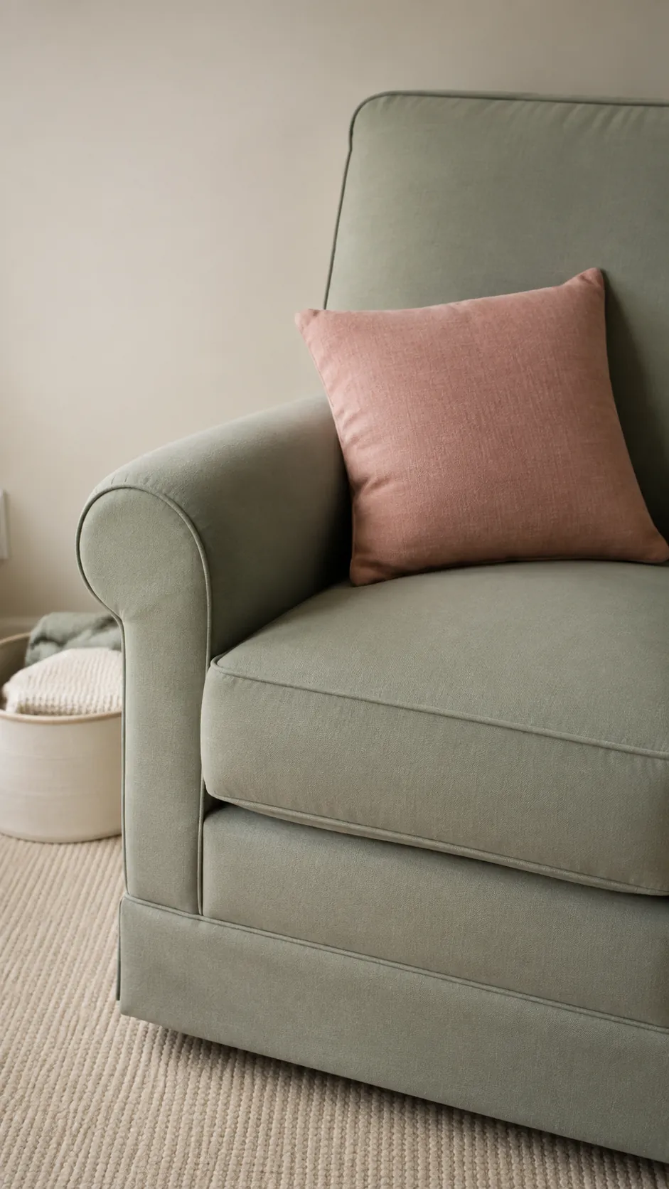
Use dark walnut for a quieter contrast
Walnut adds a clear dark note that helps pale sage and cream retain definition. A walnut chair frame or existing dresser can provide enough contrast on its own. Keep additional dark accents small so the room does not become a collection of competing outlines. This combination suits families who want neutral baby room colors that can stay as the child grows.
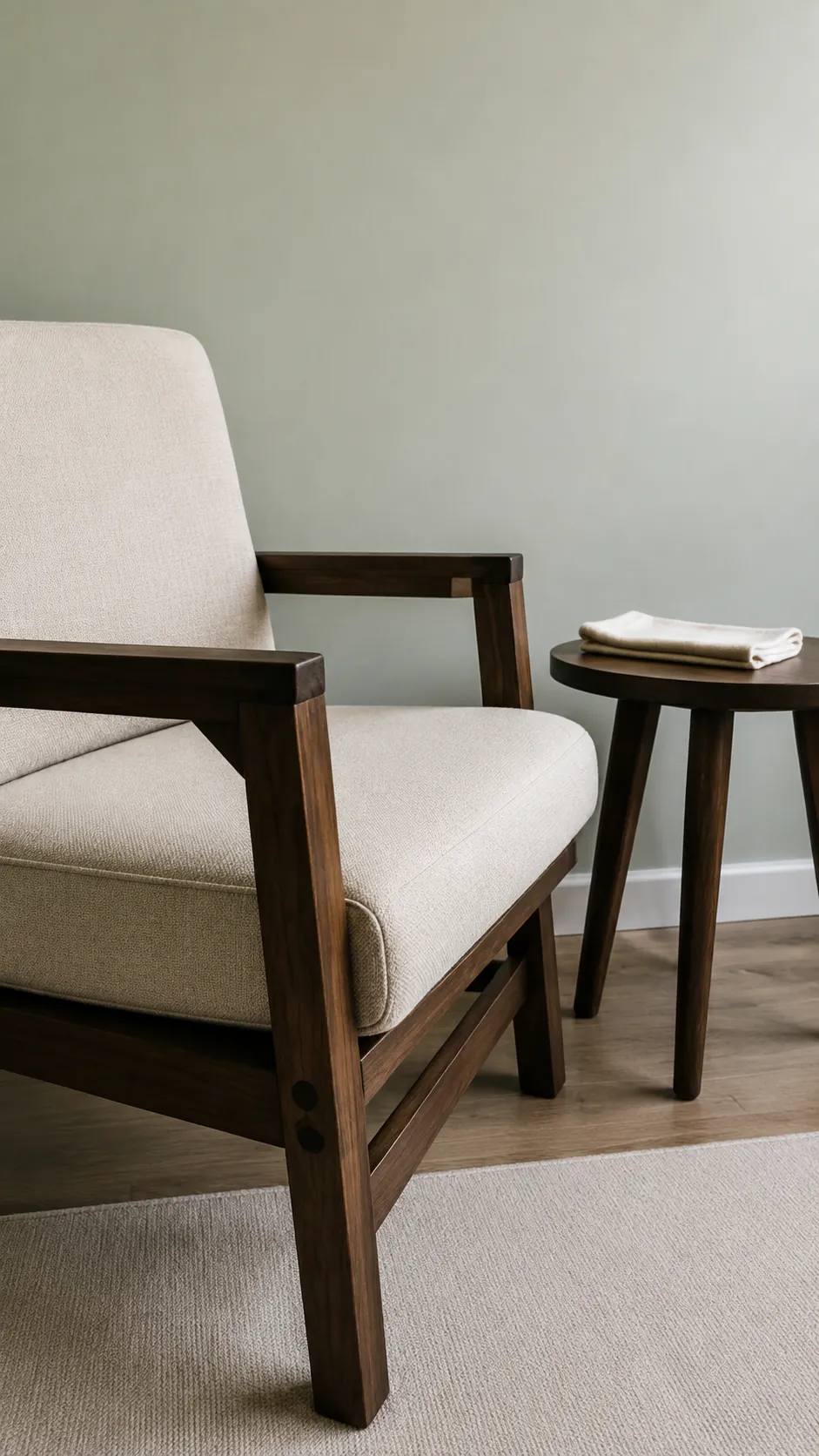
Try sage and cream stripes at the window
A simple stripe makes the two colors feel deliberately connected rather than merely placed beside each other. Choose a broad enough stripe to read from across the room and keep nearby textiles plain. Check a fabric sample with light passing through it, since a lined curtain can look different from an unlined swatch. Install window treatments securely and keep fabric and operating cords away from the sleep space.
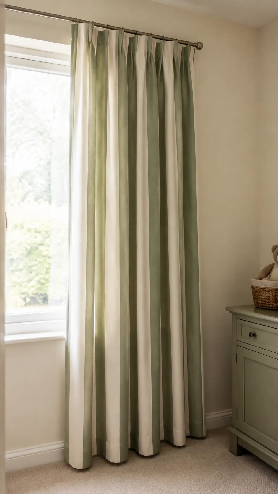
Add a botanical print in a restrained corner
A physical botanical print can introduce small variations of sage without expanding the whole palette. Choose a specific leaf study with a cream background and place it in the reading area, away from the crib and changing surface. Pull one green from the print for a nearby useful textile. Avoid adding several unrelated plant patterns, which can make the room feel busier than the colors suggest.
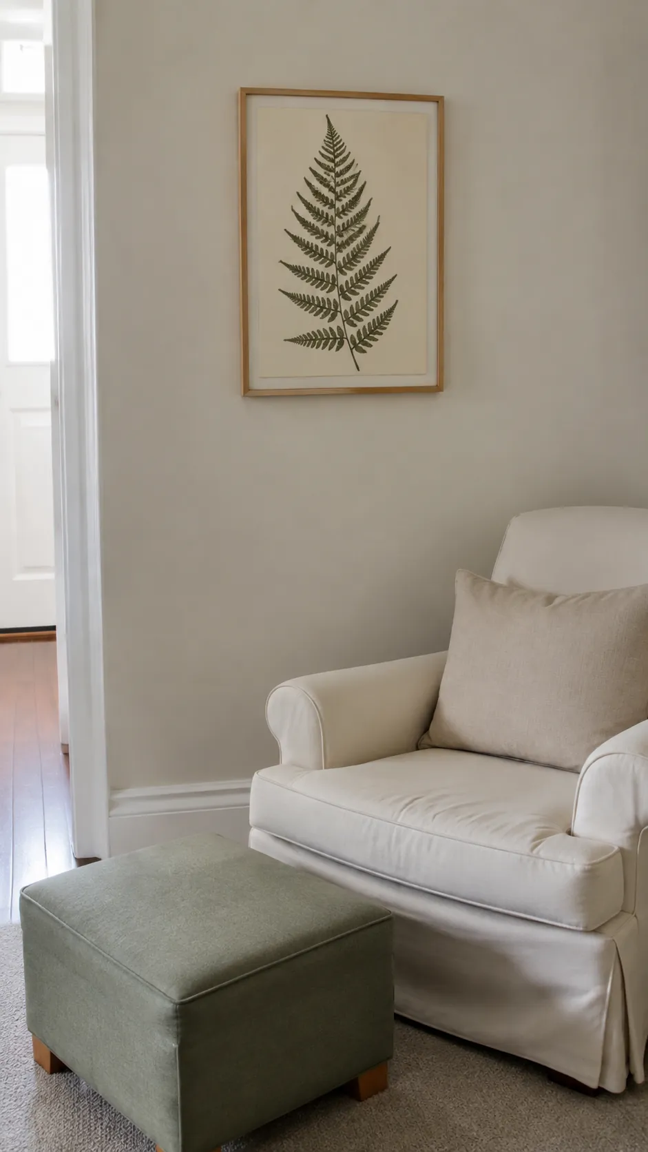
Use a cream ceiling above a sage lower wall
A two color wall can place green at furniture height while the upper room stays light. Decide where the dividing line relates to the door trim and furniture before painting, rather than choosing a height in isolation. Keep the cream ceiling and upper wall close in tone for a softer transition. A clean paint boundary needs careful preparation, but it does not require new paneling.
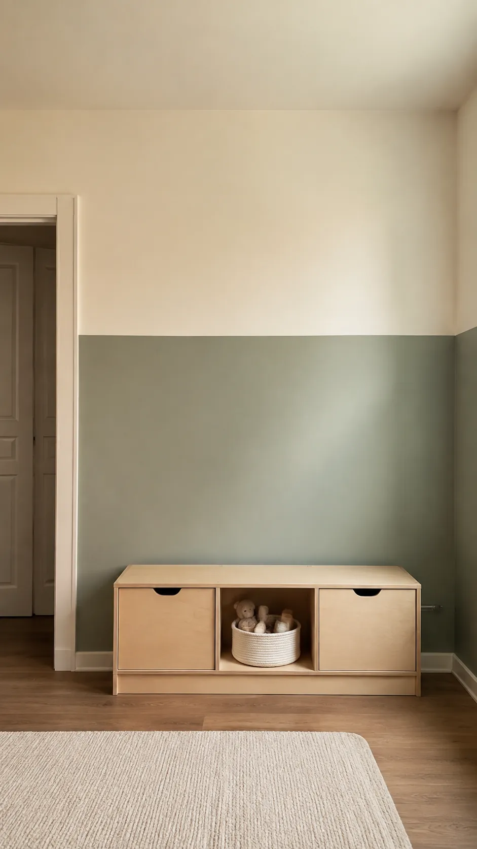
Bring in soft blue through a single detail
A small dusty blue accent can draw out the cooler side of sage. Try it in a folded cloth basket or a plain book cover display while cream remains the main neutral. Check that the blue is muted enough to sit beside the green without turning the palette into two competing themes.
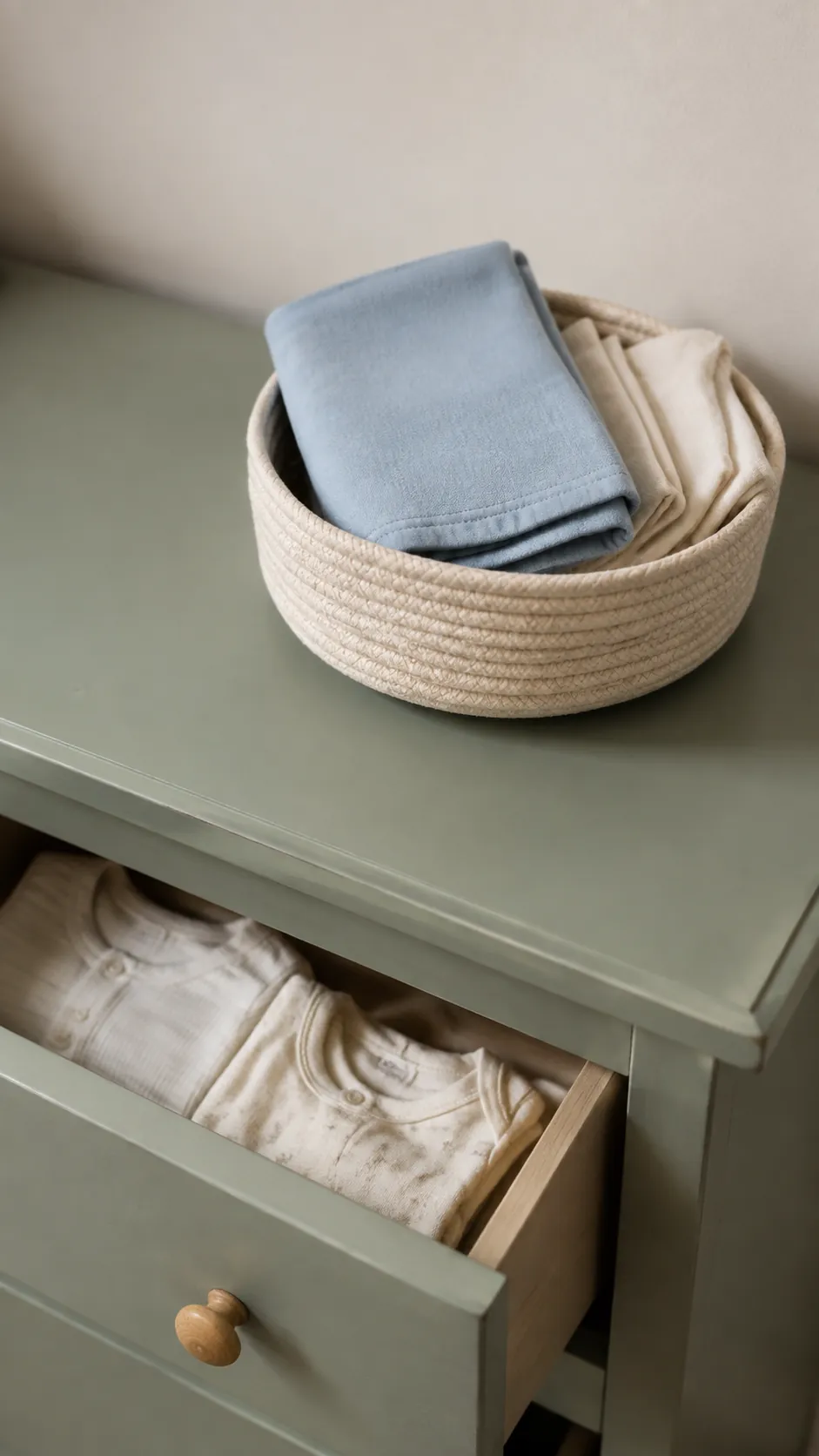
Choose textured cream instead of more colors
If the room looks flat, change the texture before adding another hue. A cream cotton curtain, a smooth painted dresser, and a low pile rug reflect light differently even when their colors are close. Those differences give a soft green nursery depth without a crowded palette. Keep loose cushions, throws, and decorative blankets outside the infant sleep space.
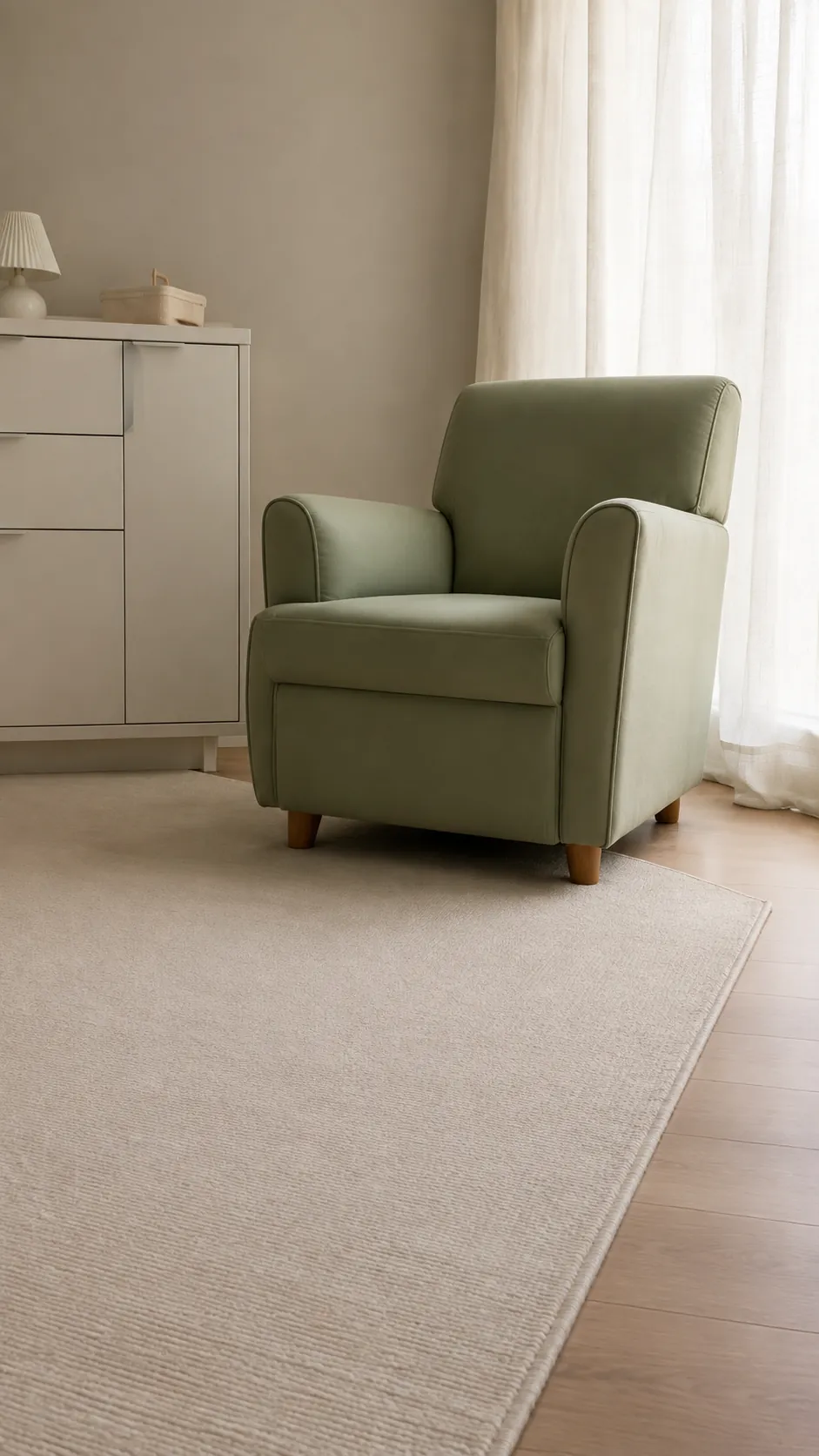
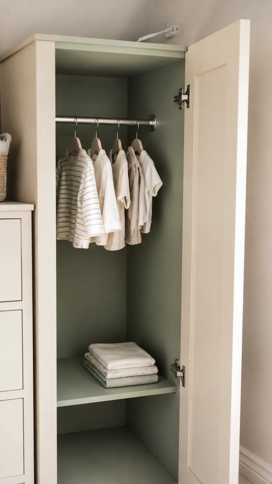
Use sage inside an open wardrobe
A sage cabinet interior gives a small dose of color each time the door opens. Cream exterior doors keep the closed furniture quiet, making this useful when several pieces share a short wall. Sample the green inside the cabinet because the reduced light can make it look darker. Use a suitable coating and allow the manufacturer’s required cure time before replacing clothing. Secure the wardrobe properly after positioning it.
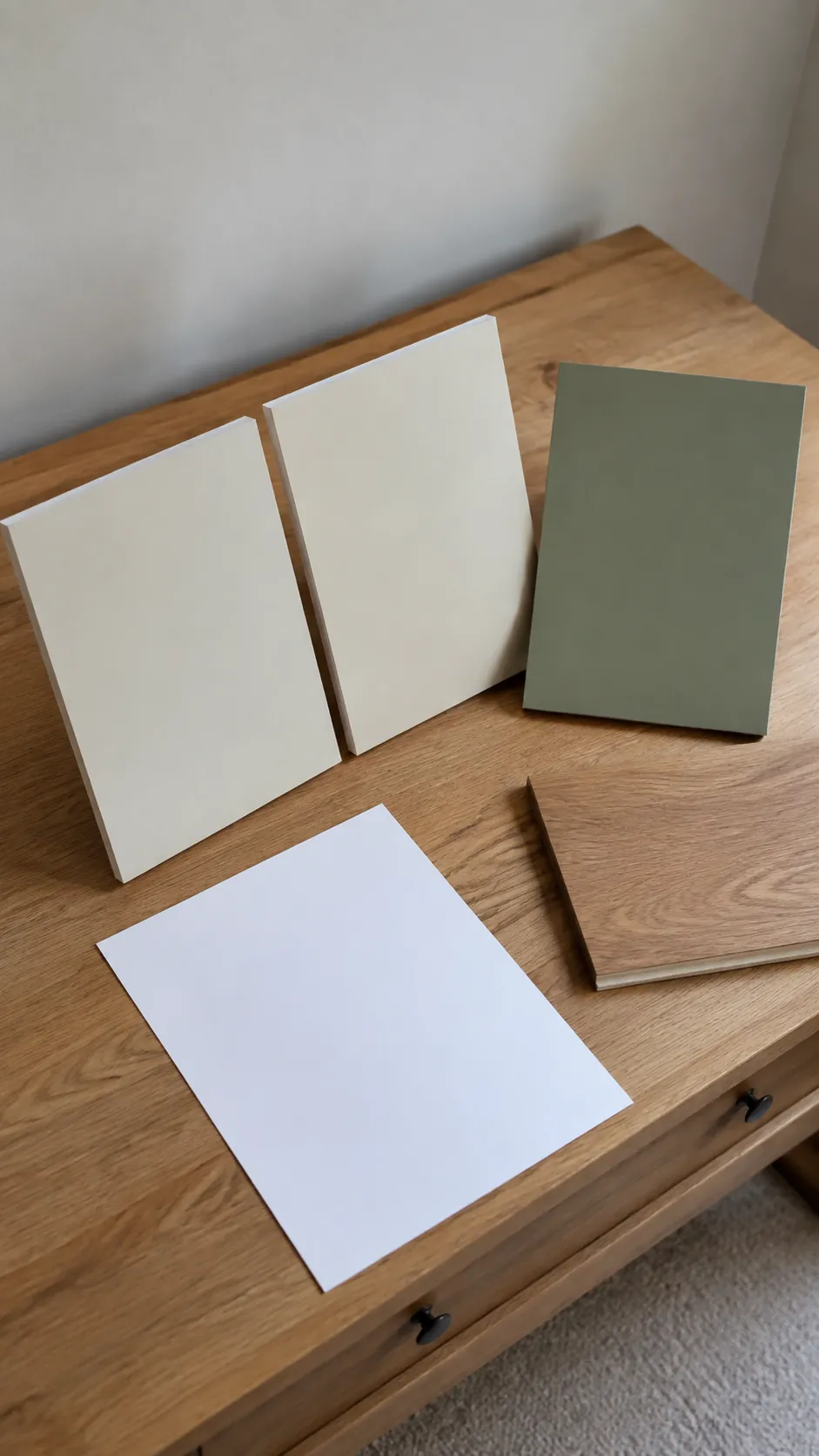
Keep cream warm without turning it yellow
Cream includes a wide range of undertones, and the wrong one can change how sage reads. Place candidate cream samples against a plain white sheet of paper to make their relative warmth easier to see. Then remove the paper and judge them beside the actual green, flooring, and furniture. The comparison helps you notice undertones, but the final choice belongs in the room rather than on the sample card.
Build the final palette around the evening light
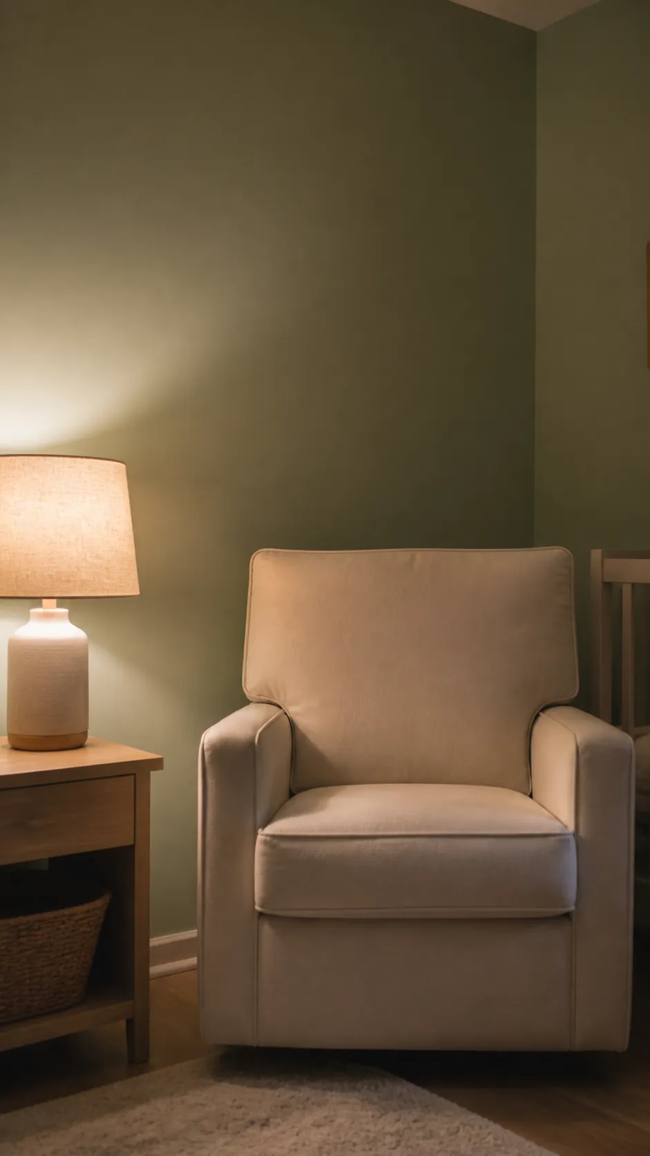
A nursery color palette needs to work after sunset as well as in a bright photograph. Look at the sage and cream samples under the exact lamps and bulbs you expect to use, with other nearby lights switched off. If cream becomes too yellow or sage turns muddy, adjust the paint pairing or test a different suitable bulb before committing. Choose the combination you enjoy during ordinary use, not only the one that photographs best at noon.