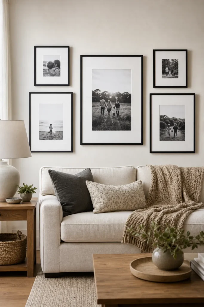
Family Photo Gallery Wall Layouts That Feel Modern
A family photo wall can go wrong quickly. The photos matter, but the layout is usually what makes the wall feel current or dated. Too many tiny frames, uneven spacing, shiny mismatched finishes, and every school portrait from the past decade can turn a personal idea into visual noise.
The better approach is more edited. A modern family photo wall usually has one clear rule: a consistent photo treatment, a consistent frame language, or a consistent layout rhythm. You do not need all three to match perfectly. You need enough control that the wall feels designed, and enough warmth that it still feels like your family.
Edit The Photo Set Before You Choose The Layout
Most family gallery wall problems start with too many photos. Before thinking about nails, pick the story the wall should tell. Is this a hallway of everyday family life, a black and white photo wall of portraits, a travel-and-family mix, or a quiet display of generational pictures? The tighter the story, the less the wall has to fight for cohesion.
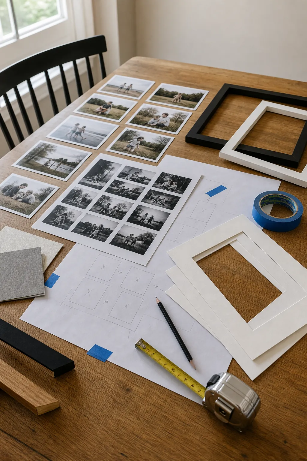
A good first pass is ruthless: remove near-duplicates, overly dark snapshots, photos with busy backgrounds, and anything that only makes sense because you remember the moment. The wall has to work visually from a few feet away. Save the full archive for albums, digital frames, or smaller rotating displays.
If the photos come from different years and cameras, convert the whole set to black and white or soften the color palette before printing. This is one of the easiest ways to make a family picture wall feel intentional. White mats also help uneven photo sizes look related because the eye reads the outside frame and mat first, then the image.
Use A Grid When You Want Calm And Structure
A grid is the most reliable layout for a modern family photo wall because it removes guesswork. Same frame size, same mat size, same spacing, same photo treatment. The result feels clean even when the photos are emotional and personal.
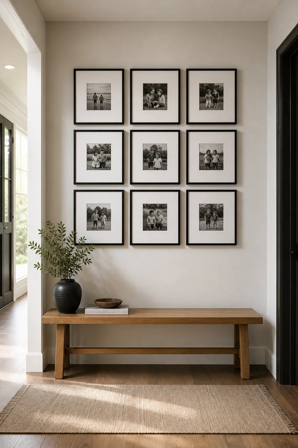
For a hallway, entry, dining nook, or small living room wall, try a 2 by 3, 3 by 3, or 2 by 4 grid. Keep the spacing equal. Two to three inches between frames usually looks tighter and more current than wide gaps. If the wall is large, increase frame size before increasing the number of frames. A few generous pieces almost always look better than many small ones scattered across too much wall.
The grid works especially well for school portraits, family milestones, and black and white candid photos. It is less forgiving when every image has a different color temperature. If you want to display family photos from different eras, a grid can still work, but use consistent matting to give the mixed photos a shared edge.
Make An Organic Layout With Anchors, Not Randomness
Organic gallery walls can look more collected than grids, but they need anchor pieces. Without anchors, the layout becomes a cloud of small rectangles. Choose one or two larger family photos first, then build around them with smaller frames. The larger pieces give the eye somewhere to land.
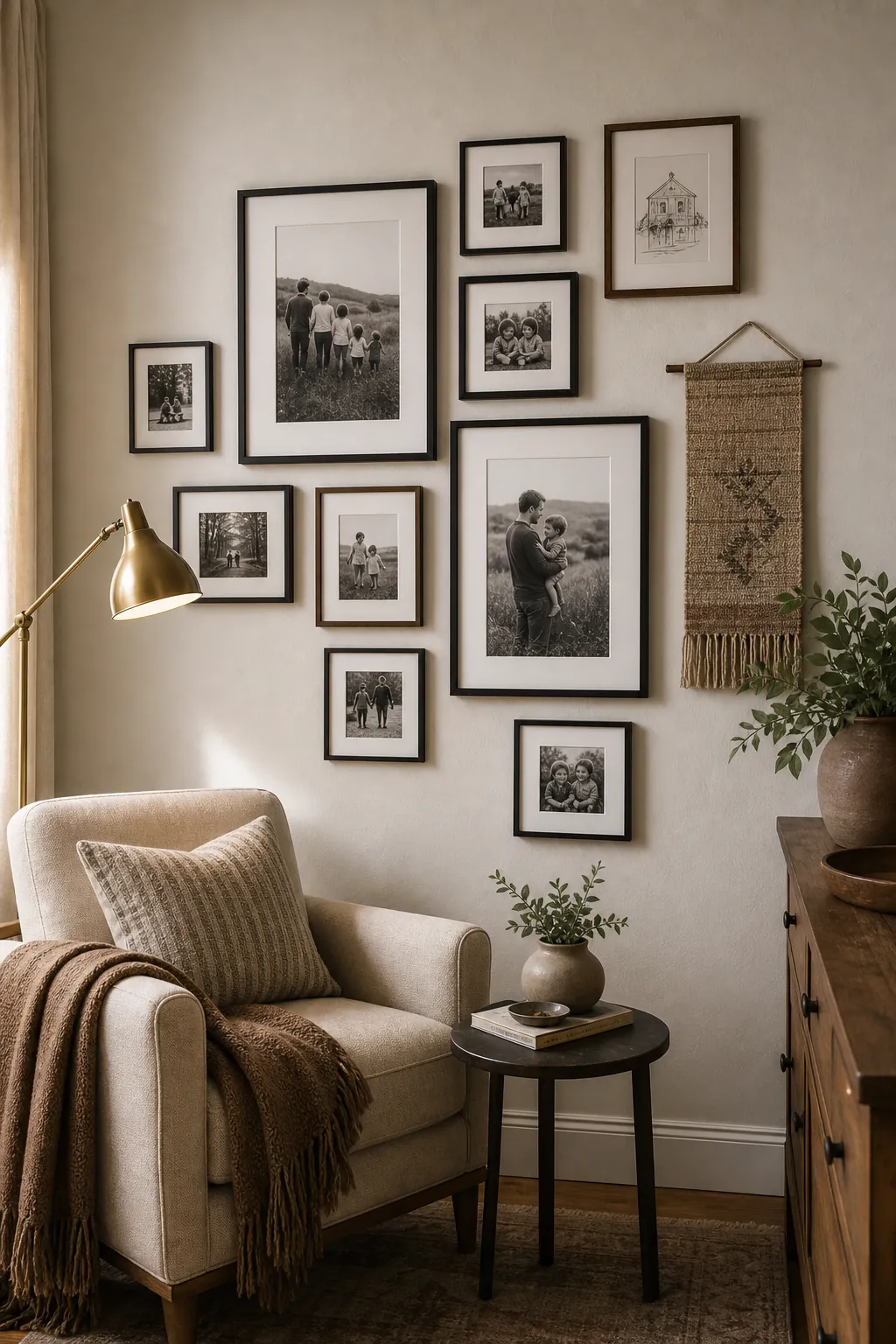
Keep one unifying thread. You might mix black, wood, and brass frames, but keep all the photos black and white. Or you might use different photo colors, but keep every frame slim and simple. The mistake is mixing everything at once: every frame finish, every mat color, every photo size, every photo style. That reads as accidental.
For a more layered family gallery wall, add one or two non-photo pieces that still mean something: a simple line drawing of a childhood home, a textile panel, a small silhouette, or a scanned handwritten recipe. These pieces give breathing room between faces and make the display feel less like a yearbook page.
Use Picture Ledges If Your Family Photos Change Often
If you like changing photos seasonally, picture ledges are easier than a permanent frame map. They also solve the problem of mixed photo sizes because the ledge creates the horizontal line. You can layer portrait and landscape frames without every edge aligning.
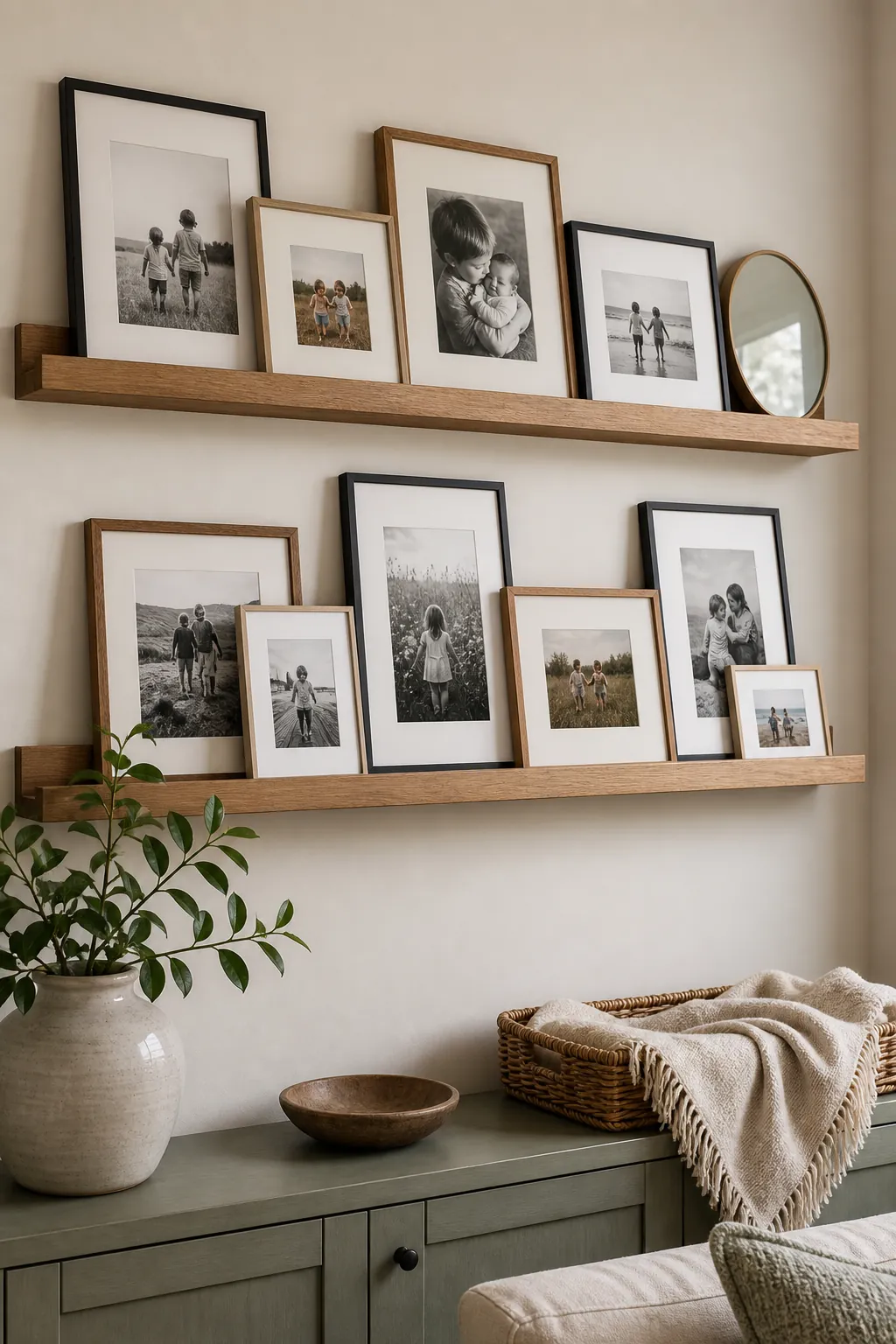
The key is restraint. Use two ledges at most on a normal wall, and overlap frames by a small amount instead of stacking them so densely that the photos disappear. Keep the largest frame toward the back, then place smaller frames forward. A round mirror, small ceramic object, or narrow keepsake can break the rectangle rhythm, but it should support the photos rather than compete with them.
Ledges are useful in family rooms, playrooms, and casual hallways because they look relaxed by nature. For a formal living room, a grid or anchored gallery wall usually feels more finished.
Limit The Palette So The Wall Does Not Age Fast
A dated family photo wall often has too many finishes: glossy black frames, silver frames, rustic wood, ornate gold, colored mats, and high-saturation photos all sitting together. A tighter palette makes even inexpensive frames look more considered.
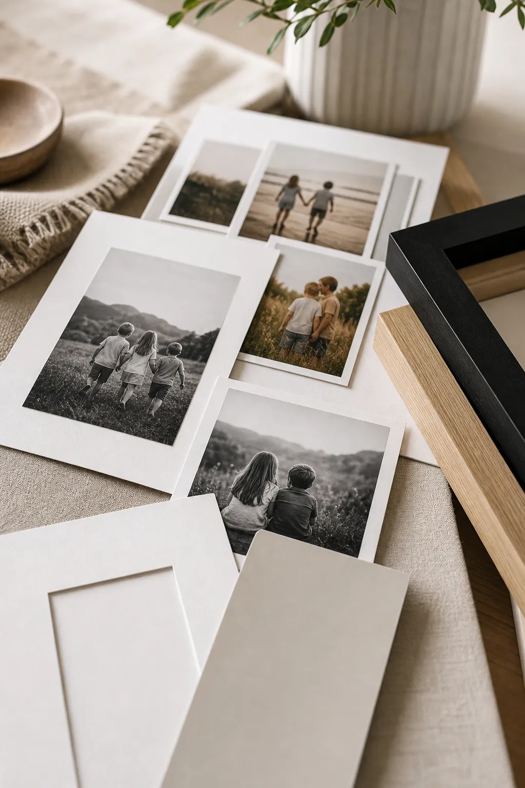
For a modern family photo wall, try one of these combinations: black frames with white mats and black-and-white photos, pale wood frames with soft color photos, or mixed black and wood frames with one mat color throughout. Avoid bright white mats if your room has warm walls; a soft white or ivory mat often blends better.
Mat size matters more than people expect. A wider mat makes a simple family snapshot feel more like photography. It also gives small photos presence, which is why a wall of modest prints can still look elevated when the matting is generous.
Hang The Layout For The Room, Not Just The Wall
The right family photo wall layout depends on where people see it. A hallway needs tighter spacing and a layout that reads while walking. A living room wall needs enough scale to relate to the sofa or console below it. A stair landing can handle a vertical arrangement, but the frames still need a clear line to follow.
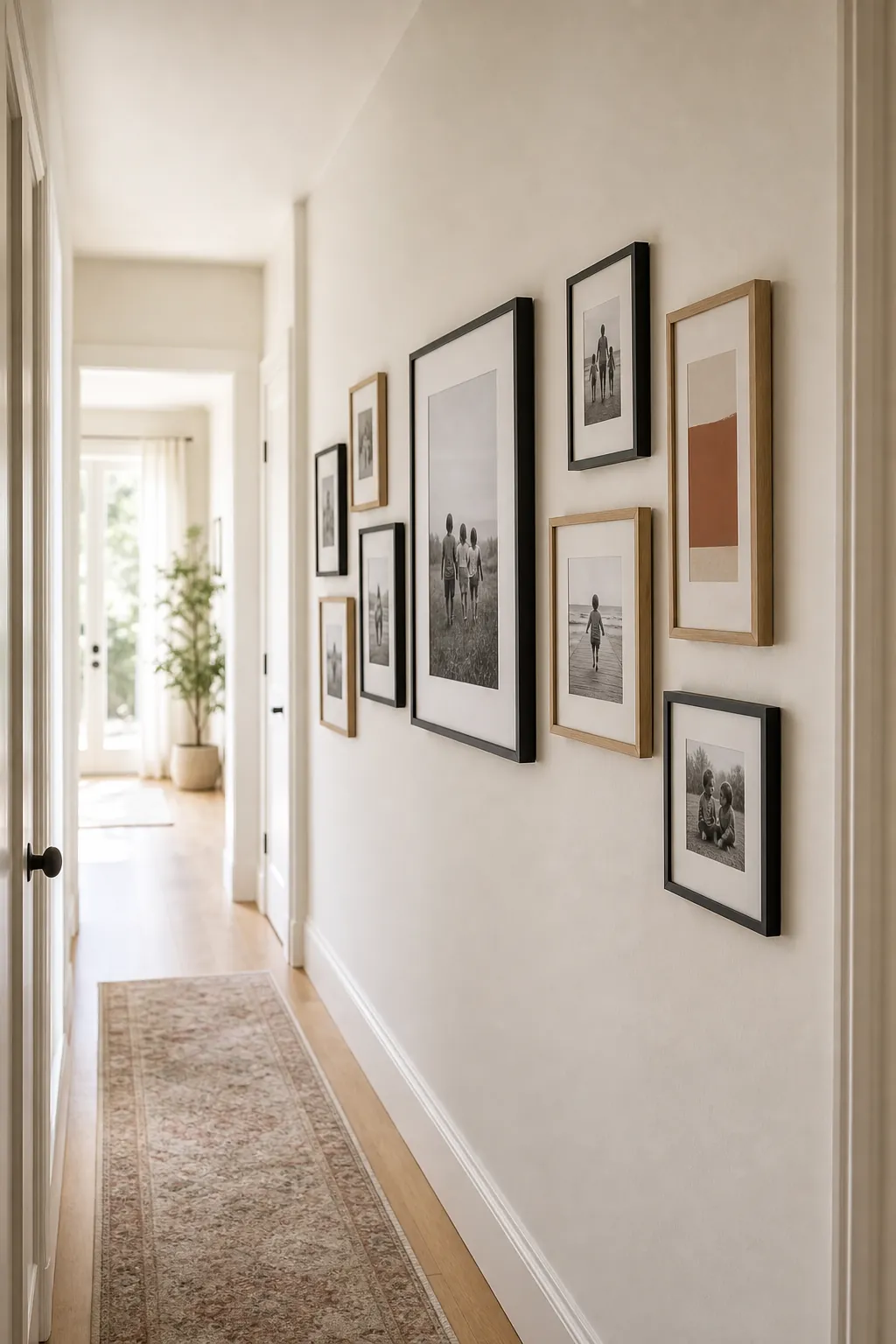
As a practical starting point, keep the center of the arrangement around eye level rather than pushing every frame high. If the gallery hangs over furniture, leave enough breathing room so the display belongs to the furniture instead of floating above it. Above a sofa or console, the total arrangement should usually be narrower than the furniture below.
Before hanging, tape the outer boundary on the wall. Then arrange paper templates or frames on the floor inside that boundary. This catches scale problems early. If the whole layout looks too busy on the floor, it will not become calmer on the wall.
A Simple Formula That Usually Works
For an easy, non-dated family photo wall, choose one of three formulas. First, a symmetrical grid of matching frames for a clean black and white photo wall. Second, an asymmetrical layout with two larger anchor photos and a tight frame palette. Third, picture ledges with layered frames for rooms where the photos will change often.
Whichever route you choose, do the editing first. Print fewer photos, use better scale, repeat one finish, and give the pictures room to breathe. The goal is not to make family photos look impersonal. It is to display family photos in a way that feels loved, deliberate, and easy to live with.