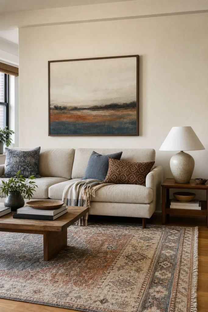
How to Choose Living Room Wall Art That Matches Your Sofa and Rug
Choosing living room wall art gets easier when you stop treating the sofa, rug, and artwork as three separate decisions. The room usually starts to feel wrong when one piece is shouting, another is whispering, and the wall art is trying to rescue the whole palette at the end. A better method is to let the sofa set the visual weight, let the rug reveal the color story, and choose artwork that connects those two pieces without matching them too literally.
If you are standing in your room wondering whether your living room wall art should match the rug, the sofa, the curtains, or nothing at all, use this order: scale first, palette second, mood third. That order prevents the most common mistake: buying a beautiful print that is too small, too busy, or too disconnected once it sits above the couch.
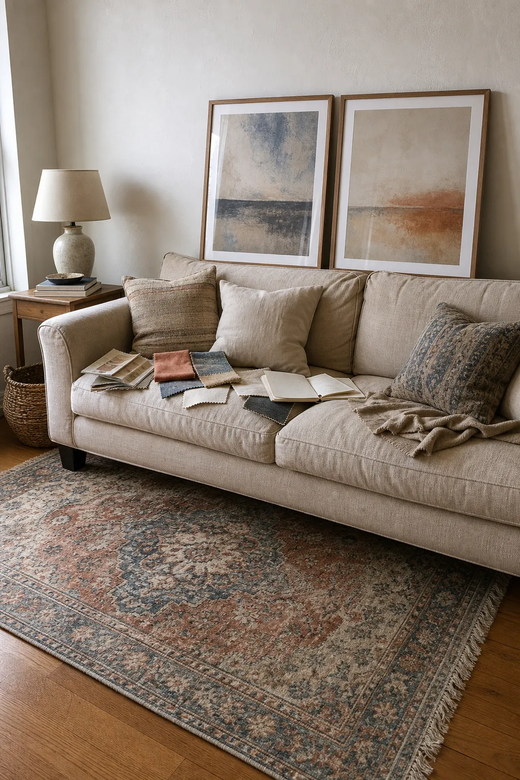
Start With the Sofa Because It Sets the Visual Weight
Your sofa is usually the largest solid shape in the living room. Even when the rug has more pattern, the sofa still creates the broad block of color the eye reads first. That means wall art above sofa should respond to the sofa’s weight before it responds to every tiny color in the rug.
For a light beige, cream, gray, or white sofa, artwork can carry more contrast. A darker frame, a bolder abstract print, a moody landscape, or a set of large living room prints can keep the wall from looking washed out. For a dark sofa, artwork often works better when it includes breathing room: pale matting, lighter backgrounds, soft negative space, or a frame that keeps the wall from feeling heavy.
The sofa also tells you how much artwork the wall can handle. A low, clean-lined sofa can look overwhelmed by tall narrow pieces. A deep, chunky sectional can make one delicate print look accidental. Before color, ask: does the art feel visually strong enough for the sofa underneath it?
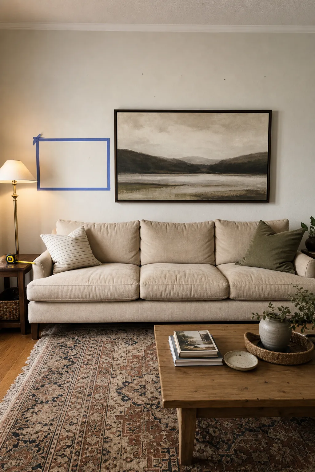
Use the Rug as the Color Map, Not a Color Prison
A patterned rug is useful because it already solved part of the living room color palette. It shows the undertones, accent colors, and contrast level that belong in the room. But matching art to rug does not mean repeating the rug exactly. In fact, exact matching can make the space feel flat and showroom-like.
Pull one dominant color, one supporting neutral, and one small accent from the rug. Then choose artwork that includes two of those three. If your rug has rust, ivory, taupe, and faded blue, the art might use ivory and blue with only a hint of rust. If the rug is mostly neutral with black linework, the art can repeat the black in the frame and introduce one warmer tone through the print.
The key is to create recognition, not repetition. The eye should think, these pieces belong together, not, these pieces came as a set.
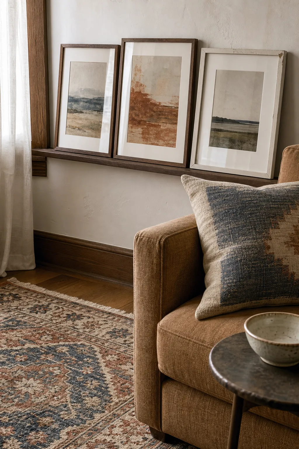
Choose a Mood Before You Choose a Print
Color matching can still lead you to the wrong art if the mood is off. A soft vintage rug and a linen sofa may share colors with a high-gloss neon print, but the room will feel tense unless you are intentionally going for contrast. A sleek black leather sofa might technically match a muted botanical print, but the mood may feel too delicate.
Use three mood words before shopping: calm, collected, graphic, earthy, airy, tailored, vintage, playful, coastal, organic, modern, dramatic. If your sofa is relaxed and your rug is worn-in, choose art that feels relaxed and tactile. If your sofa is structured and the rug is geometric, choose art with cleaner lines or a sharper composition.
This is where cohesive living room decor starts to look intentional. The artwork does not have to be the same style as the rug, but it should feel like it lives in the same room on purpose.
Get the Size Right Before You Worry About the Frame
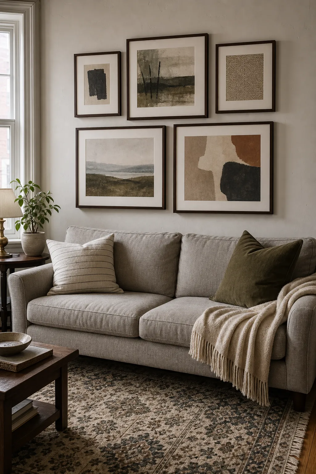
Undersized art is the fastest way to make a living room wall feel unfinished. As a practical rule, the total artwork width above the sofa should usually land around two-thirds to three-quarters of the sofa width. This can be one large piece, two coordinated prints, or a gallery arrangement measured as one full composition.
For a standard sofa, one large horizontal piece is often the cleanest answer. For a sectional, a pair of oversized prints or a wider gallery wall can feel more balanced. For a room with tall ceilings, vertical pieces can work, but only when the grouping still feels wide enough for the sofa. The common problem is not that the art is too bold. It is that the art is too small for the wall it is trying to anchor.
Hang height matters too. Artwork should feel connected to the sofa, not floating near the ceiling. Leave enough space for pillows and heads, but keep the bottom of the composition visually tied to the furniture below it.
Match Undertones More Carefully Than Colors
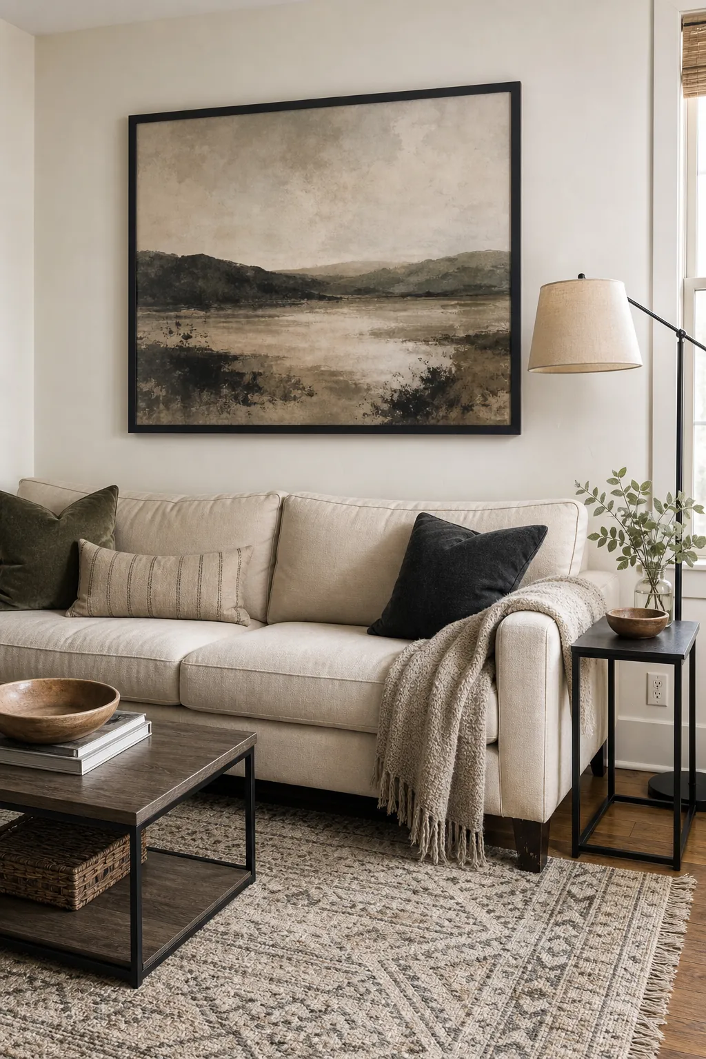
Two blues can clash. Two beiges can clash. Two whites can definitely clash. The issue is undertone. A cool gray sofa beside a warm jute rug may need artwork that bridges the temperature gap, such as a print with charcoal, cream, and muted clay. A warm camel sofa with a blue rug may need artwork that repeats the blue but adds a tan, ochre, or off-white note so the sofa does not feel separate.
When in doubt, place a photo of the sofa and rug beside the artwork listing or sample. Look for the color temperature before the exact hue. If the room has warm woods, brass, cream, terracotta, or taupe, icy whites and blue-gray art may feel cold. If the room has chrome, black accents, cool stone, or crisp white walls, yellowed beige art may look muddy.
The best sofa wall decor usually has at least one bridge color: a tone that appears in the rug, sofa, floor, pillows, or wood furniture. That bridge color is what makes the artwork feel like part of the room instead of a separate decoration.
Use Contrast When the Room Feels Too Safe
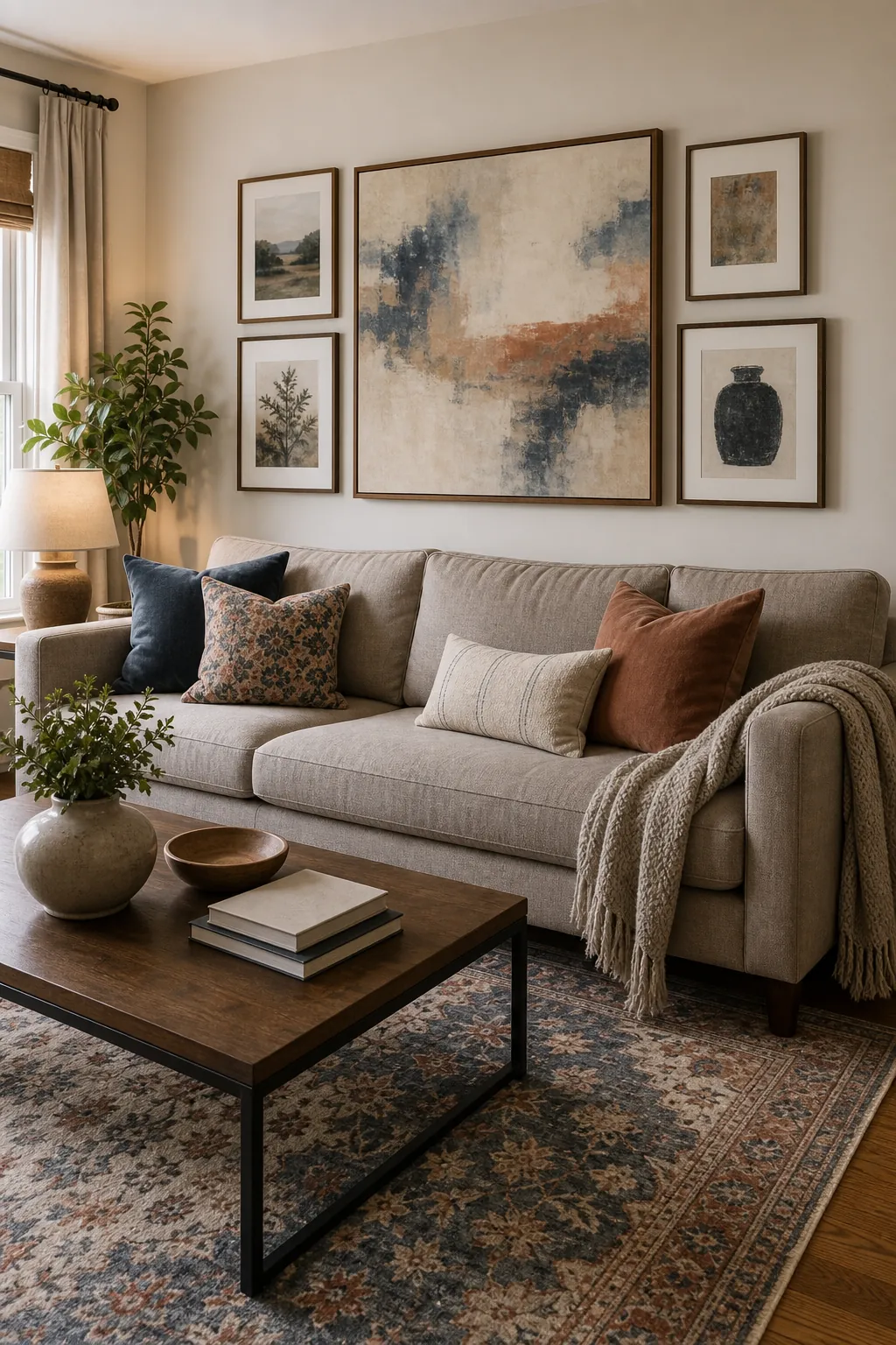
If everything in the room is already soft, neutral, and tone-on-tone, matching the art too closely can make the space feel sleepy. This is where contrast helps. Contrast can be a darker frame, a bolder shape, a larger scale, a black-and-white photograph, a richer landscape, or a print with one confident accent color.
Contrast does not mean random. A navy print can work with a beige sofa and warm rug if there is a navy book spine, pillow stripe, lamp, or tiny rug detail somewhere else in the room. A black frame can work in a pale space if the room also has black curtain rods, table legs, picture lights, or hardware. Give the contrast a second place to land.
For renters or anyone decorating slowly, this is the safest formula: keep the large pieces flexible, then let artwork carry the personality. A neutral sofa and rug can support large living room prints, textured canvas, framed textiles, vintage landscapes, or a restrained gallery wall as long as the scale and undertones are right.
A Simple Check Before You Buy
- Scale: Is the art wide or strong enough for the sofa?
- Palette: Does it repeat at least one color from the rug, sofa, or accents?
- Undertone: Does it lean warm or cool in a way that fits the room?
- Mood: Does the style match the feeling you want from the space?
- Contrast: Does the wall need a quieter piece or a stronger focal point?
- Connection: Is there a bridge color, material, frame finish, or shape repeated elsewhere?
The right artwork does not have to match every color in the sofa and rug. It needs to make the room feel edited. When the scale is right, the undertones agree, and one or two colors connect across the room, the wall art stops looking like an afterthought and starts doing the job it should: pulling the living room together.