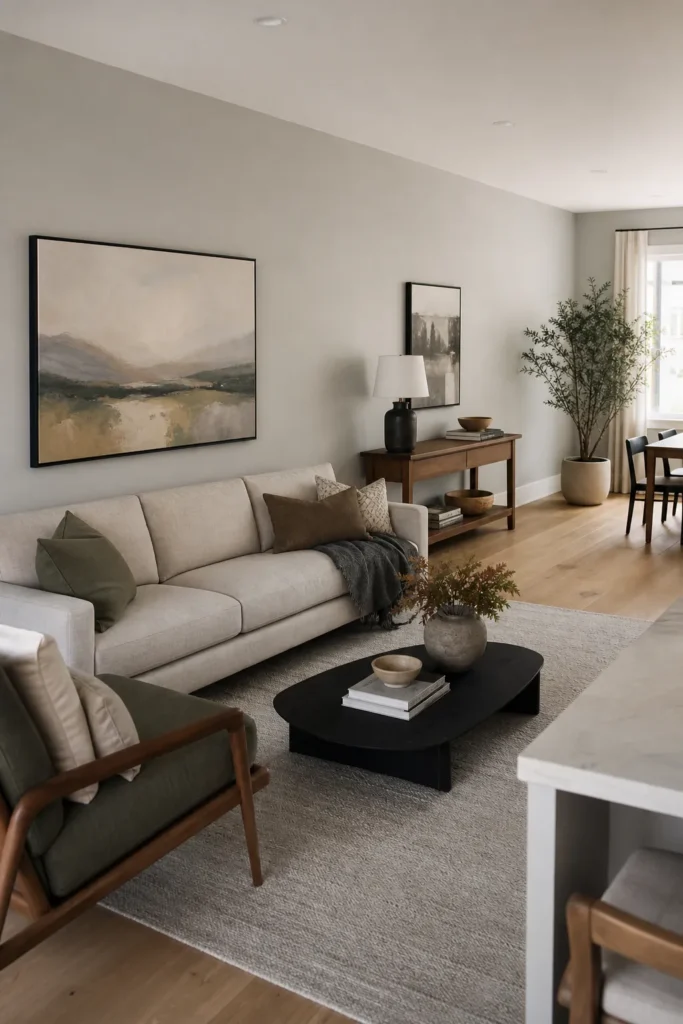
Living Room Wall Decor Ideas for Open Concept Long Walls
A long wall in an open concept living room usually fails for one simple reason: it is treated like one giant blank surface instead of a series of smaller decisions. The wall may run past the sofa, dining area, walkway, kitchen edge, or stair opening, so a single tiny print looks lost and a full wall of decor can feel busy from every angle.
The best living room wall decor ideas for open concept homes with long walls start with zones. Decide where the eye should pause, where the walkway needs to stay calm, and where furniture can anchor the wall. Once those zones are clear, art, mirrors, shelves, lamps, plants, and texture feel intentional instead of scattered.
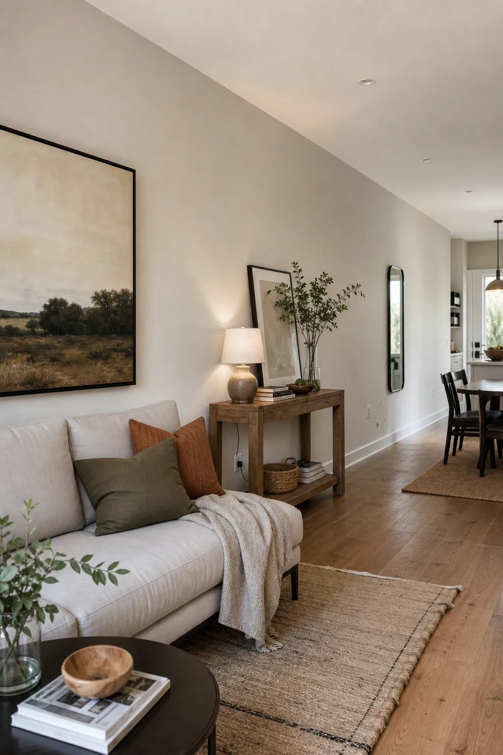
Start by Dividing the Long Wall Into Real Living Zones
Before buying anything, stand at the main entry to the room and mark the natural breaks. In many open layouts, the same wall touches a TV area, a sofa zone, a dining corner, and a pass-through. If you decorate across all of it with the same spacing, the room can look like a hallway gallery instead of a comfortable living room.
A practical way to plan living room wall zones is to connect each wall section to the furniture below it. The sofa zone can hold the strongest art moment. A console table can create a smaller styled vignette. A narrow walkway section may need only one vertical piece, a slim mirror, or no decor at all. Leaving a quiet gap between zones often makes the whole wall feel more expensive.
- Seating zone: use the largest art, gallery grouping, mural panel, or textured focal wall here.
- Console zone: layer art, a lamp, branches, books, and one sculptural object for depth.
- Dining or kitchen edge: repeat one color, frame finish, or material so the open concept wall decor still flows.
- Walkway zone: keep depth shallow and avoid fragile pieces where people pass closely.
This is the point where many big blank wall ideas become easier. You are no longer trying to solve one oversized problem. You are choosing the right visual weight for each part of the room.
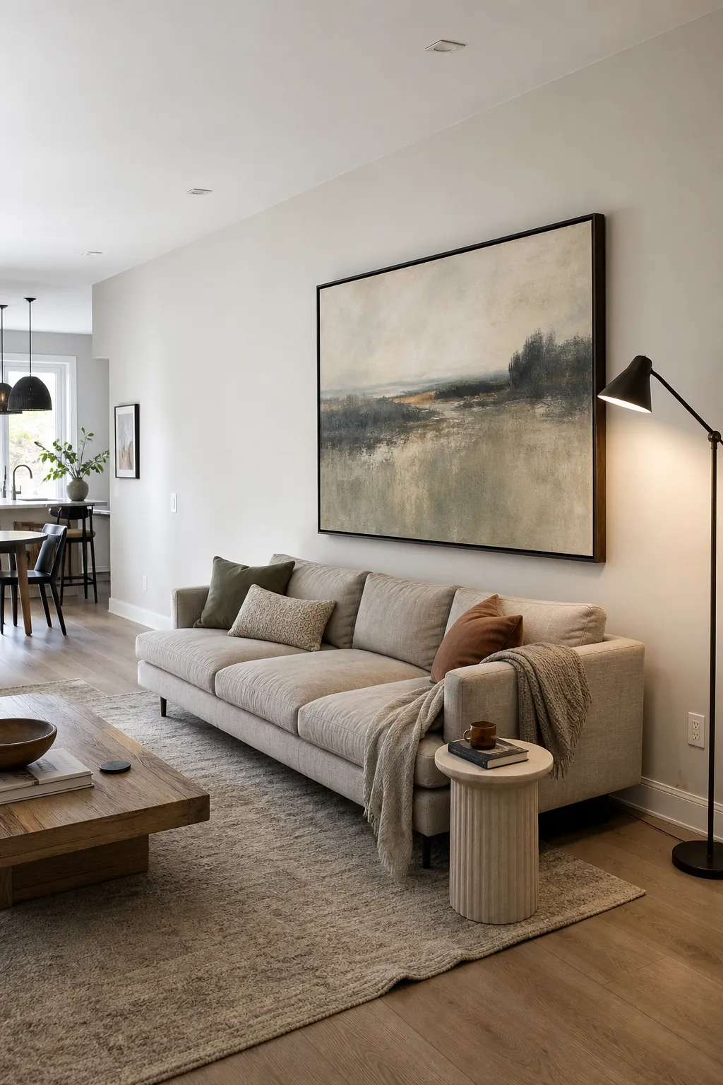
Use Oversized Art Where the Room Needs One Clear Pause
If your long wall feels restless, one oversized piece can calm it down. This works especially well behind the main sofa, near the center of the seating group, or across from the first sightline when someone enters the open room. The art becomes a visual full stop, which helps the furniture grouping feel anchored.
Scale matters more than price. As a starting point, the art or grouped artwork should usually span about two-thirds of the furniture below it. A small 24-inch print over a 96-inch sofa will look accidental, even if the print is beautiful. A single large canvas, a framed textile, a wide landscape, or two large companion pieces can feel more balanced than many little frames spread thinly across the wall.
For long wall decor living room layouts, resist the urge to center art on the entire wall if the sofa or seating group is not centered on that wall. Center the art on the furniture zone. The room reads furniture first, then wall decor. When those two things agree, the long wall stops feeling awkward.
Choose art with enough presence to be seen from the kitchen or dining area, but not so much contrast that it shouts from every corner. In open concept rooms, muted large-scale art often works better than several loud, unrelated pieces.
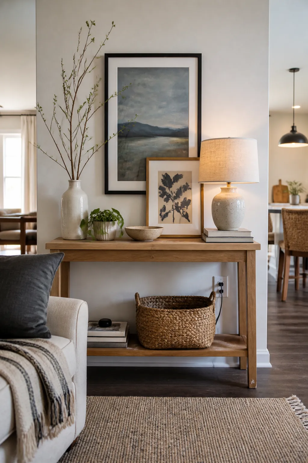
Add a Console Table to Give the Wall Depth
A long flat wall often looks unfinished because everything sits in the same plane. A console table fixes that quickly. It gives the eye a base line, adds depth, and creates a place to layer art, lamps, branches, bowls, books, or small plants without covering every inch of drywall.
Art over console table styling is also useful when the wall is part of a walkway. The table tells people where the decorated zone begins and ends. Choose a console shallow enough for traffic flow, then hang or lean one main art piece above it. Add one tall object, one medium object, and one lower object so the vignette steps down instead of forming a stiff row.
This approach works beautifully for renters because the furniture carries much of the composition. You can use removable picture hooks, leaning frames, a plug-in lamp, a tall plant, or a mirror without committing to built-ins or permanent paneling. If the open concept wall runs behind a sofa, a sofa-back console can create a soft divider between the living area and the dining or kitchen zone.
The key is restraint. A console zone should not become a storage dump. Keep the top edited enough that it reads as wall decor, not as the place where keys, mail, and chargers go to disappear.
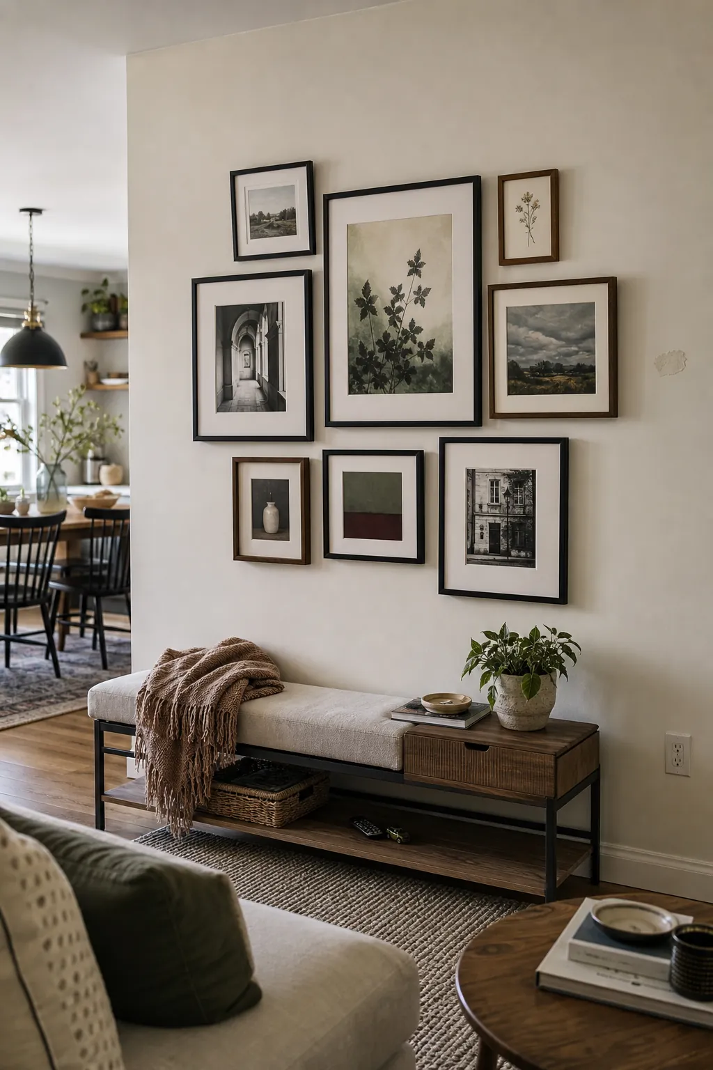
Build a Gallery Wall in Clusters, Not a Thin Horizontal Line
A gallery wall can solve large wall space ideas living room searches, but it can also make a long wall look even longer if every frame marches across in one skinny band. Instead, build the gallery in one contained cluster or in two related clusters with breathing room between them.
Start with the largest piece near the center of the furniture zone, then add smaller frames around it. Keep the outside edge intentional: a rectangle, a loose oval, or an asymmetrical block. The shape matters because the eye reads the whole grouping before it reads individual art. If the frames stretch too far, the wall can feel like a waiting room.
In an open concept home, the gallery wall should borrow colors from nearby areas. A frame finish that relates to the dining chairs, a print color that repeats in the rug, or a warm wood tone that echoes the kitchen shelves will make the wall feel connected without matching everything.
- Use fewer, larger frames if the room already has a lot of furniture legs, shelves, or open sightlines.
- Use one consistent frame color if the art styles are mixed.
- Use mixed frame finishes only when the art palette is calm and cohesive.
- Mock it on the floor first so the final shape is clear before anything goes on the wall.
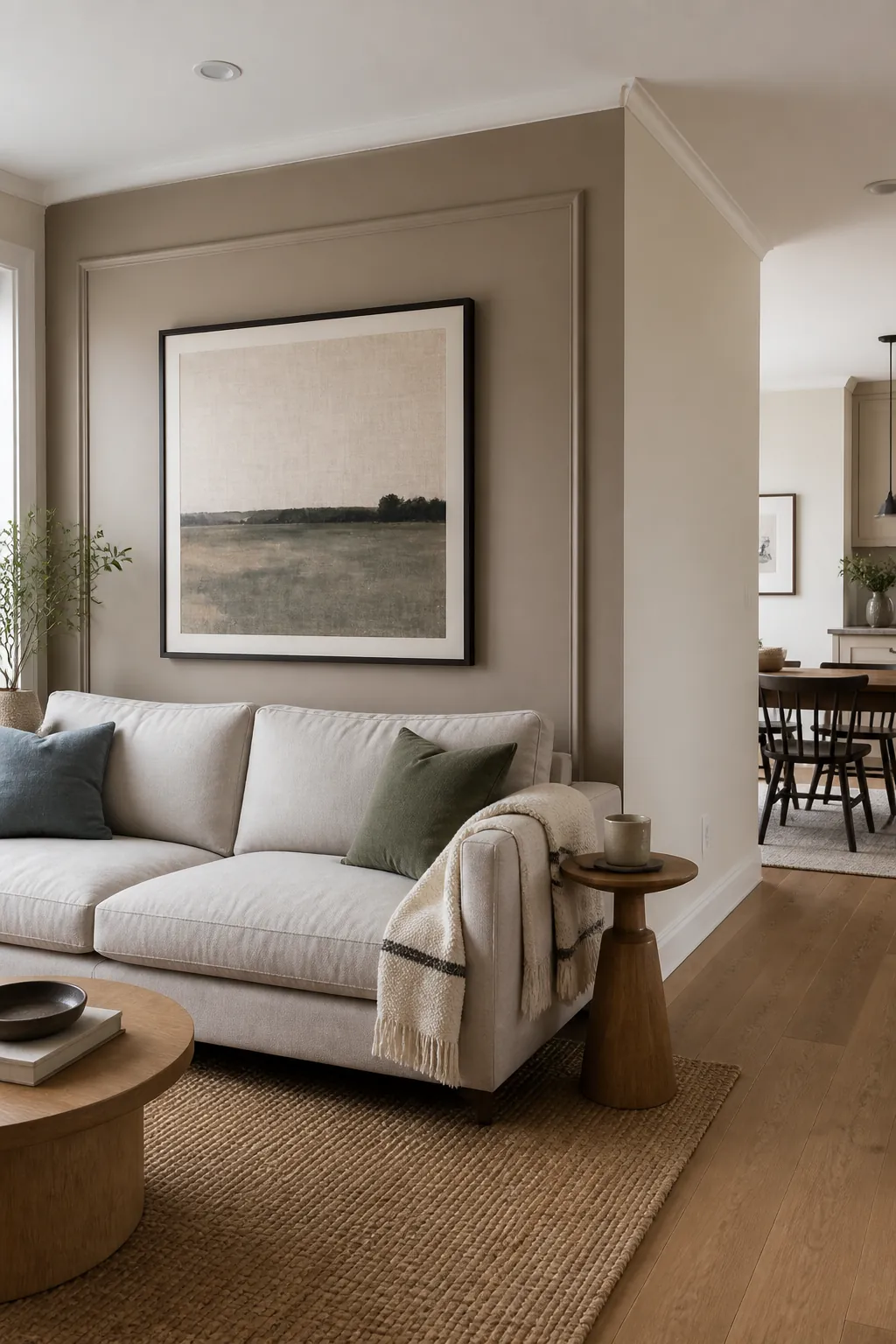
Turn One Section Into a Focal Wall With Texture or Color
Sometimes the right answer is not more objects. It is a stronger background. Paint, wallpaper, peel-and-stick mural panels, picture molding, vertical slats, or limewash-style texture can define the living area without filling the entire wall with frames.
This is especially helpful when the long wall continues into a dining space or kitchen. A living room focal wall can stop at the seating zone, while the rest of the wall stays quieter. That break tells the eye, “this is the living room,” even though the architecture is open.
If you use wallpaper or a mural, let it cover one clear panel rather than the whole run unless the room is very simple. In homes with visible kitchens, shelves, appliances, dining chairs, and pendant lights, a full long wall of busy pattern can compete with everything else. A contained feature area gives you impact without visual noise.
For renters, framed peel-and-stick wallpaper panels can create a similar effect. Mount two or three tall panels behind a sofa or console, then keep the surrounding wall plain. It gives the room architecture where none exists.
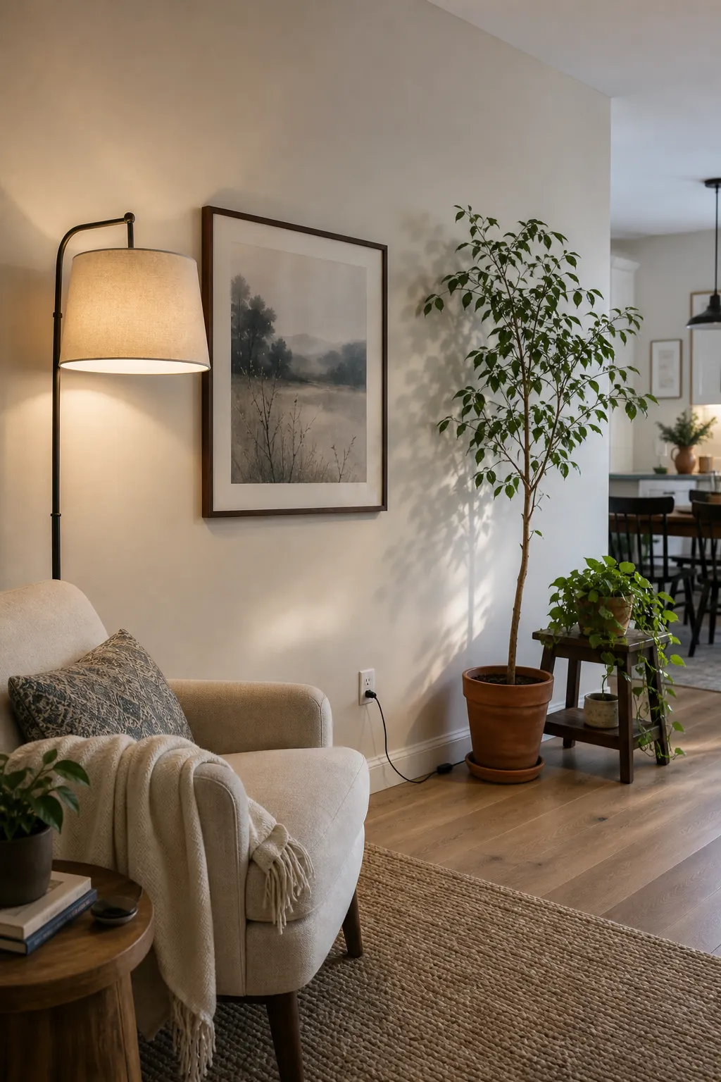
Layer Lighting and Plants So the Wall Does Not Feel Flat
Long walls need shadow, height variation, and a little life. A floor lamp beside the sofa, a table lamp on a console, a tall plant near a blank corner, or a wall sconce over a reading chair can do as much for the wall as another print.
The best layered wall decor has three depths: something on the wall, something in front of the wall, and something lower that connects back to the furniture. For example, a large framed print, a slim console below it, and a ceramic lamp plus trailing plant will feel richer than the same print floating alone.
This is where open concept rooms benefit from repetition. If the kitchen has black metal pendants, a black picture frame or lamp base can connect the living wall to the kitchen. If the dining area has woven chairs, a rattan shade, basket, or textured frame can repeat that material on the living room wall. The goal is not matching; it is visual conversation.
Keep the Wall Calm Where the Room Already Has Movement
Open concept homes already have a lot happening: people moving through, kitchen surfaces, dining chairs, windows, rugs, TV screens, and changing sightlines. A long wall does not need decor everywhere. In fact, the most polished rooms often use a strong focal zone and a few quieter stretches.
If your wall includes a doorway, thermostat, return vent, light switch, or TV, work with those interruptions instead of fighting them. Keep art away from busy controls. Use a mirror where it reflects something attractive, not a cluttered kitchen counter. Choose shallow decor near walkways. Let blank space act like punctuation between zones.
A useful final check is to look from three places: the entry, the sofa, and the kitchen. If every view has one clear focal point and one quiet place for the eye to rest, the long wall is probably balanced. If every view has competing art, shelves, plants, and lamps, remove one layer before adding anything else.
For most open concept homes, the winning formula is simple: anchor the main seating zone, create one layered console or gallery moment, repeat a few colors or materials, and leave enough blank space for the room to breathe. That is how a long wall becomes part of the living room instead of a problem running through it.