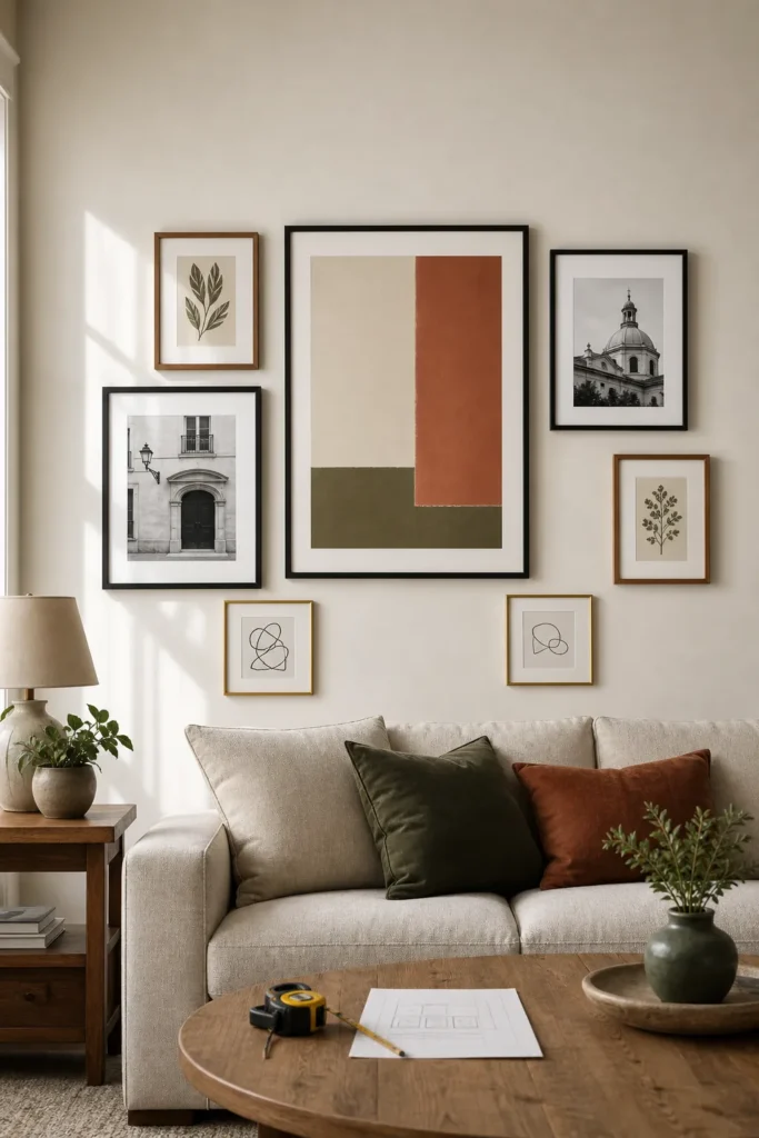
Gallery Wall Layout Ideas With Frame Sizes for Beginners
A good gallery wall does not start with buying more frames. It starts with choosing a simple layout, giving every frame a job, and keeping the spacing consistent enough that the whole wall reads as one composition.
That is where beginners usually get stuck. You may have a stack of photos, prints, and frames you like, but once they are on the floor, the arrangement starts to feel random. One frame looks too small. Another feels too heavy. The space above the sofa looks empty even though there are plenty of pieces. The fix is not a mysterious designer instinct. It is a repeatable gallery wall layout method with frame sizes, spacing, and a simple template plan before you make holes in the wall.
Use this guide as a beginner-friendly gallery wall template. It shows how to choose frame sizes for a gallery wall, how much space to leave between frames, and how to plan a picture wall layout that looks intentional instead of scattered.
Start With The Wall, Not The Frames
The most common beginner mistake is planning from the pile of frames instead of the wall itself. Before choosing a gallery wall layout, measure the area you want to fill. For a sofa, console, bed, or dining bench, the finished arrangement usually looks best when it fills about two-thirds to three-quarters of the furniture width. For a hallway or stair landing, think in terms of the visual path: where does the eye enter, and where should the wall feel full?
Mark the outer boundary first with painter’s tape. This is your invisible frame. Every picture wall layout decision becomes easier once you know the total width and height you are trying to fill.
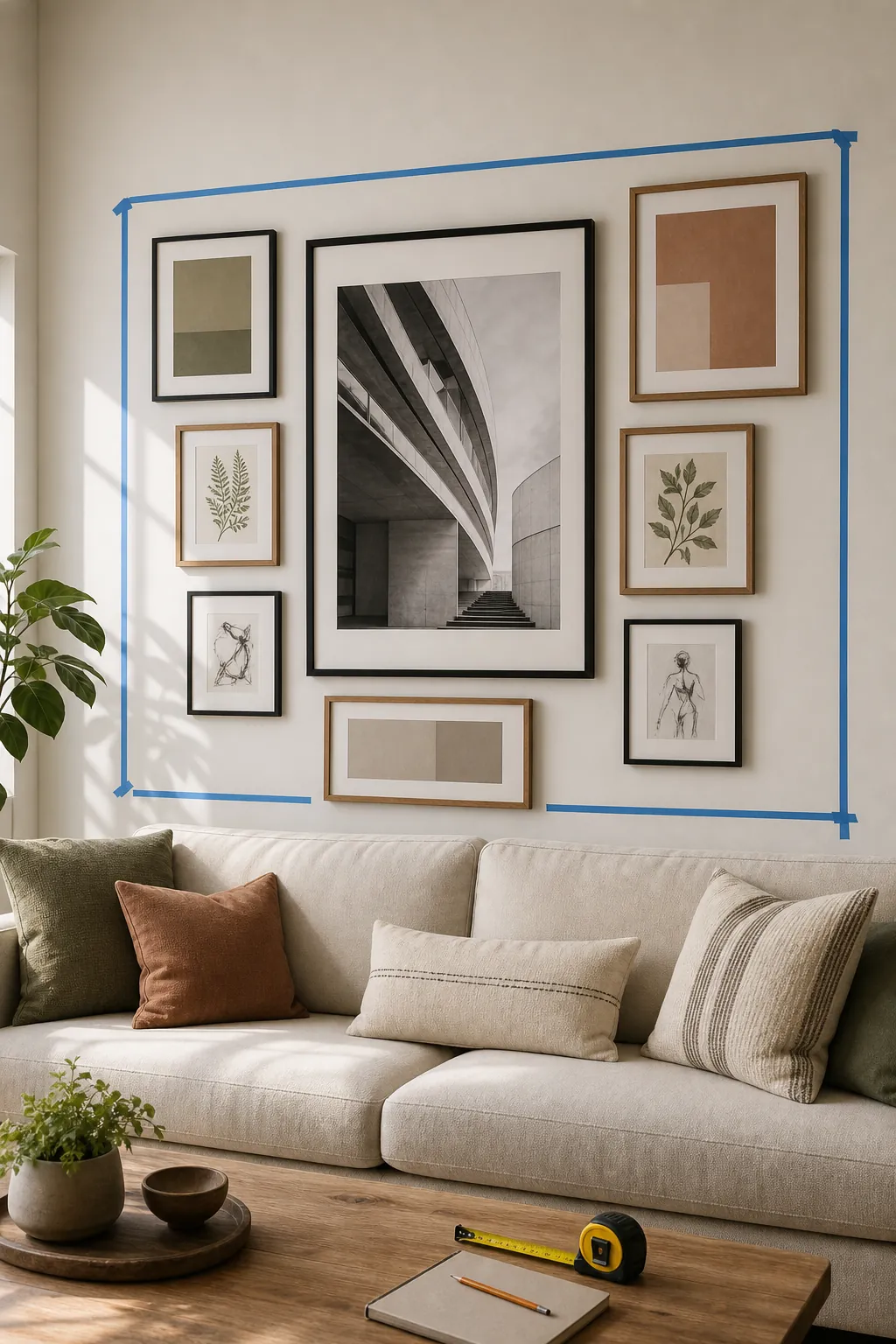
If you skip this boundary, small pieces tend to drift apart. The wall may have plenty on it, but it will not feel like one design. A taped boundary gives the gallery wall a clear footprint before you worry about the exact frame sizes.
Beginner Frame Sizes That Actually Work
A beginner gallery wall needs size variety, but not chaos. If every frame is small, the wall looks busy and under-scaled. If every frame is the same size, the wall can look flat unless you are making a strict grid. The easiest formula is one large anchor, two or three medium frames, and several small pieces that fill the gaps.
Here is a practical starting set for frame sizes for gallery wall planning:
- Small wall or narrow nook: one 16×20 frame, two 11×14 frames, and two or three 8×10 frames.
- Above a sofa or bed: one 20×24 or 24×36 frame, two 16×20 frames, two 11×14 frames, and two to four 8×10 frames.
- Large living room wall: one 24×36 frame, two or three 16×20 frames, several 11×14 frames, and small 5×7 or 8×10 accents.
This does not mean every gallery wall with sizes must follow those exact numbers. It means you should avoid making every piece fight for the same visual weight. One larger piece gives the eye a place to land. Medium pieces build the shape. Smaller frames make the layout feel collected.
Choose One Layout Type Before You Arrange Anything
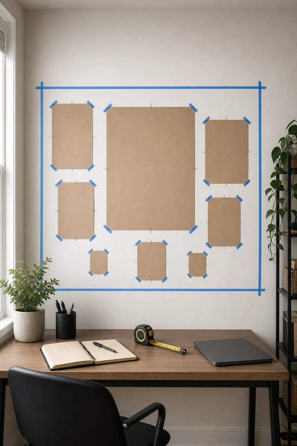
Most gallery wall layout ideas fall into three beginner-friendly types. Pick one before you start moving frames around.
The Center Anchor Layout
This is the safest layout for beginners. Place your largest frame slightly off center or exactly in the center, then build around it with medium and small pieces. It works well above a sofa, bed, console table, or fireplace-adjacent wall because the large piece gives the arrangement structure.
The Loose Grid Layout
A loose grid keeps the outside edges calm while allowing different frame sizes inside. Align a few top edges, bottom edges, or center lines so the wall looks designed, not accidental. This is a good choice if you like a clean picture wall layout but do not want every frame to match.
The Organic Collected Layout
An organic layout looks casual, but it still needs rules. Keep the spacing steady, repeat at least one frame color or art color, and make sure the largest pieces are spread out rather than clumped on one side.
Use A Floor Layout Before You Touch The Wall
If you are wondering how to plan gallery wall placement without regret, start on the floor. Measure the taped boundary from your wall, then recreate that rectangle on the floor with painter’s tape. Arrange the frames inside that shape at full scale. This lets you see the proportions before hardware, nails, or adhesive strips enter the picture.
Take a photo from straight above each time you try a new arrangement. The camera makes imbalance obvious. If one side feels heavy, move a medium frame across the layout. If the whole gallery feels spotty, bring the pieces closer together before adding more frames.
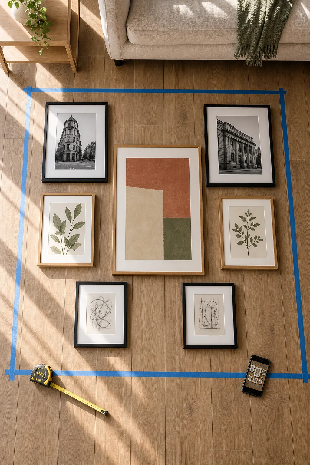
The floor stage is also where you can test the story of the wall. A family photo, a travel print, a botanical study, and a tiny sketch can work together if the sizes and color rhythm make sense. If they do not, the floor will tell you before the wall does.
Make A Paper Gallery Wall Template
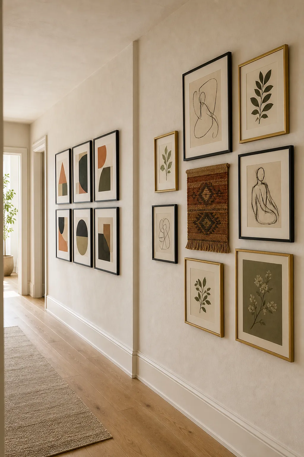
A gallery wall template is the bridge between the floor and the wall. Trace every frame onto kraft paper, builder paper, or taped-together printer paper. Cut out each shape, label it, and mark the hanging point. Then tape the paper pieces inside your wall boundary.
This step feels slow, but it solves the two problems beginners mention most: getting the spacing right and keeping the frames level. You can move paper around for ten minutes without patching holes. You can also step back and check whether the arrangement feels too high, too low, or too wide.
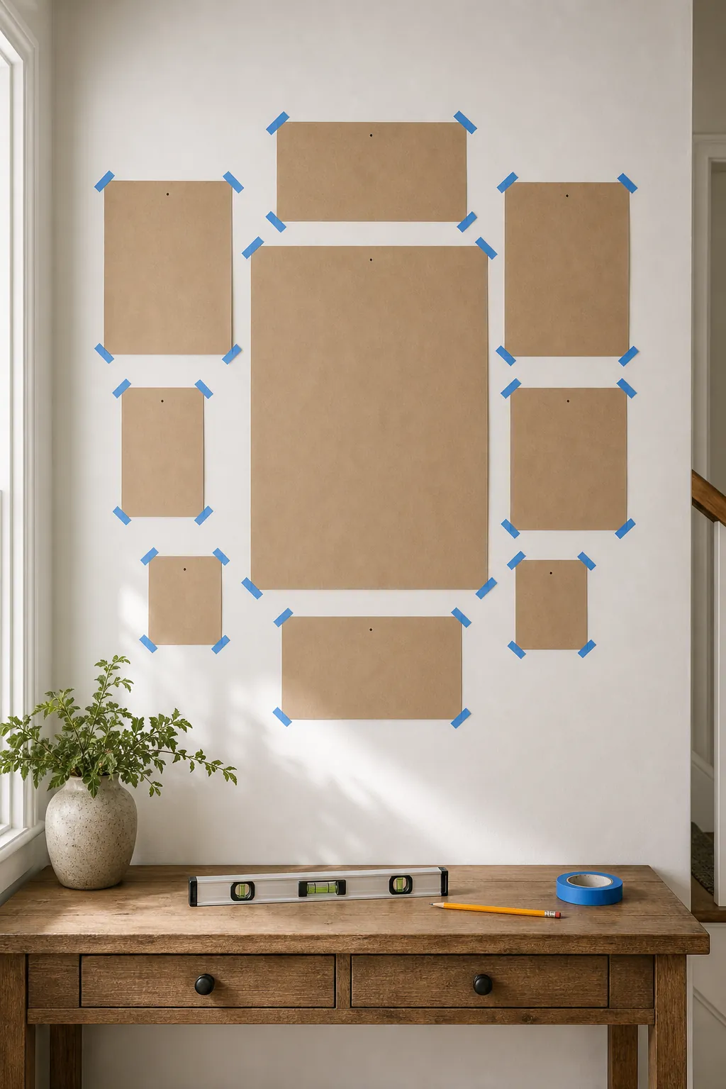
When the paper template looks right, hang the largest frame first. Then work outward from that anchor. Do not remove all templates at once. Remove one paper shape, hang that frame, then move to the next. This keeps the layout from shifting as you work.
Keep Gallery Wall Spacing Consistent
Gallery wall spacing is where a good layout can fall apart. For most beginner arrangements, leave 2 to 3 inches between frames. Use the smaller end for compact hallway walls or small frames. Use the larger end for oversized frames or a relaxed living room wall.
The exact number matters less than consistency. If one gap is 1 inch and the next is 6 inches, the eye reads the empty space as a mistake. Cut a cardboard spacer to your chosen gap and use it as you tape templates or hang frames. This is faster than measuring every space with a ruler.
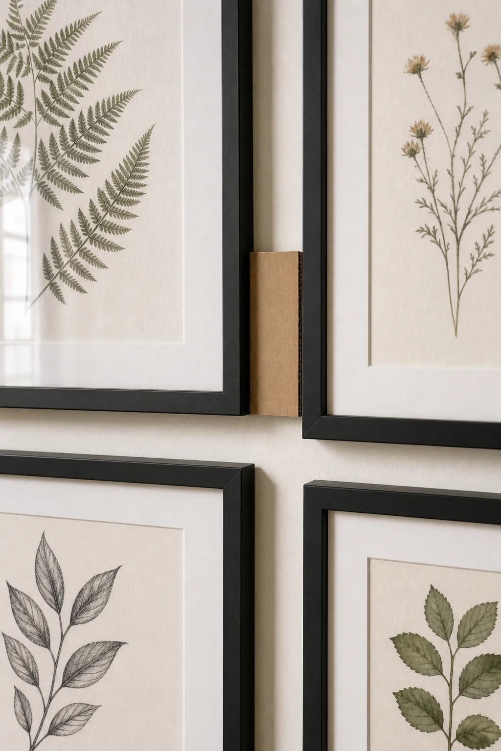
Also check the relationship to furniture. Above a sofa or console, the bottom of the gallery usually feels best about 6 to 10 inches above the furniture. In a hallway, keep the center of the arrangement near eye level instead of floating too high.
A Simple 7-Frame Beginner Layout
If you want a ready-to-use starter plan, try this 7-frame gallery wall layout:
- Place one 20×24 or 24×36 frame as the anchor.
- Add one 16×20 frame on the opposite side to balance the anchor.
- Add two 11×14 frames, one vertical and one horizontal.
- Use two 8×10 frames to fill smaller gaps.
- Add one small 5×7 or sculptural accent if the layout needs character.
Keep the outer edge roughly rectangular, but let a few small pieces step in or out. That combination gives you structure without making the wall look stiff.
How To Adjust For Hallways And Stairs
Hallways and stairs need tighter control because people view them while moving. For a hallway, keep the gallery wall narrower and more linear. For stairs, follow the slope with an imaginary center line, then keep each frame’s center close to that line. The spacing should still stay consistent even though the whole arrangement steps upward.
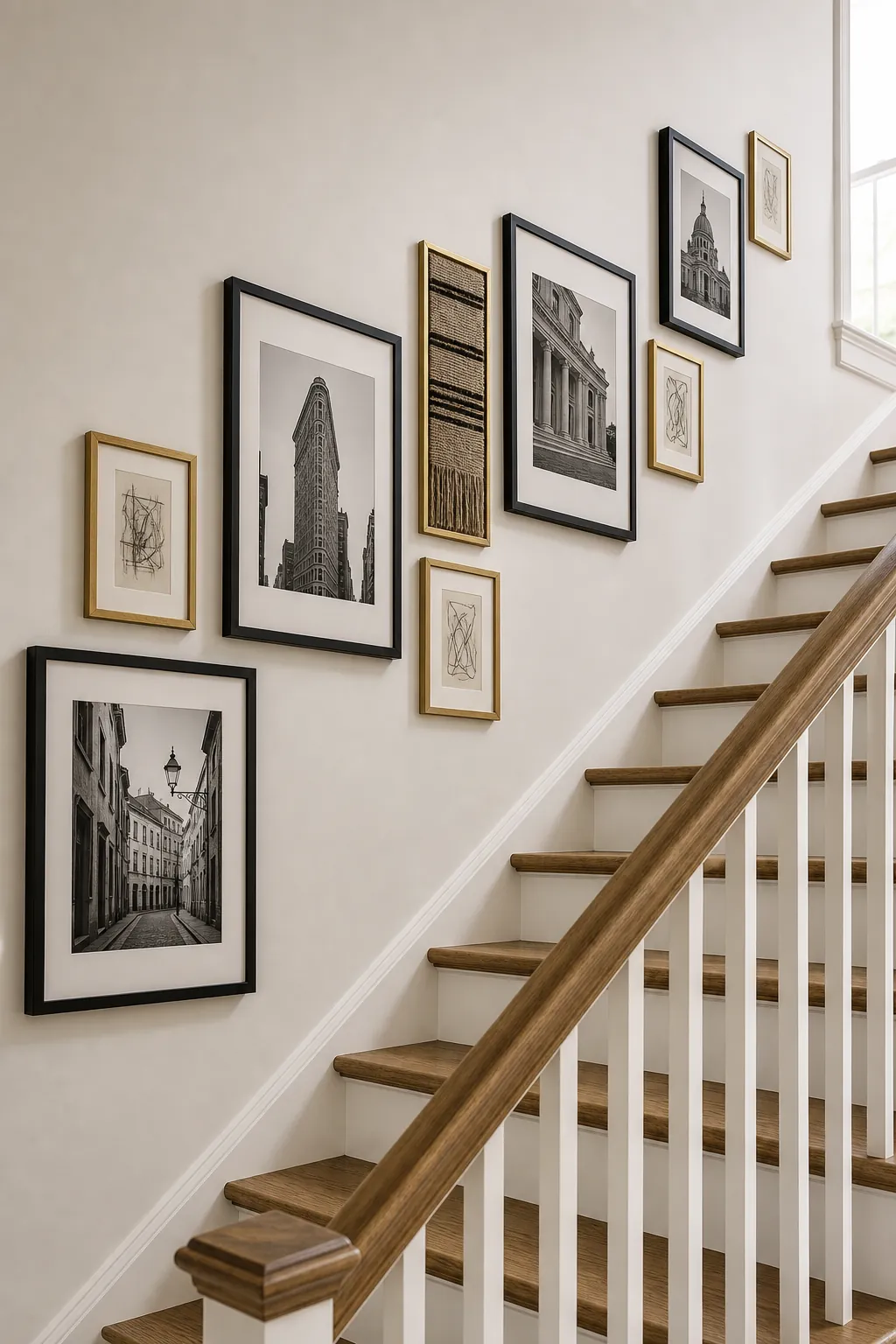
If your stair gallery wall feels messy, it usually needs fewer tiny frames and more medium ones. A long wall can handle size variation, but it still needs repeated spacing and a clear rhythm.
Beginner Mistakes To Avoid
Do not hang every frame at the same height unless you are making a strict grid. Do not use only small frames on a large wall. Do not spread pieces so far apart that they stop reading as one gallery. Do not choose a layout only because it looked good in a different room. Your wall size, furniture width, and frame mix should decide the final arrangement.
Most importantly, do not confuse eclectic with unplanned. A beginner gallery wall can include mixed photos, prints, sketches, and keepsakes, but it still needs repeated colors, steady spacing, and at least one strong anchor.
The Easiest Way To Make It Look Intentional
Before hanging anything, check your layout against three questions. Is there one clear anchor piece? Is the gallery wall spacing consistent? Does the outside shape feel deliberate from across the room?
If the answer is yes, you are ready to hang. If the answer is no, fix the template before fixing the wall. A beginner-friendly gallery wall is not about having perfect art or expensive frames. It is about planning the frame sizes, testing the layout at full scale, and giving the final wall enough structure to look collected on purpose.