How to Make a Cohesive Printable Art Set
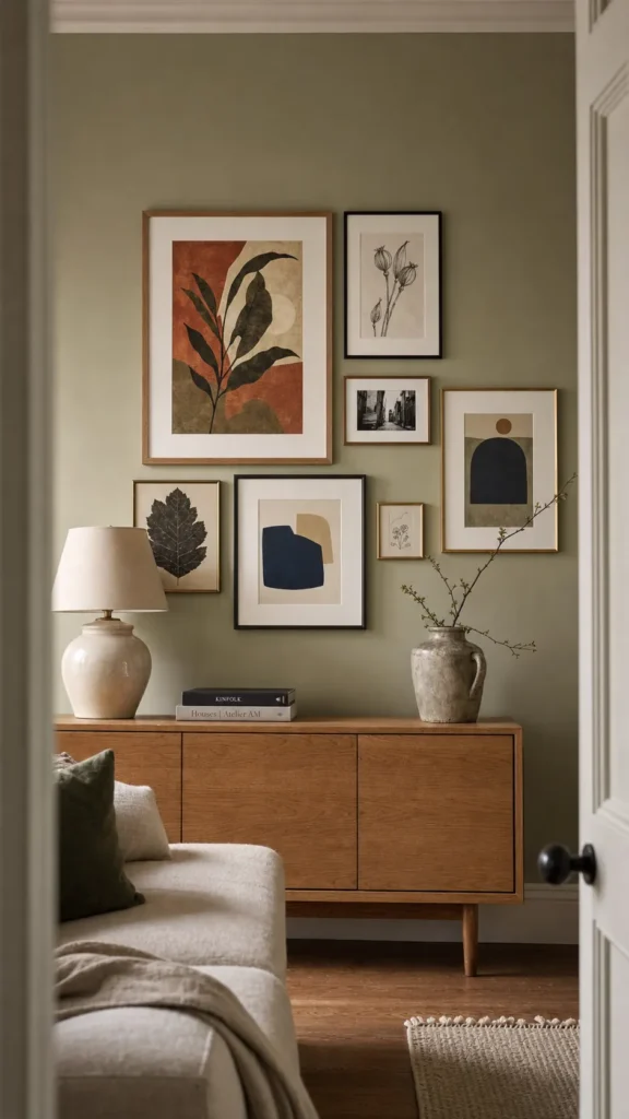
A cohesive printable art set does not require identical pictures. In fact, a row of near-duplicates often feels flatter than a collection built from different subjects. Cohesion comes from repeated decisions: the same visual temperature, a controlled color family, related line weight, compatible margins, and a clear rhythm once the pieces are on the wall.
The useful question is not “Do these prints match?” It is “What do they share, and where are they allowed to differ?” Decide that before downloading or designing ten files. You will spend less, print fewer rejects, and end with cohesive wall art that still feels personal.
Start With the Wall, Not the Files
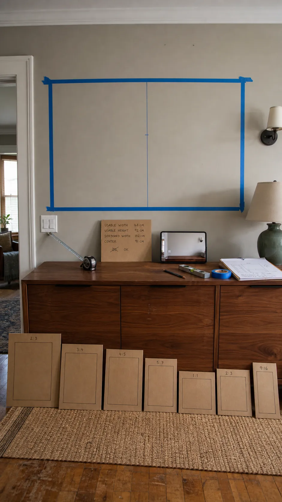
Photograph the empty wall straight on and measure the usable rectangle above the furniture. Include switches, lamps, doors, and the height of anything that sits below it. A printable set for a narrow stair landing needs a different silhouette from one above a long sideboard. Treat the full arrangement as one large composition, not as isolated frames that happen to share a wall.
Choose an outside boundary and a visual center. The center of the whole grouping—not necessarily the largest frame—should relate to the furniture and normal standing sightline. This early constraint prevents the familiar problem of buying appealing gallery wall prints and discovering that their combined shape fights the room.
Choose One Anchor and Write Down Its Rules
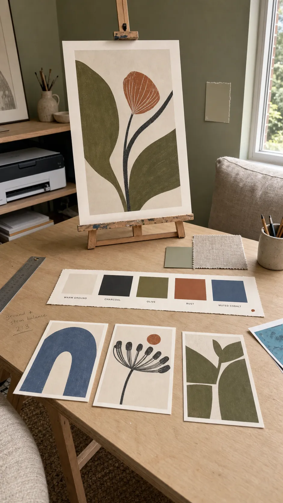
Your anchor can be the largest print, the most meaningful subject, or the piece with the strongest color. Pull four practical rules from it: background temperature, dominant hue, accent hue, and contrast level. A faded botanical with warm paper, olive foliage, rust details, and soft charcoal shadows gives you a much clearer brief than “vintage.”
Keep those rules visible while you select the rest. They are a filter, not a demand for copies. A geometric print, a line drawing, and a family photograph can coexist when their whites, darks, and accent colors speak the same language.
Build a Small Color Recipe
Sample colors from the anchor and reduce them to a usable recipe: one light ground, one dark neutral, two supporting colors, and one restrained accent. Repeat the ground and dark neutral in almost every piece. Let the accent appear in only a few places so the eye travels rather than stopping everywhere at once.
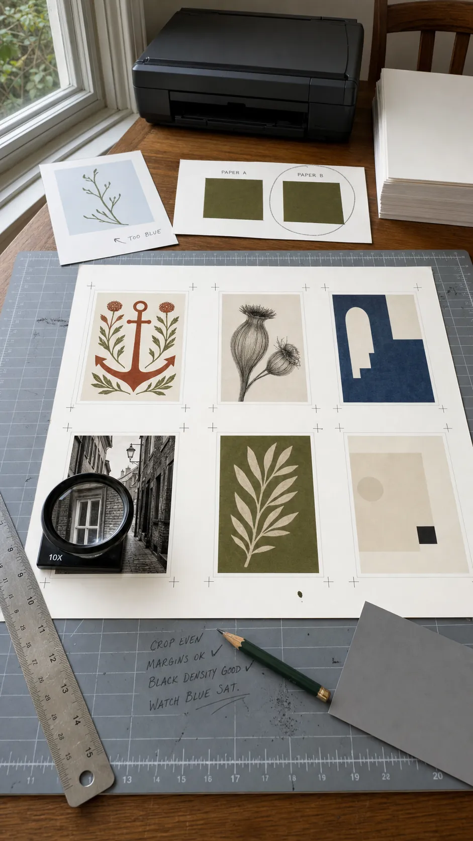
Judge colors beside the actual room finishes. A blue that looks balanced on a bright monitor may become electric beside a muted sofa; a cream may turn yellow against a cool white wall. Print a small swatch sheet on the paper you plan to use and view it during daytime and evening lighting before committing to full-size files.
Set a Shared Visual Grammar
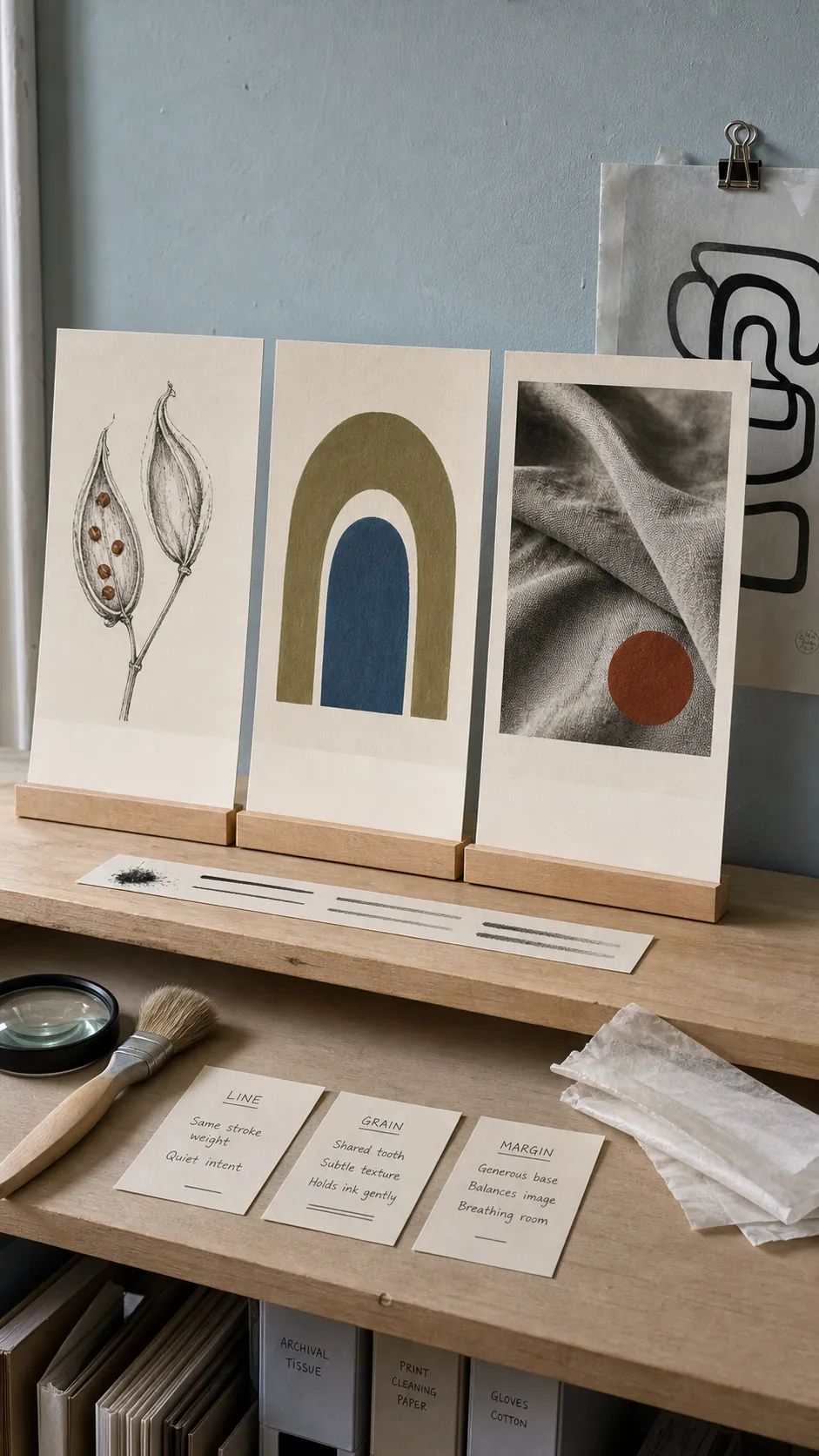
Color alone cannot carry the whole set. Decide how the images are made. You might use flat gouache shapes with visible brush edges, fine ink contours over pale washes, grainy two-color photography, or crisp vector forms with generous negative space. Mixing media is possible, but it needs another strong bridge such as identical mat widths and a tightly repeated palette.
Watch line weight, texture density, and edge treatment. One delicate drawing can disappear beside three heavy poster graphics even when the colors match. A subtle paper grain repeated across the files, or a consistent charcoal outline, can make different subjects feel authored together.
Create Variety by Changing One Variable at a Time
Matching prints become more interesting when each piece changes one major variable while the others stay stable. Keep palette, texture, and margin constant, then vary the subject. Or keep the botanical subject family and vary scale: one close leaf, one branching silhouette, one field of small seed forms. This produces kinship without the packaged-set feeling.
Include a quiet piece. A simple shape study or sparse drawing gives the eye somewhere to rest between detailed images. Also include one bridge piece that carries a color from one side of the arrangement to the other. These roles matter more than forcing every file to contain every color.
Proof the Files as a Set
Open every file at the final ratio and inspect its resolution. Enlarging a small raster image can create softness that is invisible on screen. Confirm that each file has enough pixels for the intended physical size, and preserve the aspect ratio when resizing. Cropping a composition to force it into a convenient frame can remove the very negative space that made the set balanced.
Print reduced proofs on one sheet. This reveals mismatched whites, unexpected saturation, inconsistent margins, and a print that carries too much visual weight. Make adjustments while the pieces are still inexpensive thumbnails. If the files come from different sources, this step is where they begin to behave like one printable art set.
Arrange Visual Weight Before You Hang
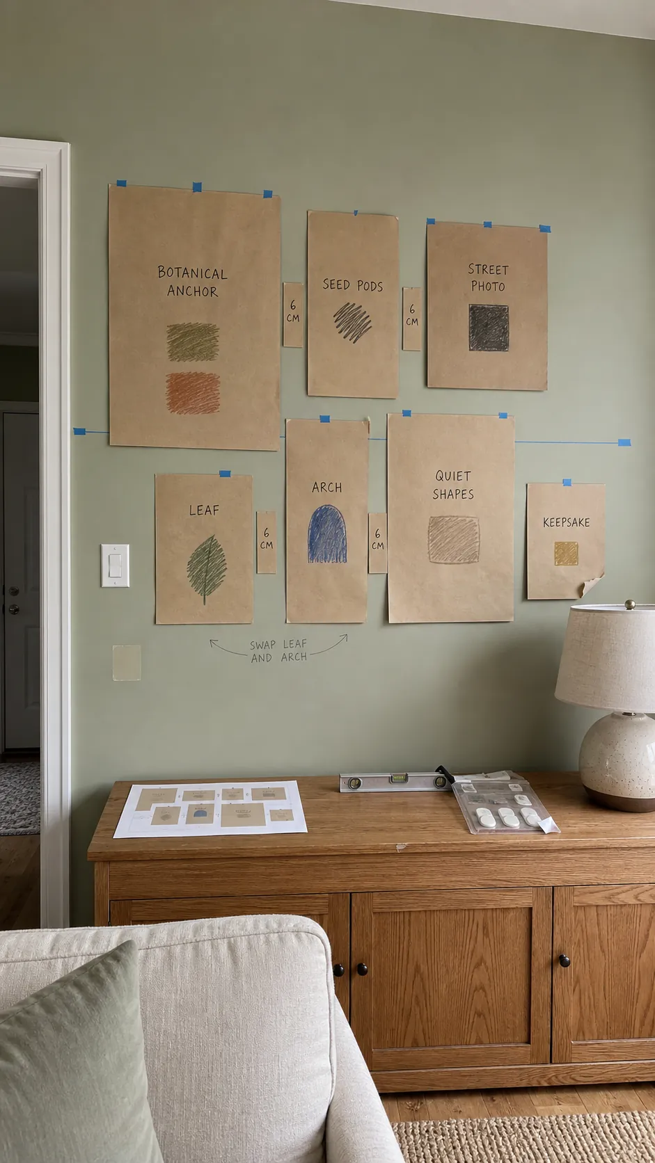
Trace the real frames onto kraft paper, label each template, and tape the shapes to the wall. Keep a consistent gap—often two to four inches works well—then adjust for the room and frame widths. Align some edges or centers to create structure, but avoid turning every row into a rigid grid unless the architecture calls for it.
Balance dark areas, large subjects, and saturated accents across the full footprint. Visual weight is not the same as frame size: a small black graphic can pull harder than a large pale wash. Step back from the doorway, sit in the main seat, and photograph each revision. The camera makes drifting spacing and top-heavy layouts surprisingly easy to see.
Use Frames and Mats as the Final Bridge
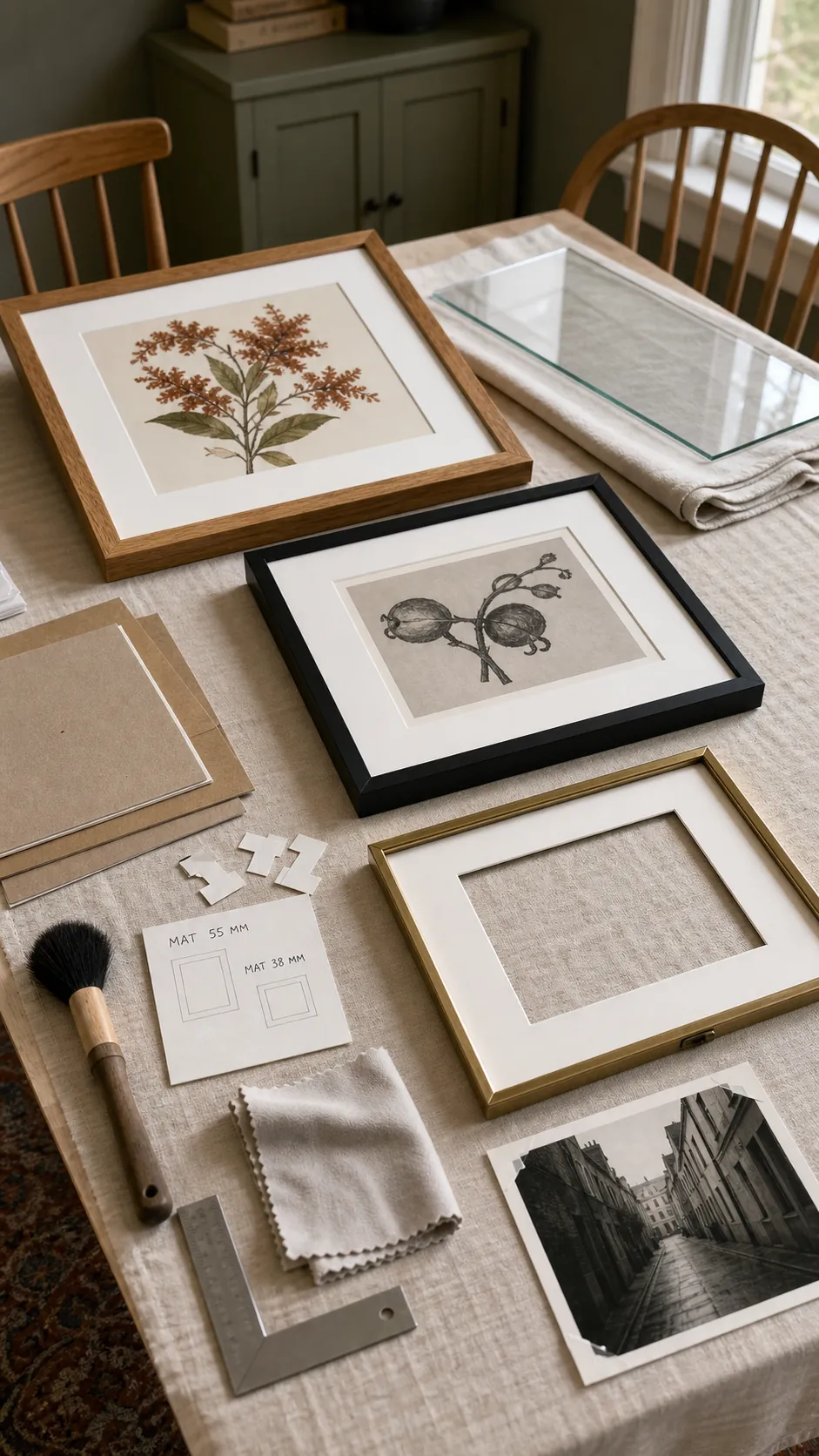
Frames do not have to be identical. Limit them to a small family—perhaps warm wood, thin black, and aged brass—with similar visual delicacy. If the art already contains strong variety, simplify further. Consistent mat color and proportional mat widths can unite files from different sources more effectively than painting every frame the same color.
Choose archival or acid-free materials for work you want to keep, and use acrylic glazing where weight or breakage is a concern. Clean the glazing, remove dust from the mat, and check that every print sits square before closing the backs. These quiet finishing details are what make inexpensive frameable art look intentional.
Let the Set Look Collected, Not Cloned
The strongest wall has a recognizable point of view and a little friction. A personal photograph, a child’s drawing, or a thrifted object can interrupt the printable pieces without breaking the composition when it repeats one color, texture, or shape. That interruption keeps the room from feeling like a product page.
Stop when the outside shape feels balanced and every piece has breathing room. You can always add later, but a set becomes more cohesive through editing than accumulation. Repeat a few deliberate choices, vary the subjects with purpose, and let the wall tell one story in several voices.