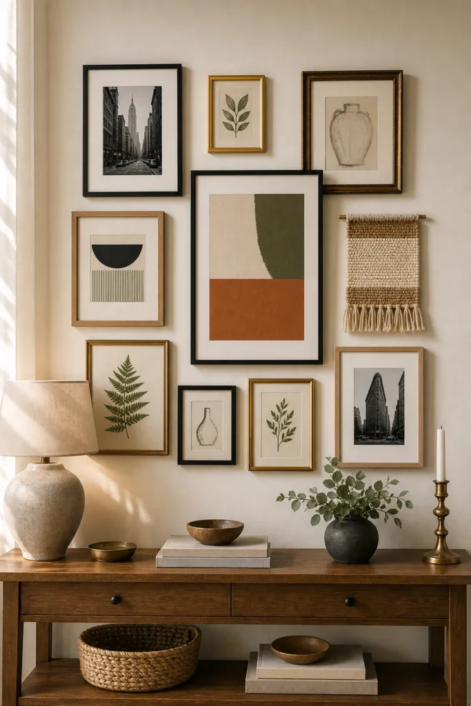
Mixed Frame Gallery Wall Ideas That Still Look Cohesive
A mixed frame gallery wall can look collected, personal, and expensive. It can also look accidental fast. The difference is not whether every frame matches. The difference is whether the mismatched frames repeat enough visual rules to feel like one wall.
If you love vintage frames wall decor, black modern frames, brass accents, oak frames, small sketches, family photos, and prints from different places, you do not need to force everything into a matching set. You need a plan for color, spacing, frame finish, scale, and visual weight.
Use these mixed frame gallery wall ideas when you want an eclectic gallery wall that still looks cohesive, not cluttered.
Choose One Unifying Rule First
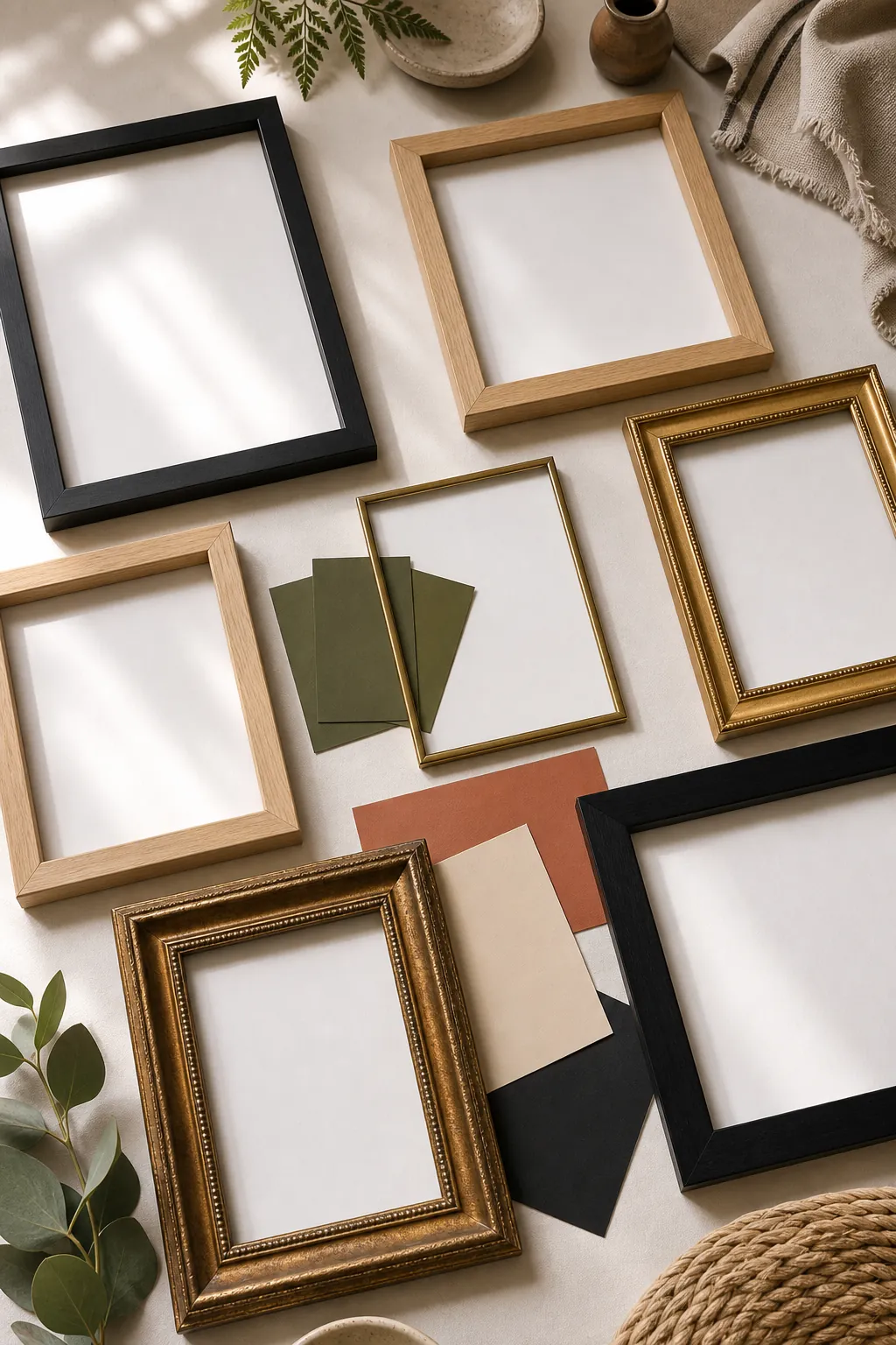
Before arranging anything, choose one rule that will hold the wall together. The rule can be frame color, art palette, mat color, subject matter, or spacing. You only need one strong rule, but it must be visible across the whole wall.
For example, a mismatched frames gallery wall can include black, brass, oak, and antique gold frames if most of the art shares warm neutrals and muted green. Another wall can mix colorful art if every frame uses a white mat. A third wall can mix frame finishes if every gap stays consistent.
The mistake is trying to make every element different. Eclectic does not mean unrelated. A cohesive gallery wall gives the eye a pattern to follow.
Limit The Frame Finishes
The simplest mixed frame formula is two main finishes and one accent finish. Black plus oak with a little brass works. White plus natural wood with a little antique gold works. Brass plus walnut with a few black frames can also work. Once you add four or five dominant finishes, the wall starts to feel noisy unless the art palette is very controlled.
Repeat each finish at least twice. One lonely gold frame can look like a mistake. Three gold frames, spread across the wall, look intentional. The same is true for vintage frames, thin black frames, chunky wood frames, or small metal frames.
Use Consistent Spacing To Calm The Mix
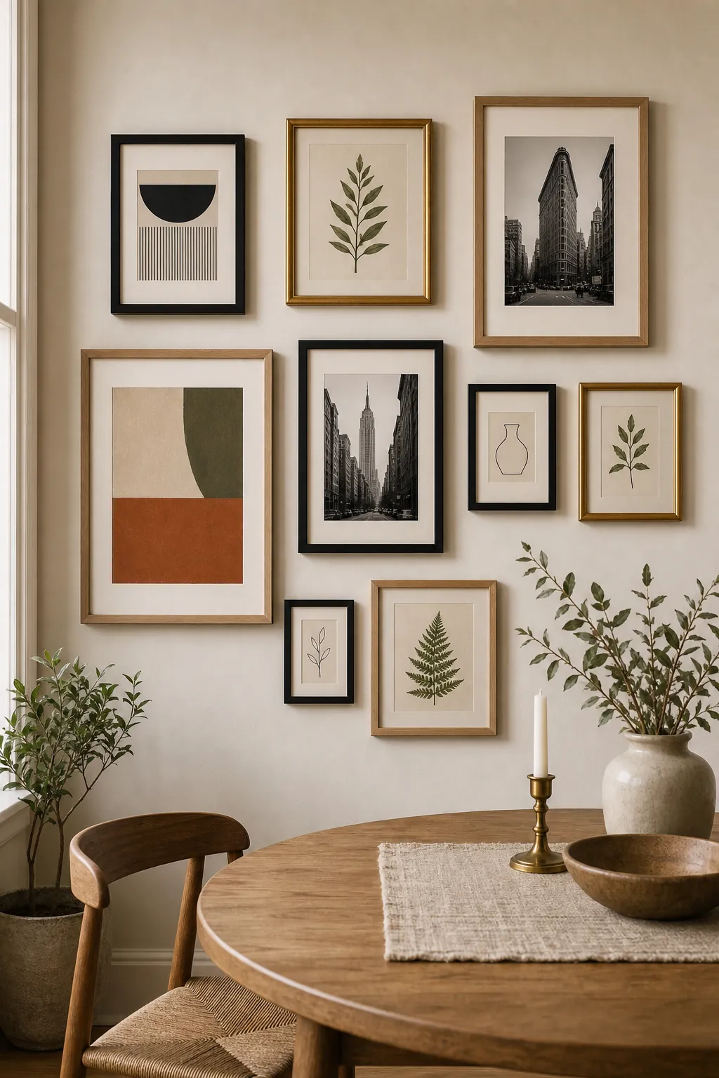
When the frames are different, the spacing needs to be steady. Most mixed gallery walls look best with 2 to 3 inches between frames. A tighter gap makes the pieces read as one collection. A wider gap can work, but it needs a strong outer shape and fewer tiny frames.
Use a cardboard spacer while planning. If your art wall eclectic layout feels messy, check the gaps before blaming the frames. Uneven negative space makes mismatched pieces look more chaotic than they really are.
Spread Heavy Pieces Around The Wall
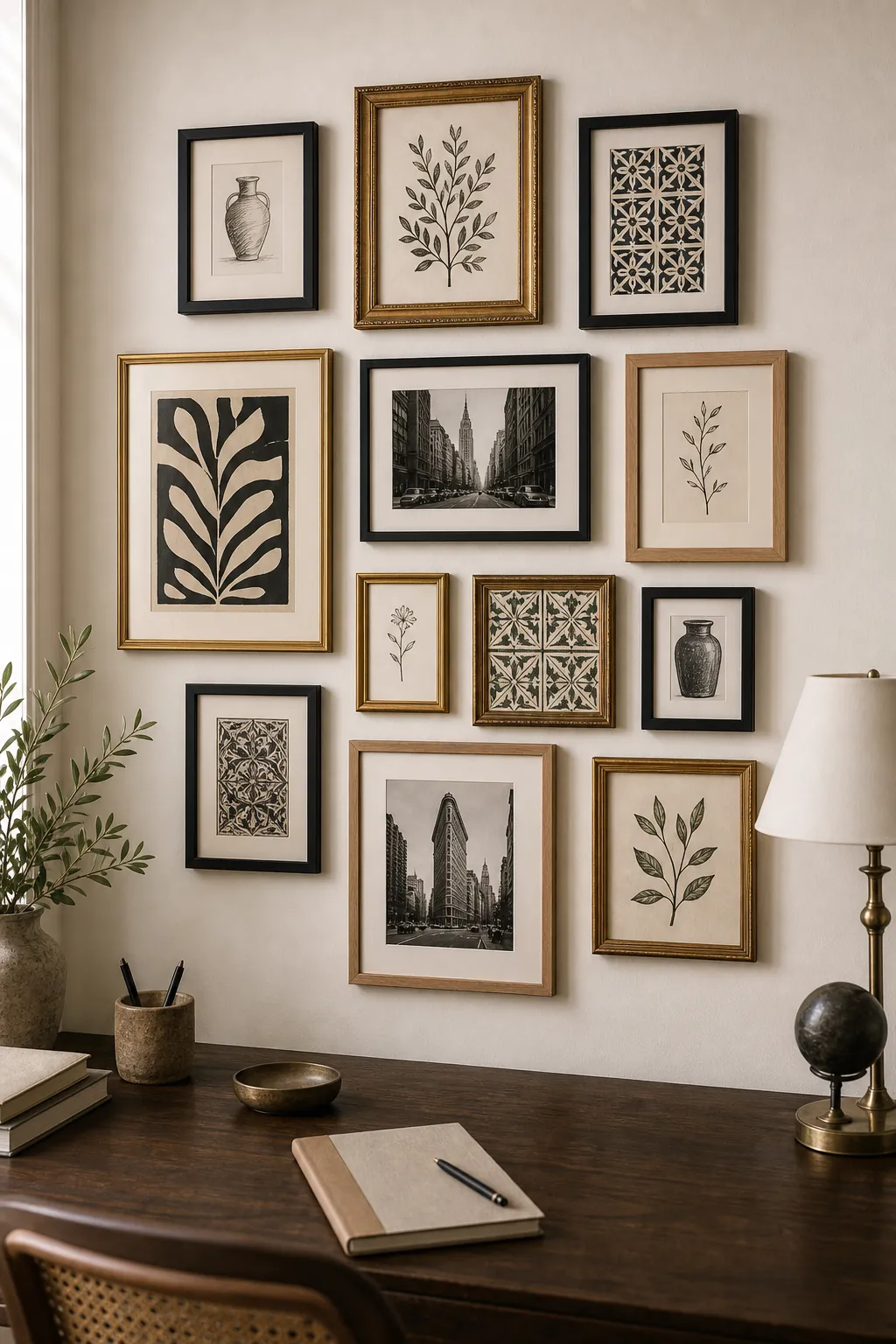
Visual weight matters more than frame size alone. A dark ornate frame can feel heavier than a larger pale wood frame. A high-contrast photograph can feel heavier than a soft botanical print. A thick mat can make a piece feel calmer, while a full-bleed image can feel stronger.
As you arrange the wall, keep the heavy pieces from clumping together. Put one dark or ornate frame near the lower left, another near the upper right, and a medium-weight piece between them. This creates movement without making one side sag.
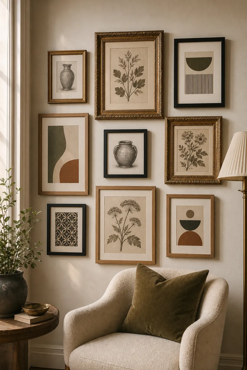
Let Mats Do The Cohesion Work
If your frames are very different, use mats to create consistency. White or warm white mats can make antique gold, black, oak, and brass frames feel related. Wide mats also give small pieces more presence, which helps them stand beside larger frames.
You do not need a mat in every frame. In fact, a few full-bleed pieces can make the wall feel more alive. But if the layout looks restless, add mats to the smallest or busiest pieces before replacing the frames.
Mix Media, But Repeat Texture
A mixed media gallery wall can include framed prints, canvas, a woven textile panel, a small mirror, a sculptural relief, or a shallow shelf. The trick is to repeat texture in a controlled way. If you add one woven piece, echo the warmth with an oak frame or linen mat. If you add a mirror, balance the shine with brass or glass elsewhere.
Keep depth modest. Pieces that stick far out from the wall can make the arrangement feel busy, especially in hallways. A little texture is enough to keep the wall from looking flat.
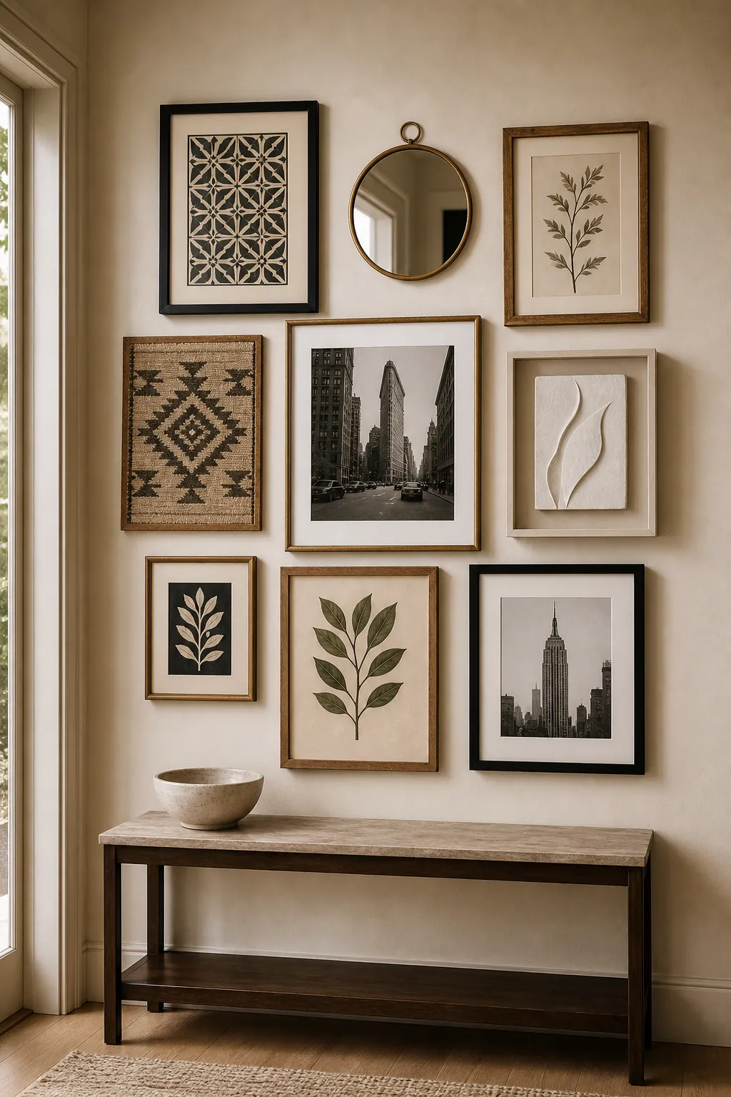
Build Around One Anchor Piece
A cohesive gallery wall needs a place for the eye to land. Choose one anchor piece: the largest frame, the boldest print, the most sentimental photo, or the most sculptural object. Place it first, then build the mixed frame gallery wall around it.
The anchor does not have to sit in the center. An off-center anchor often looks more collected. Just make sure the opposite side has enough medium pieces to balance it.
Keep The Outer Shape Deliberate
Mixed frames can vary inside the layout, but the outside shape should feel controlled. A rough rectangle is the easiest beginner choice. You can let a few small frames step outside the edge, but do not let every edge wander. If the outer shape is too loose, the wall reads as unfinished.
Before hanging, tape the intended outer boundary on the wall or floor. Arrange the frames inside that shape. This keeps an eclectic gallery wall from expanding until it loses focus.
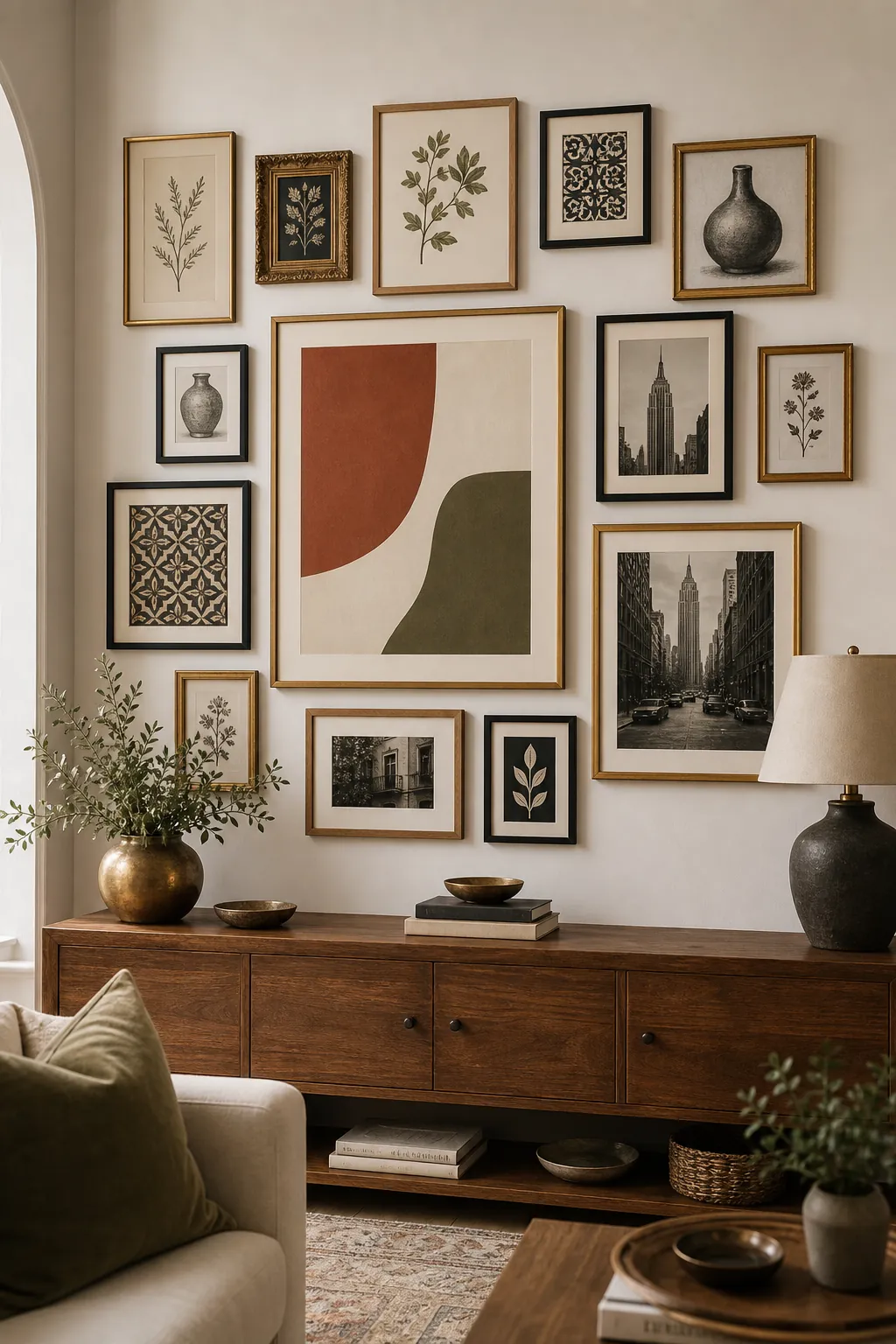
Quick Formula For A Cohesive Mixed Frame Wall
- Choose two main frame finishes and one accent finish.
- Repeat every finish at least twice.
- Keep 2 to 3 inch spacing between most frames.
- Use one shared art palette or repeated mat color.
- Spread dark, ornate, or high-contrast pieces around the layout.
- Keep the outer shape simple, even if the inside feels collected.
The best mixed frame gallery wall does not hide the differences between pieces. It organizes them. When the spacing, finishes, palette, and weight repeat with purpose, mismatched frames stop looking random and start looking like a collection built over time.