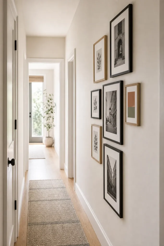
Vertical Gallery Wall Ideas for Narrow Hallways
A narrow wall can make a gallery layout feel harder than a large blank wall. There is less width, less viewing distance, more door trim, and usually more foot traffic. That is why a vertical gallery wall needs different rules than a wide living room arrangement.
The goal is not to fill every empty inch. The best narrow wall gallery ideas use height, rhythm, and restraint. A tall arrangement can make a hallway feel more finished, but only when the frames are scaled to the wall and the spacing is calm enough to read while you walk past.
Start With The Walking Path, Not The Frames
Before choosing art, stand in the hallway and notice how people move through it. If shoulders or bags pass close to the wall, avoid deep frames, heavy protruding ledges, or frames on both sides. In a narrow hallway, one good wall is usually better than two busy ones.
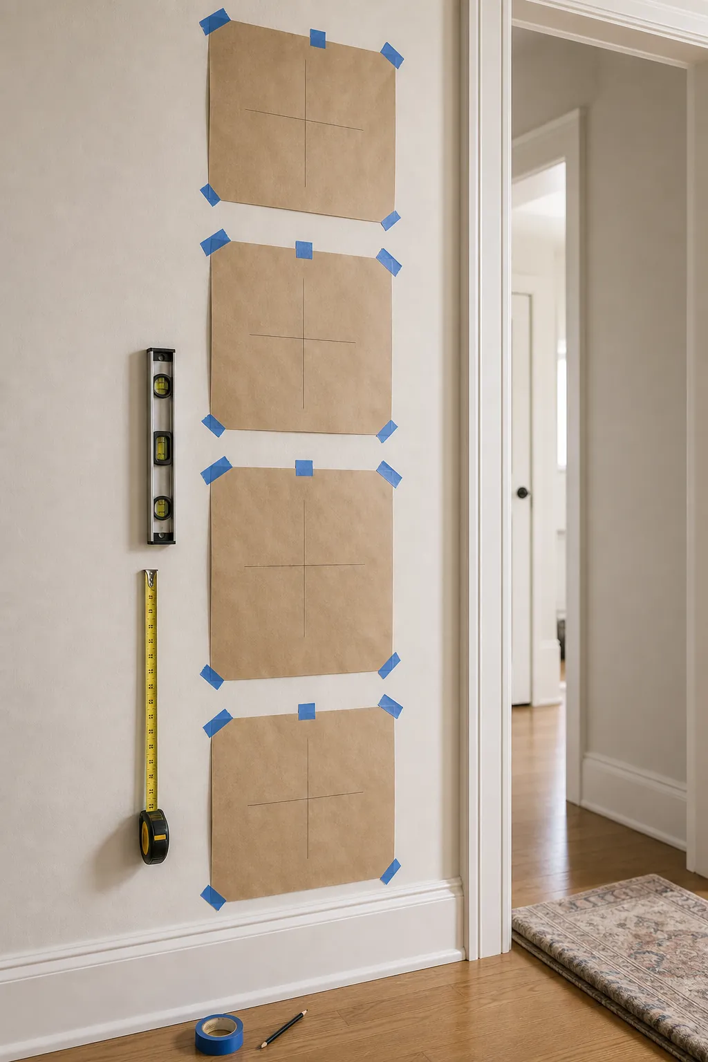
Use paper templates to mark the outer boundary first. For a small gallery wall layout, the boundary matters as much as the individual frames. Leave breathing room near door casings, corners, switches, and handrails. A layout that crowds trim usually looks accidental, even if the frames are beautiful.
When in doubt, make the arrangement narrower and taller. A vertical gallery wall works because the eye follows the stack upward. If the layout spreads too far sideways, it begins to fight the shape of the hallway.
Use A Single Column For The Tightest Wall
A single column is the cleanest solution for a wall strip between doors, a short entry wall, or the end of a hallway. It looks intentional because every piece shares the same centerline. It also keeps pictures on a small wall from turning into clutter.
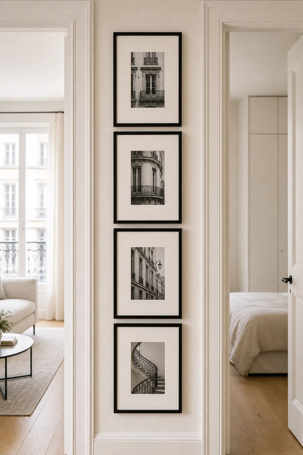
Use three to five frames, not a dozen tiny ones. Matching frame sizes create a stronger architectural line, while mixed sizes need more wall width to breathe. If you want a tall wall photo gallery with mixed frame sizes, keep the largest frame in the middle and let the smaller pieces support it.
For this kind of layout, black and white photography, architectural details, simple line drawings, or tonal botanical prints work well because the content does not overwhelm the narrow space. Strongly colorful art can work too, but keep the palette tight.
Keep Hallway Gallery Walls One-Sided
The fastest way to make a hallway gallery wall feel cramped is to hang frames on both sides at the same height. It can create a tunnel effect, especially in a narrow hallway with low natural light. Choose the longer, cleaner side and leave the opposite wall quieter.
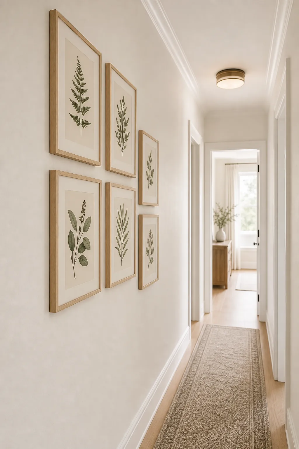
Use repeated frame finishes to calm the view. Pale oak frames can soften a long white hallway. Slim black frames can make the arrangement feel crisp and graphic. If the hallway is already dark, avoid heavy dark mats and bulky frames that visually shrink the walkway.
Spacing should be tight enough to read as one arrangement. Two to three inches between frames often works for narrow walls. Wider gaps can make the layout feel scattered because the viewer is too close to see everything at once.
Let Stair Landings Follow The Rise, But Use One Anchor
A stair landing photo wall has a built-in vertical movement, so the layout can step upward. The mistake is letting every frame float at a different height with no anchor. Start with the largest frame, then build the smaller frames around it while respecting the stair angle.
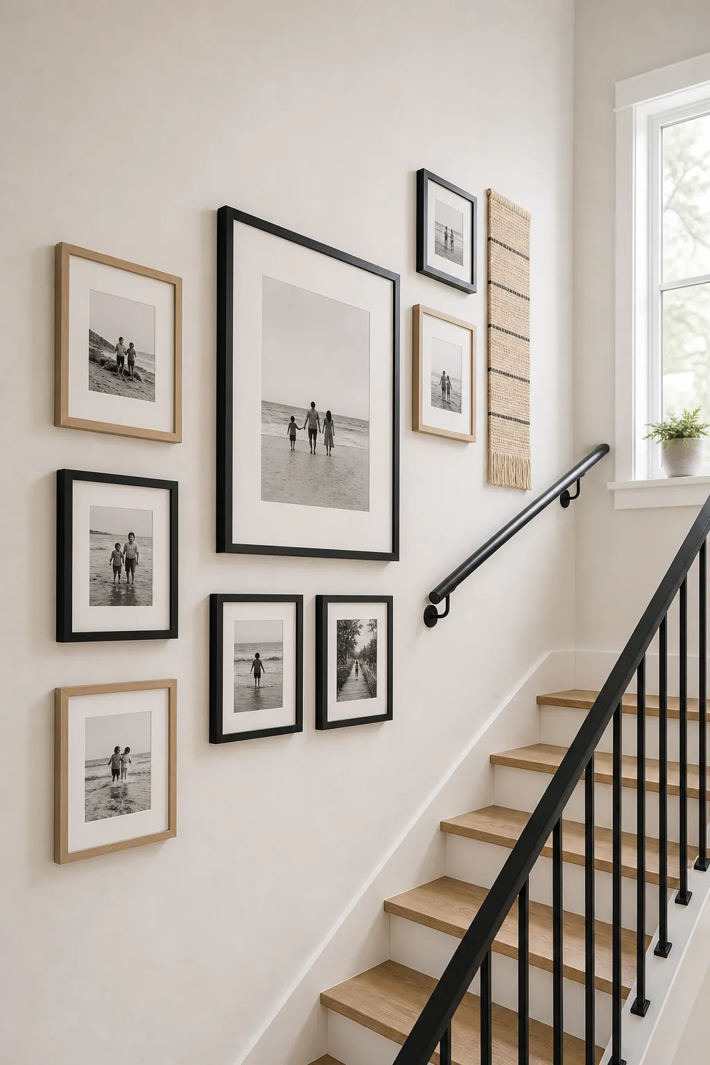
Keep clear space around the handrail and landing trim. Frames placed too close to a rail feel unsafe and visually tense. If you have family photos, convert them to black and white or use the same mat color throughout so the stair wall does not become a busy patchwork.
A stair landing is also a good place to mix one personal piece with quieter supporting art. A small textile, silhouette, or house sketch can break up a wall of faces without making the arrangement less meaningful.
Try A Slim Picture Ledge When You Need Flexibility
Picture ledges can work on a narrow wall, but only when they are shallow and lightly styled. A ledge that projects too far into the hallway will feel awkward every time someone walks by. Choose one ledge, not a stack of shelves, unless the wall is wider than it first appears.
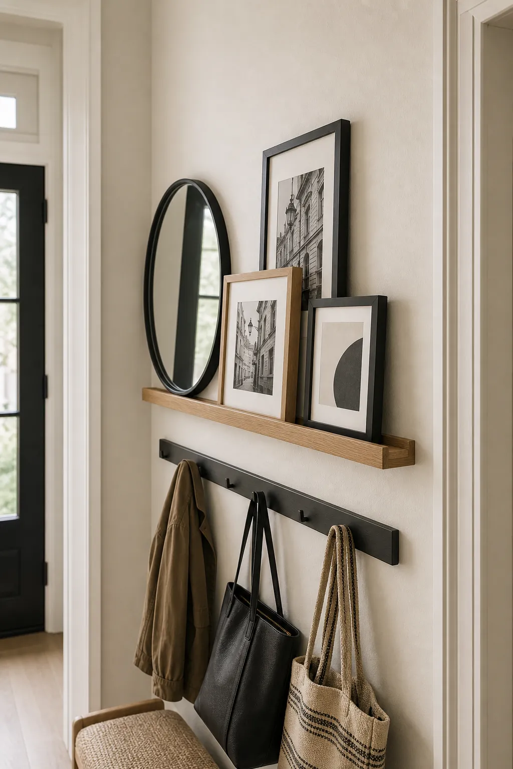
The ledge should do the organizing. Lean a few small frames, overlap them slightly, and add one round object such as a mirror if the wall feels too rectangular. Avoid filling the ledge end to end. The negative space is what keeps the small gallery wall layout from looking like storage.
This approach is useful for renters and for families who change photos often. It also lets you test scale before committing to a permanent vertical gallery wall.
Use Light To Make A Tall Wall Feel Deliberate
Narrow walls often have poor light. Without enough light, even a careful layout can look flat. A small picture light, nearby sconce, or brighter hallway bulb can make the gallery feel like a design choice instead of leftover wall filler.
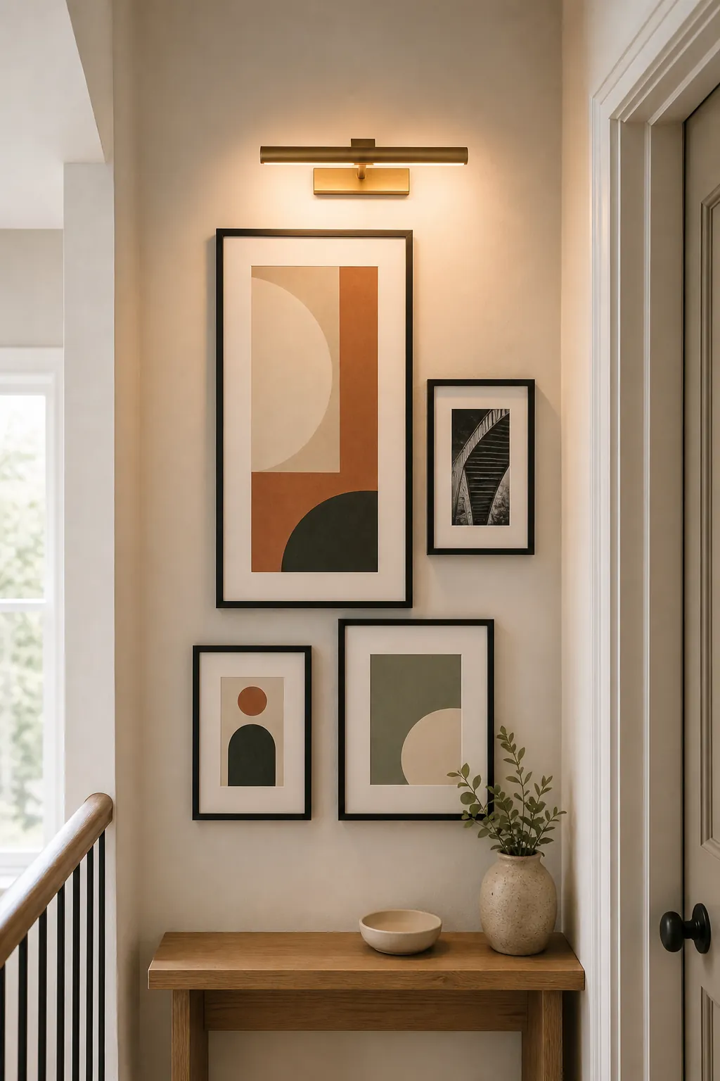
Lighting also reveals spacing mistakes. If a picture light is centered above one frame, make that frame the anchor. If a sconce sits near the arrangement, give it clear space instead of crowding frames around it. The wall will feel calmer when every object has a job.
The Narrow-Wall Formula
For most narrow walls and hallways, the formula is simple: choose one side, keep the layout vertical, use fewer frames than you think, repeat one frame finish, and test the boundary with paper before hanging. A narrow wall gallery should make the passage feel more finished, not more crowded.
If the layout feels busy, remove frames before changing the whole idea. In a tight space, restraint usually looks more expensive than abundance.